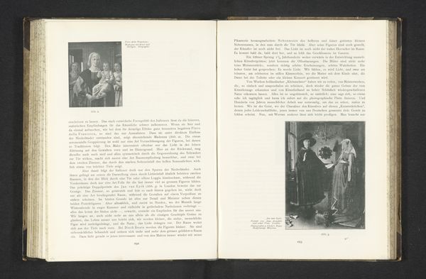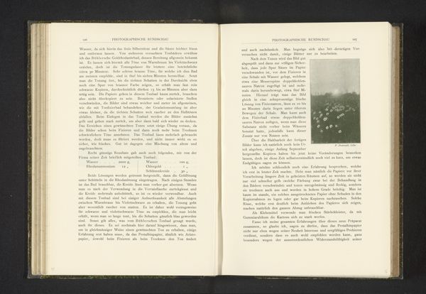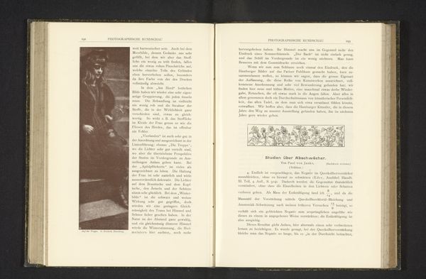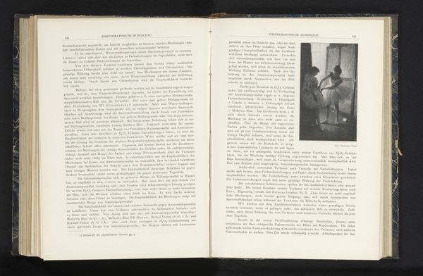
photogram, print, photography
#
portrait
#
script typeface
#
type repetition
#
aged paper
#
still-life-photography
#
photogram
# print
#
editorial typography
#
photography
#
hand-drawn typeface
#
stylized text
#
thick font
#
handwritten font
#
thin font
#
historical font
Dimensions: height 110 mm, width 85 mm
Copyright: Rijks Museum: Open Domain
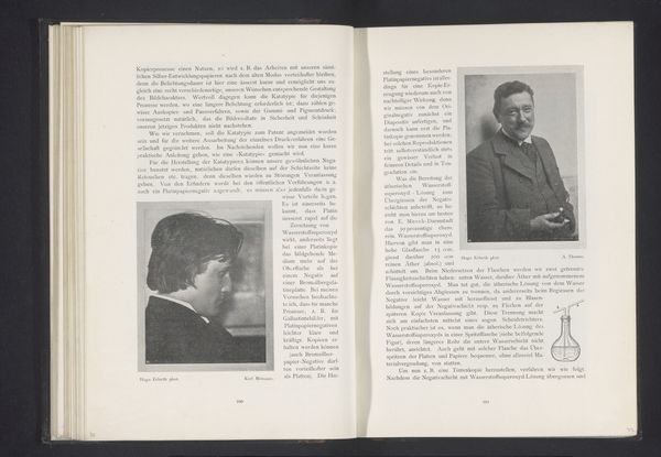
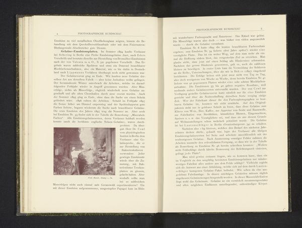
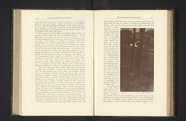
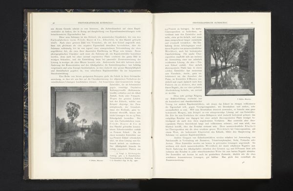
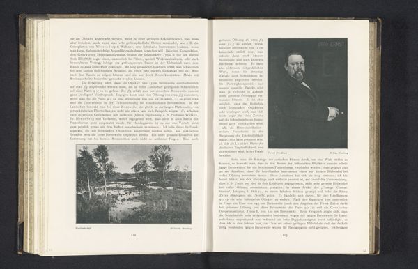
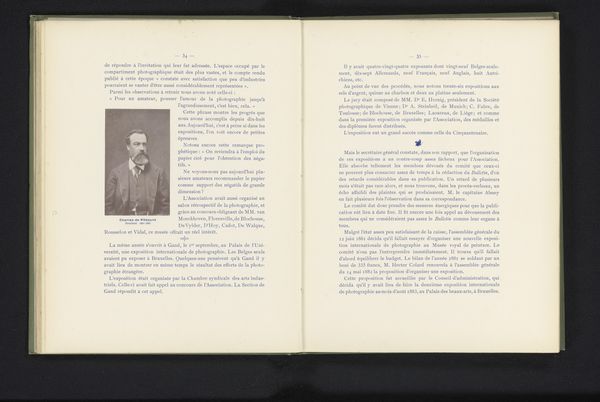
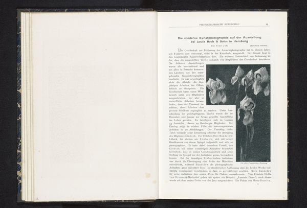
Editor: This image presents a spread from a book; on one side is a landscape photograph, while the other side contains a portrait and text. This piece, titled *Portret van Sascha Schneiders*, was created before 1903 by Alfred Schneider using photogram and print techniques. It feels almost like a diptych. What kind of connections or hidden meanings do you perceive within these juxtaposed images and text? Curator: Indeed, a fascinating juxtaposition! Consider the symbols interwoven here. Photography itself, especially then, carried the weight of memory, freezing moments. A portrait of a person and landscape evokes certain cultural associations between identity, nature, and belonging. Look at the typefaces—hand-drawn, historical—they telegraph nostalgia, hinting at cultural traditions and even bygone eras. Can we decode Schneider's intention, using typography, his ancestor, in the service of this symbolism? Editor: It's interesting that you point out the hand-drawn typeface. I hadn't considered the potential links between text and image as carrying any kind of meaning in particular! Curator: And see how it intertwines with the very *idea* of printed text; there is more going on here. Texts in old manuscripts—how might those relate to photography's claim to indexical truth? The choice isn't arbitrary; it evokes both history and a claim to originality. Consider the composition. Do these pairings trigger other historical, emotional associations for you? Perhaps even loss, absence, and the fleeting nature of life? Editor: That makes sense. Perhaps the aged quality and the thin typeface do suggest that loss, yes. I will definitely remember to look beyond the purely visual aspects and think of imagery from a historical perspective going forward. Curator: Precisely! It is about looking at imagery as cultural touchstones—ones where past, present, and the artist's intention converge to spark our own associations and meanings.
Comments
No comments
Be the first to comment and join the conversation on the ultimate creative platform.
