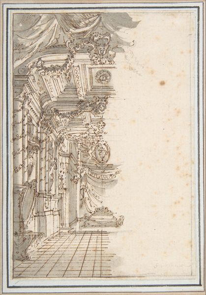
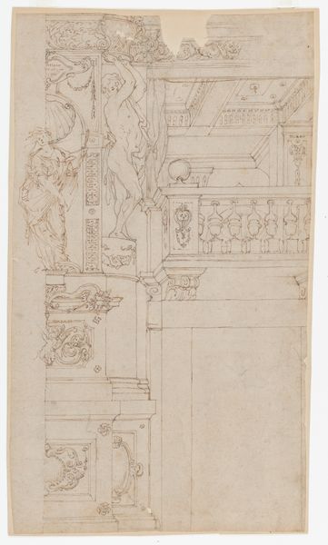
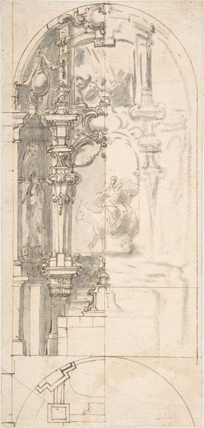
Design for the Corner of a Decorated Ceiling 1620 - 1660
drawing, print, paper, ink
drawing
baroque
mannerism
paper
ink
geometric
decorative-art
mixed medium
Dimensions: sheet: 5 1/2 x 3 3/4 in. (13.9 x 9.5 cm) (irregular borders)
Copyright: Public Domain
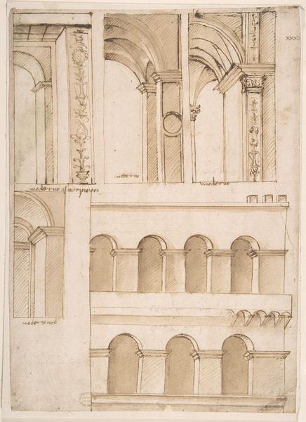
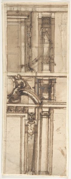
Editor: This is a drawing titled "Design for the Corner of a Decorated Ceiling" created between 1620 and 1660 by Agostino Mitelli. It's rendered in ink on paper, and what strikes me is the intricacy of the architectural details despite the looseness of the sketch. What catches your eye when you look at this design? Curator: The use of line is immediately compelling. Notice the density and variation; Mitelli employs both fine, delicate strokes and heavier, more emphatic lines to define the structure and ornamentation. This juxtaposition creates depth and visual interest, wouldn't you agree? Editor: Yes, I see what you mean. The heavier lines really make the bottom ornamentation pop, while the top fades back. How does the composition contribute to its overall effect? Curator: The composition, though a fragment, reveals a keen understanding of Baroque principles of design. The spiraling, almost florid detail in the lower register contrasts sharply with the geometric austerity higher up. This deliberate juxtaposition is characteristic of Mannerist sensibilities informing Baroque forms, demonstrating a transition or tension. Is that something that you had also noticed? Editor: It wasn't something I considered explicitly. It gives a sense of movement that would've been interesting to see play out across an entire ceiling. Does the medium, ink on paper, play a significant role here? Curator: Absolutely. The choice of ink allows for spontaneity and precision, perfectly suited for capturing the complex details of architectural ornamentation. The varying tonality achieved with ink wash further enhances the sense of depth and volume, transforming a simple line drawing into a study of light and shadow, no? Editor: I see. It’s not just a plan; it's almost a study in itself. Thank you! I've learned a lot by focusing on those elements. Curator: The beauty, really, is in the synthesis. Contemplate the dialogue between form and function, representation and abstraction – there lies the genesis of meaning.
Comments
No comments
Be the first to comment and join the conversation on the ultimate creative platform.