Copyright: Public domain
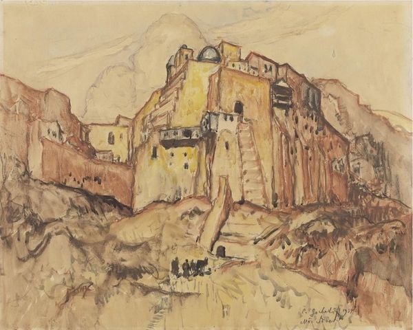
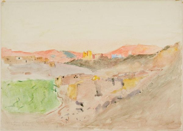
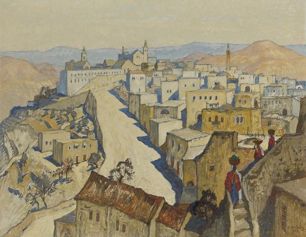
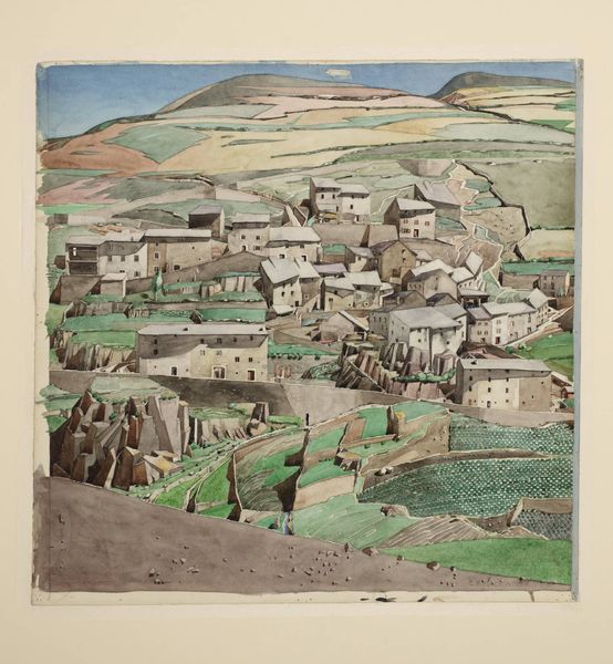
Editor: Here we have Konstantin Gorbatov’s “Nazareth,” created in 1935. The subdued watercolor and ink palette creates a rather dreamlike quality, but also somewhat muted. The composition with the houses staggered almost looks stacked or wedged together. What do you see as being particularly interesting? Curator: It’s the interplay of form and texture that captivates me. Consider the almost geometrical arrangement of the buildings against the organic swell of the landscape. Notice how the artist manipulates the watercolor, juxtaposing transparent washes with areas of heavier pigment to achieve tonal gradations, especially on the structures at eye level. This juxtaposition creates depth without the dependence on a rigid perspective. Editor: I can see what you mean by geometric—the buildings almost seem cubist in their blockiness. Is the relative lack of bold color here meant to convey a mood? Curator: Perhaps. The color palette, while restrained, is deliberately chosen. The dominance of earth tones—browns, ochres, muted yellows—establishes a harmonious, unified field. However, consider where he places the accents. What do you notice? Editor: The touches of blue and green in the background buildings draw the eye back into the distance. The brighter color creates depth but also pulls our focus in opposite directions from the bolder architecture in the front. Curator: Precisely. It creates a visual tension, doesn’t it? A pull between the immediate and the distant. And while the texture varies, it serves less to portray literal reality than to establish a visual rhythm—an ebb and flow. A unified, expressive whole dependent on varied but balanced forms. Editor: I appreciate the structural breakdown. The piece feels so much more dynamic when you look at how Gorbatov actually built the image. Curator: And, hopefully, you can see how close attention to the formal properties of a work allows deeper comprehension.
Comments
No comments
Be the first to comment and join the conversation on the ultimate creative platform.
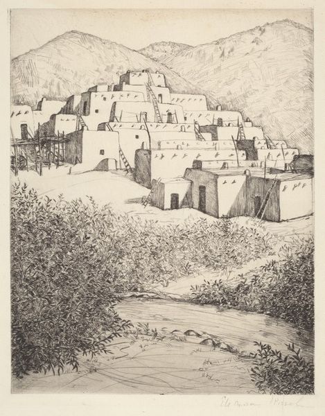
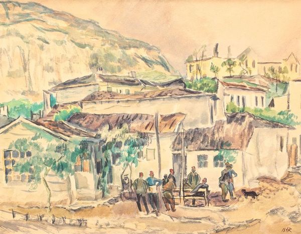
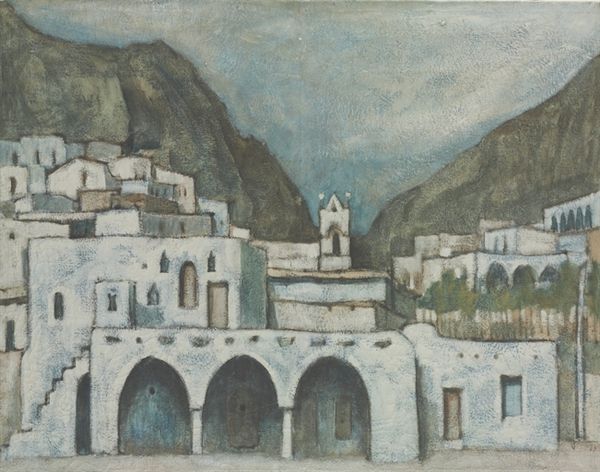
More like this