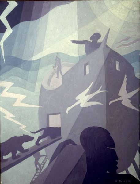
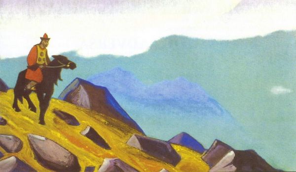
mixed-media, painting, watercolor, poster
#
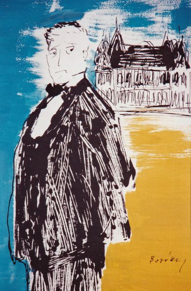
portrait
#
art-deco
#
mixed-media
#
water colours
#
painting
#
figuration
#
text
#
watercolor
#
coloured pencil
#
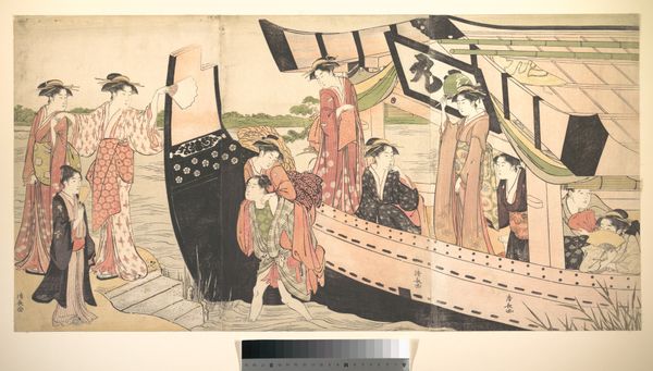
men
#
line
#
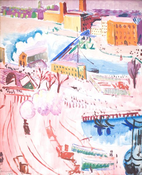
cityscape
#
poster
#
mixed media
Copyright: Rene Magritte,Fair Use
René Magritte made this advertisement for "Norine" in 1924 using watercolor. The angular shapes and overlaid textures suggest a kind of cubist influence, but applied here in a much looser and more playful way, less beholden to theory. Look at the way the watercolor is applied. In areas such as the sky, it is washy and translucent, almost like it’s floating on the paper. Elsewhere, such as in the red blocks that comprise the woman’s coat, the pigment is much more concentrated, creating a bold and striking effect. I love the gesture of the arm reaching out and the way the hand is holding a very small model of a building, as if offering it to the viewer. Is she saying goodbye to New York, or holding its future in her hand? This piece reminds me of Francis Picabia’s proto-Dadaist illustrations, which are similarly irreverent and full of sly humour. Like Picabia, Magritte embraces contradiction and ambiguity. There’s no single way to read it, and that’s the point.
Comments
No comments
Be the first to comment and join the conversation on the ultimate creative platform.
More like this