drawing, ink, pen
#
drawing
#
narrative-art
#
mechanical pen drawing
#
pen illustration
#
pen sketch
#
figuration
#
ink line art
#
linework heavy
#
ink
#
ink drawing experimentation
#
sketch
#
pen-ink sketch
#
thin linework
#
line
#
pen work
#
symbolism
#
sketchbook drawing
#
pen
Copyright: Public domain
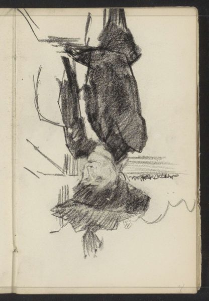
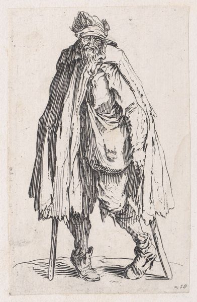
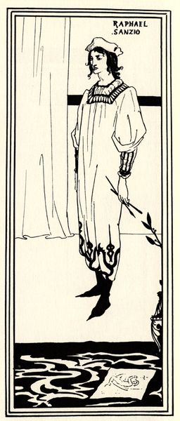
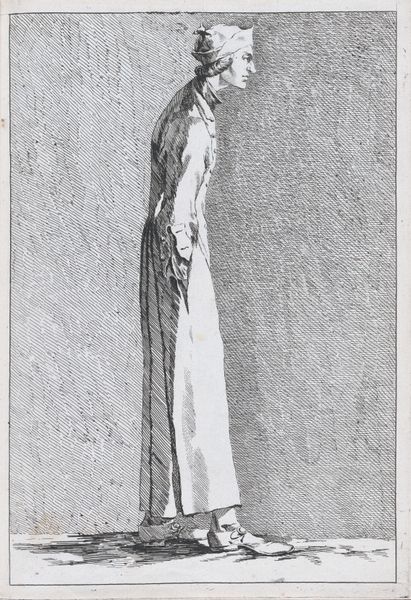
Editor: This is Harry Clarke's "The Year's at the Spring," a pen and ink drawing from 1920. The linework is so intricate, creating a rather ethereal, slightly haunting feeling. What jumps out at you when you look at this piece? Curator: Note the figure's striking verticality; it's emphasized by the elongated cloak and downward gaze. The contrast between the figure and the meticulous landscape creates a visual tension. Do you see how Clarke uses the white space not just as background, but as a structural element that shapes our perception? Editor: I do, it almost feels like the figure is suspended in air. But I'm curious about the relationship between the figure’s almost architectural clothing and the more organic, textured landscape below. Is there a kind of dialogue happening there through form? Curator: Precisely. One might consider how the geometric patterns on the robe act as a counterpoint to the organic sprawl of the land. Think of it as a formal conversation about order and chaos, control versus surrender. Consider the symbolism created with those contrasting compositional elements. Editor: That's fascinating! The attention to detail, even in the apparent simplicity of the figure's stance, really adds a layer of complexity I hadn't initially recognized. Curator: Indeed. By focusing on the formal arrangement, we unlock levels of meaning. The relationship between line, form, and space shapes our understanding of the work, revealing tensions that resonate beyond the surface level. Editor: Thanks for pointing that out; I am definitely looking at the work differently now!
Comments
No comments
Be the first to comment and join the conversation on the ultimate creative platform.
More like this