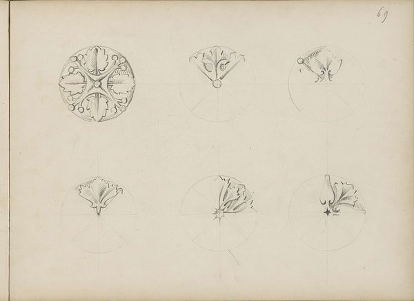
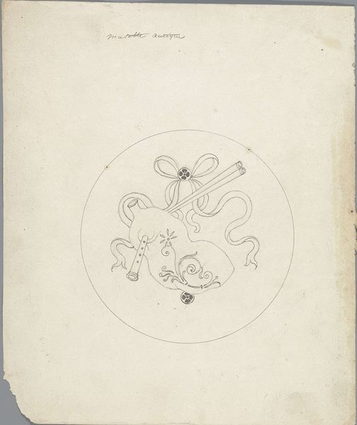
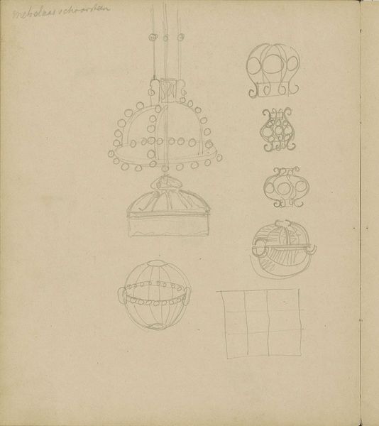
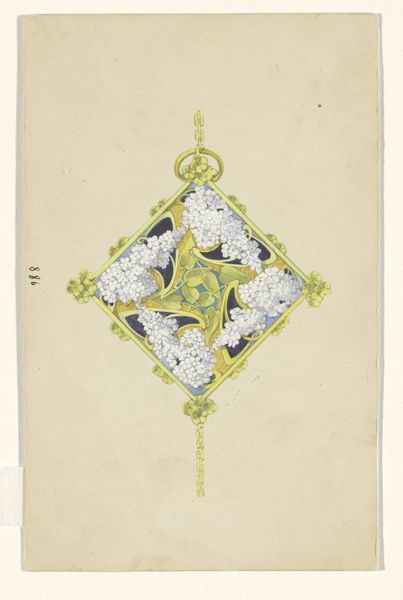
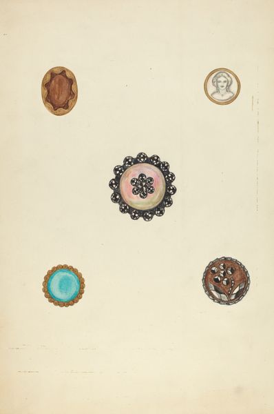
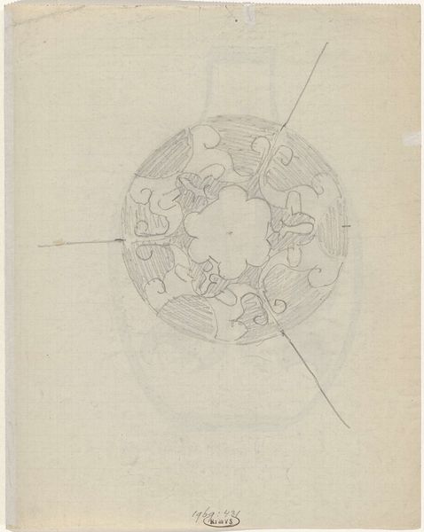
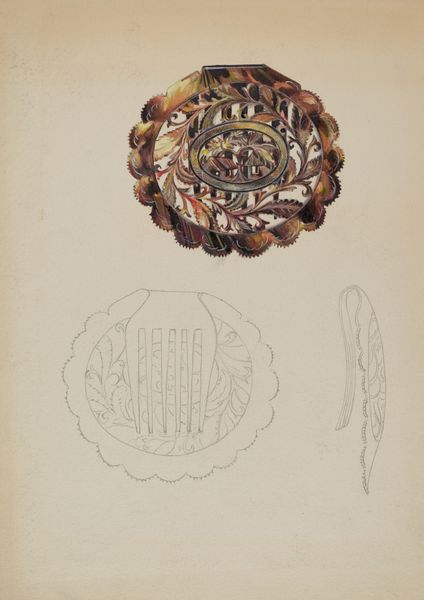
Ontwerpen voor steeknaalden met opengewerkte bollen, medaillons en Malteser kruizen c. 1864 - 1894
0:00
0:00
Dimensions: height 156 mm, width 119 mm
Copyright: Rijks Museum: Open Domain
Curator: Welcome to this audio guide entry. We will be discussing "Ontwerpen voor steeknaalden met opengewerkte bollen, medaillons en Malteser kruizen", designs for hatpins with openwork spheres, medallions, and Maltese crosses by Henri Cameré, created around 1864-1894, in pencil and colored pencil on paper. Editor: These are really intricate drawings, almost architectural in their detail. I'm particularly drawn to the contrast between the solid, geometric shapes and the delicate, openwork patterns. How do you interpret the artist's approach to form and detail in these designs? Curator: A fitting observation. The focus on intrinsic elements, the formal arrangements and the play between positive and negative space is central. Notice how Cameré uses line weight to define the contours of the shapes, establishing a hierarchy of forms, some boldly rendered, others just hinted at. Consider the interplay between the geometric rigidity of the crosses and medallions versus the curves in other areas. What do you think this communicates? Editor: Perhaps it shows the combination of structure and beauty… function, even, with that ornamentation. What about the use of colour, or the lack of strong colour rather? Does the pale palette enhance or detract from the design's legibility and perceived value? Curator: Indeed, the subdued palette reinforces the formal balance, preventing colour from overshadowing the drawing's inherent qualities. Colour plays a secondary role. Consider if strong color had been used. Would it detract from the intricacy of the patternwork? The composition and tonal balance of this design exemplifies a keen sensitivity toward subtle gradations. It provides us, as a viewer, an objective aesthetic experience that is quite satisfying. Editor: I see, focusing our attention on the craftsmanship and overall aesthetic. It’s really interesting how looking closely at just the lines and shapes can reveal so much about the artist's intent. I appreciate how you drew my attention to the design’s semiotic relationship between the line, shape, and form to see it as a composition that creates its own experience. Curator: My pleasure, it has been delightful to engage on a more purely compositional, technical plane.
Comments
No comments
Be the first to comment and join the conversation on the ultimate creative platform.
More like this