drawing, paper, ink, pen
#
drawing
#
hand-lettering
#
ink paper printed
#
old engraving style
#
hand drawn type
#
hand lettering
#
paper
#
ink
#
hand-drawn typeface
#
ink drawing experimentation
#
pen-ink sketch
#
pen work
#
sketchbook drawing
#
pen
Copyright: Rijks Museum: Open Domain
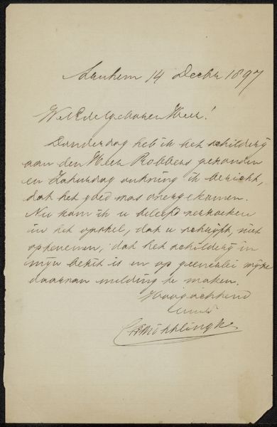
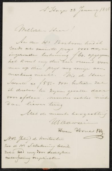
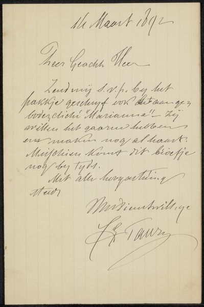
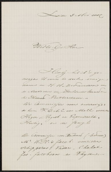
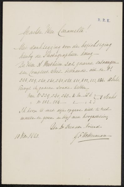
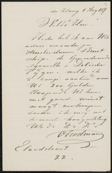
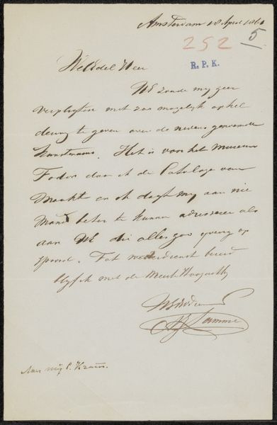
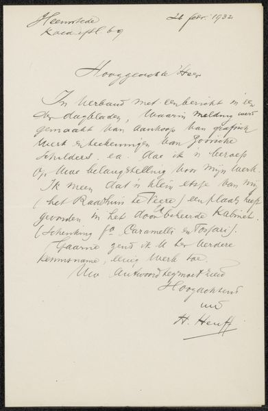
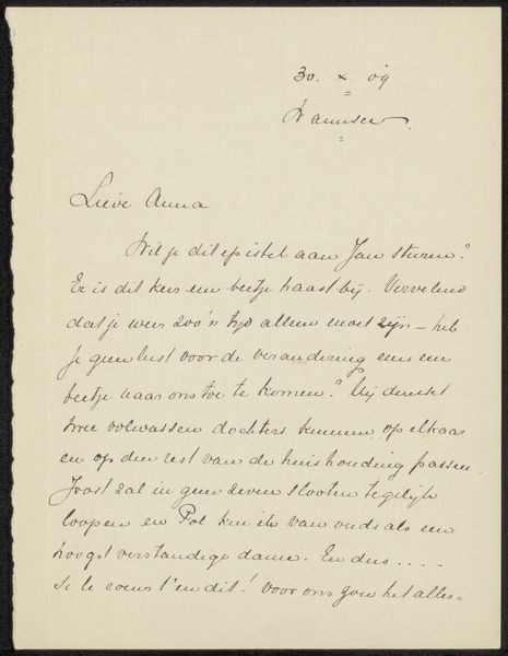
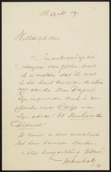
Editor: Here we have Ferdinand Hart Nibbrig's "Brief aan Philip Zilcken," a pen and ink drawing on paper, likely created sometime between 1901 and 1907. I find the density of the text, the looping cursive, visually quite captivating. How would you interpret this piece from an artistic point of view? Curator: The calligraphic lines are striking. Note the deliberate variations in pressure; Nibbrig uses thick strokes for emphasis, juxtaposed with delicate, hair-thin connectors. Observe how this fluctuation in line weight impacts the rhythm of the composition. Is there a pattern to where emphasis is applied? Editor: I see thicker strokes at the beginning of many words and phrases. Almost like a personal emphasis. Curator: Precisely. The hand-lettering transforms the functional—a written message—into an aesthetic object. Forget the literal meaning for a moment and consider the abstract patterns created. The contrast of dark ink against the white paper establishes a play of positive and negative space. How would you characterize this balance? Editor: It feels intentional, but informal. Not overly structured, yet balanced, as you said. The signature at the bottom also mirrors and yet punctuates that flow of ink and blank space above it. Curator: The flourish of the signature, placed strategically at the bottom, acts as a grounding element, securing the composition. In essence, Nibbrig isn’t simply conveying information; he's crafting a visual experience rooted in the manipulation of line, form, and space. Consider the letterforms not as text, but as abstract shapes interacting on a plane. Editor: I’m starting to see the letter less as information and more as texture, rhythm… a constructed pattern with variable marks! Curator: Exactly!
Comments
No comments
Be the first to comment and join the conversation on the ultimate creative platform.
More like this