Copyright: Modern Artists: Artvee
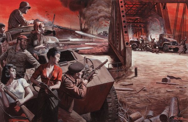
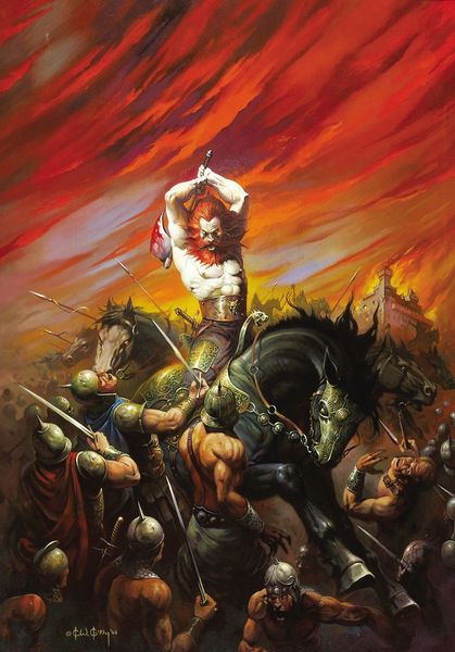
Curator: Standing before us is a poster for the 1972 film "Duck, You Sucker!" The artwork credits Robert McGinnis. It appears to be a mixed-media piece incorporating photography and some illustrative techniques common in Pop Art. Editor: The dynamism is striking. The composition throws you right into the thick of it. Explosions, weaponry, and intense figures dominate. It almost feels aggressive, confronting the viewer with the raw power on display. Curator: It’s fascinating to consider how posters like this function within a specific mode of production. McGinnis had to encapsulate an entire film within a single, marketable image, targeting potential audiences by condensing narrative elements and thematic concerns into an aesthetic whole. Editor: Absolutely. Focusing on the design, the visual hierarchy uses a clear division of space to convey this narrative. The figures are strikingly separated against that stark, empty sky, giving prominence to them, especially compared to the chaos that exists below. I notice how they use both cool and warm tones to separate these zones. Curator: The materials themselves--the paper stock, the inks used for printing--played a vital role in reaching the intended audience. We could consider the labour involved in creating these posters, from the initial photography and illustration to the industrial printing processes, as vital steps to explore beyond what is presented. These types of distribution models defined artistic production at the time. Editor: Beyond the explicit imagery of explosions and weapons, it seems clear they were hinting at the film's emotional resonance as well: A potent sense of high tension mixed with almost cinematic glee, using bold typography to emphasize impact of its message, promising an unforgettable film experience. Curator: I agree. Considering how mass-produced art such as film posters can shape collective memory, exploring the distribution and reception of such posters in relation to cultural consumption can offer valuable insight into the 1970s and beyond. Editor: Precisely, from a visual standpoint, its effectiveness lies not just in representation but suggestion: a brilliant case of how a poster distills themes and emotions through bold color choices, strong lines, and masterful placement. Curator: A truly enlightening piece of design which reveals itself layer by layer as we begin to see past its face value. Editor: Indeed; considering this design reveals much when viewed from contrasting angles.
Comments
No comments
Be the first to comment and join the conversation on the ultimate creative platform.
More like this