drawing, graphic-art, print, engraving
#
drawing
#
graphic-art
#
aged paper
#
toned paper
#
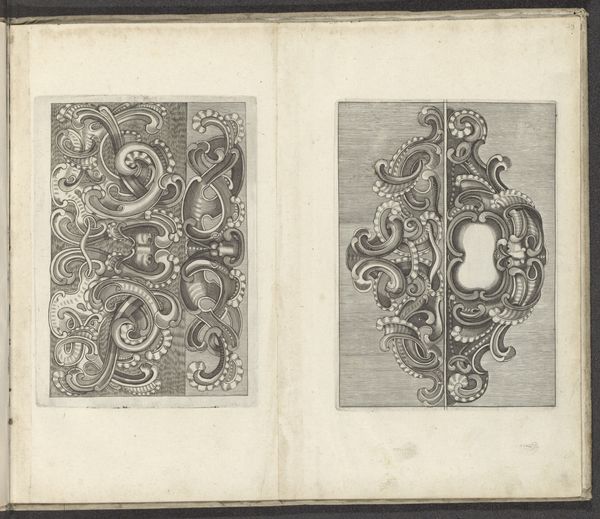
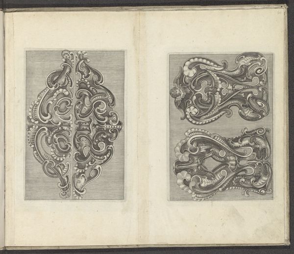
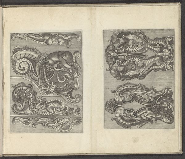
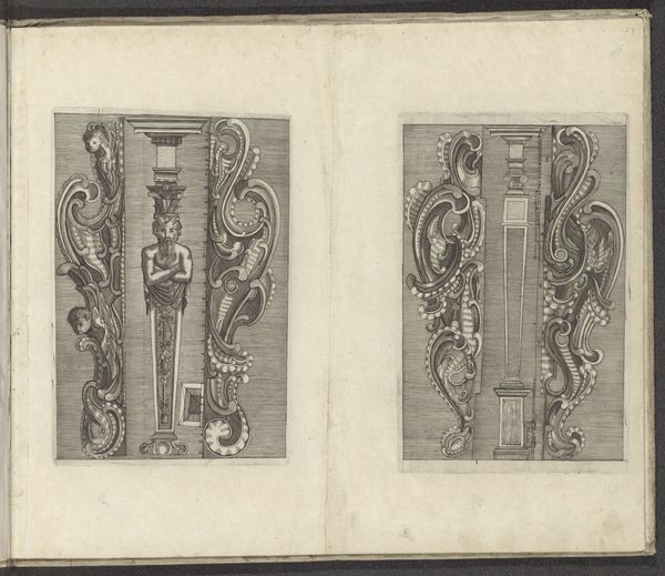
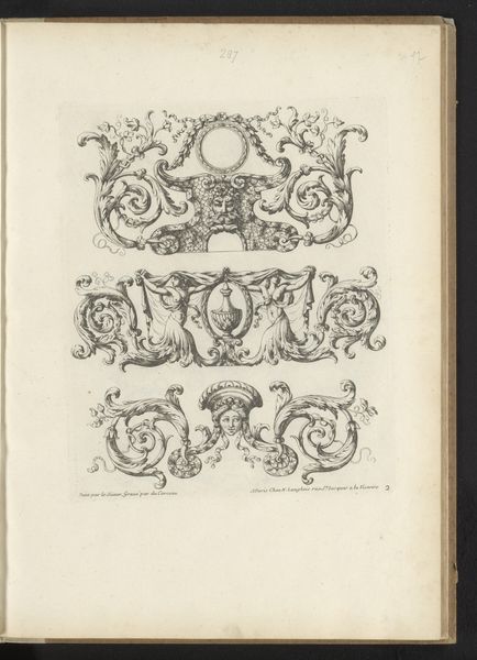
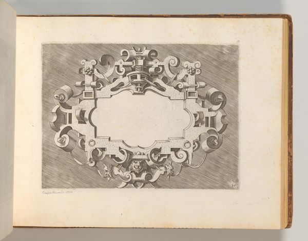
baroque
# print
#
form
#
personal sketchbook
#
pen-ink sketch
#
pen and pencil
#
line
#
pen work
#
sketchbook drawing
#
decorative-art
#
sketchbook art
#
engraving
#
pencil art
Dimensions: height 137 mm, width 192 mm, height 192 mm, width 130 mm
Copyright: Rijks Museum: Open Domain
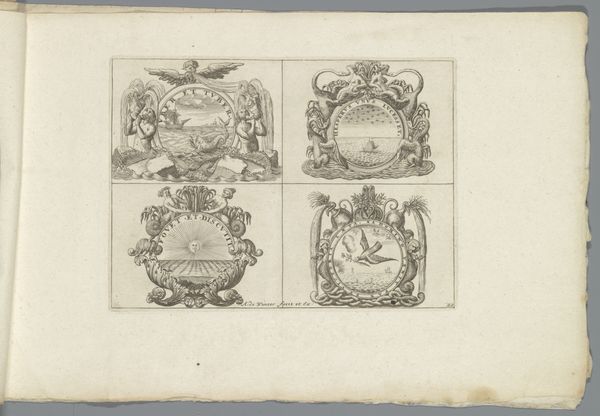
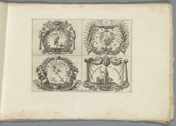
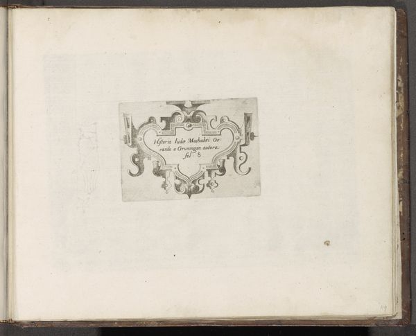
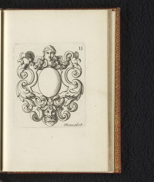
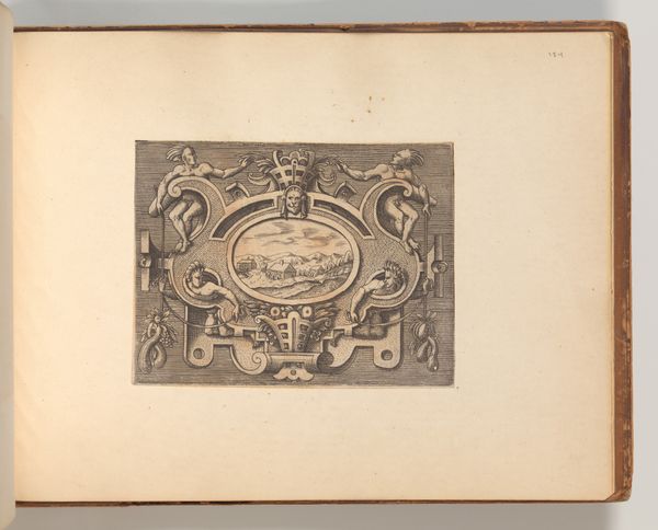
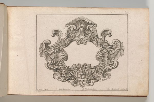
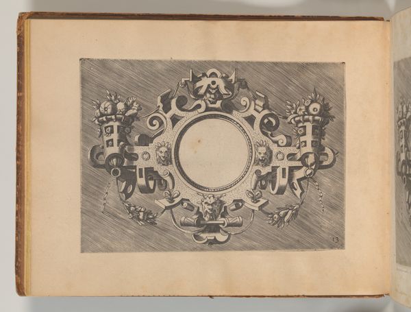
Curator: Immediately, I’m struck by how austere yet flamboyant these designs are, even in the muted tones of the paper. What do you think? Editor: Well, let's start by introducing this fascinating 17th-century drawing. It is called "Vier cartouches met een omlijsting in kwabstijl", attributed to an anonymous artist. As an engraving on what looks like aged, toned paper, it presents a study in Baroque ornamental design. Curator: "Ornamental" is definitely the word. The material itself seems intrinsic to the art. I’m interested in this kwabstijl – or auricular style. These frame designs with their fleshy, lobed forms evoke leather or even cartilage. It is a peculiar melding of the organic and the constructed. Editor: Precisely. These cartouches – decorative frames or panels – functioned as ways to elevate and contain text or imagery. Thinking about context, this print speaks to the socio-political functions of decoration during the Baroque era. Power, status, wealth – these are all performed through such detailed craftsmanship. Curator: Absolutely. These are essentially luxury products in printed form, available for circulation. They allowed the artisan or craftsman to replicate designs at scale. Though mass production might seem a stretch. We're talking about 17th-century printmaking, so the embodied labour is still evident. Editor: Yes, and the choice to depict what appears to be weaponry within two of these frames brings other historical considerations into play. Symbolically, they hint at the era's military and political struggles. Think about religious wars or territorial disputes. Even decorative forms have political resonance. Curator: That’s a good point. I suppose there's a subtle interplay here. The beauty and intricacy soften what is usually the brutal reality of warfare, contained within a design readily commodifiable. It seems counter-intuitive to beautify symbols of death. Editor: Right, the beauty performs an obfuscation; it almost makes you forget the cost, the human impact involved in constructing and then living within those very power structures the forms represent. The value of a hand crafted image on such well prepared paper isn't separate from societal forces. Curator: On viewing this image, I am led back to the questions about artistic agency within such complex social circumstances and production limitations. It almost feels like detective work, attempting to excavate lost intention. Editor: It is this intersectionality—how artistic practices are always embroiled in societal dynamics—that really grabs me with a piece like this. I hope our visitors, whether in person or listening at home, take away the importance of deconstructing not just what we see, but how its social dimensions matter, too.
Comments
No comments
Be the first to comment and join the conversation on the ultimate creative platform.
More like this