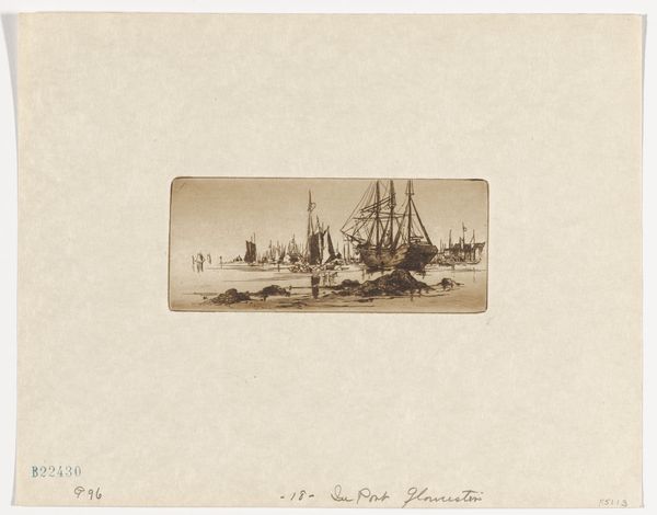
print, photography, gelatin-silver-print
# print
#
photography
#
gelatin-silver-print
#
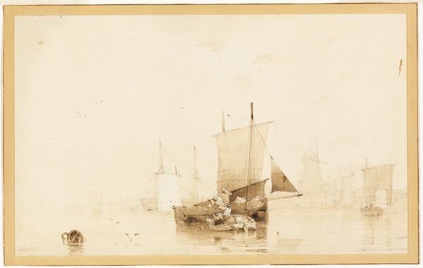
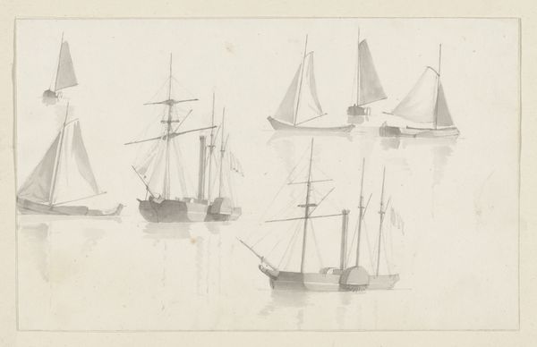
watercolor
Dimensions: height 61 mm, width 66 mm, height 88 mm, width 178 mm
Copyright: Rijks Museum: Open Domain
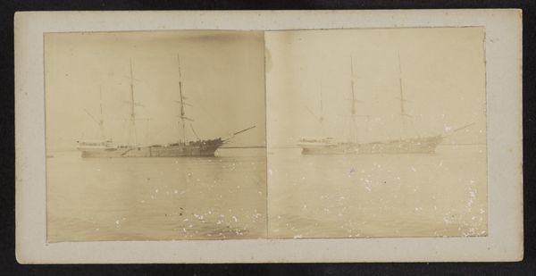
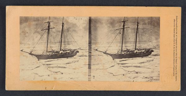
Curator: What a ghostly pair. Is it just me, or do you also sense a certain… longing radiating from these images? Editor: It’s there. These gelatin silver prints, titled "Lossen van de Soerabaja," by Robert Julius Boers and dating from 1900-1922, depict a ship, maybe unloading, maybe arriving… The double image almost emphasizes that feeling of a journey. I'd suggest its atmosphere is less about longing and more about a precise moment within the intricate tapestry of Dutch colonialism. Curator: Oh, intriguing. It is interesting, this tension between the personal and the political. But I confess I'm caught by how much the sepia tones evoke that hazy, far-off quality – not just geographically, but also temporally. Almost like peering into a collective dream of that time. Editor: Consider where Surabaya is—it’s in Indonesia. This photograph encapsulates a specific chapter in the Dutch East Indies Company's narrative. We're looking at a port city vital to the colonial trade routes. Boers doesn't simply present a ship, he’s captured the economic machinery of colonialism, even if subtly. It speaks volumes about power, resources, and the exploitation inherent within that historical context. Curator: The sepia, for me, it is something about decay too. And it has echoes in the ship. A silent, weathered witness. Do you think he meant to capture it that way, this…sense of burden, or is it our modern lens coloring the image? Editor: That's where it gets fascinating, right? The sepia and wear can function on many levels. Are we sentimentalizing the past by only seeing it through this filter, or does that faded quality amplify a truth about colonialism's inherent instability and its lasting impact? I would suggest the answer isn't clear, and it varies based on how one understands the world then versus our place today. Curator: Absolutely. Well, whatever the intention, for me the emotional layers are profound. It is evocative as something floating to the top of the conscious that feels just out of grasp, but it makes you question why it makes you feel in this specific way. Thank you for helping bring focus. Editor: A critical interpretation isn't about closing doors but opening them to a wider understanding. I see this picture more than an atmospheric picture but as a gateway into conversations about history, empire, and enduring legacies.
Comments
No comments
Be the first to comment and join the conversation on the ultimate creative platform.
More like this