#
natural stone pattern
#
abstract painting
#
water colours
#
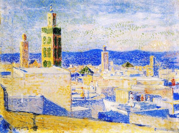
landscape
#
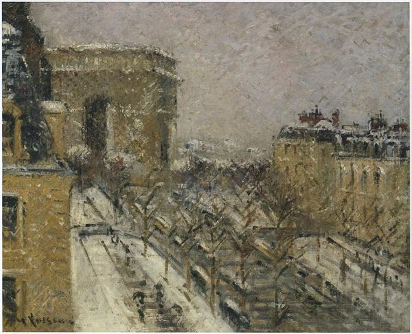
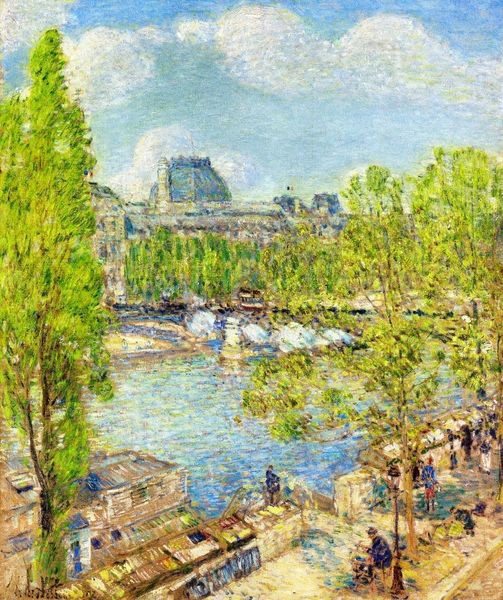
impressionist landscape
#
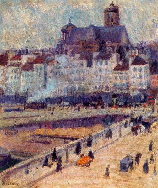
possibly oil pastel
#
street graffiti
#
paint stroke
#
watercolour bleed
#
mixed medium
#
watercolor
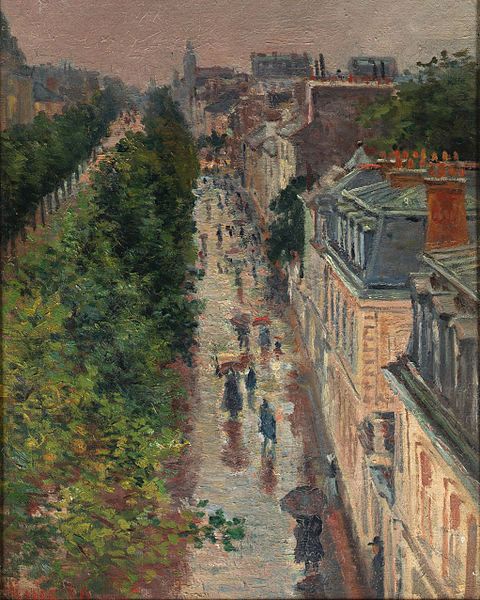
Copyright: Public Domain: Artvee
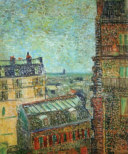
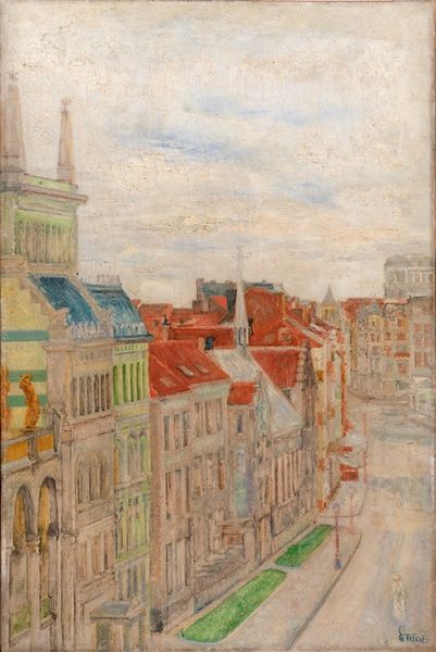
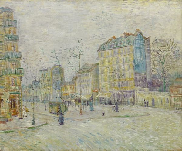
Editor: Here we have what’s believed to be “View from Theo’s Apartment” by Vincent van Gogh, date unknown. Looking at it, I am struck by the pastel color palette and the dizzying pattern of the brushstrokes creating a kind of undulating surface across the canvas. What can you tell me about this work? Curator: Immediately apparent is Van Gogh’s treatment of space and form. Notice how he dispenses with traditional perspective, creating a flattened plane where buildings seem to press against each other. How does that affect your reading of the artwork? Editor: It feels unstable, almost like everything is on the verge of collapsing or maybe floating away. It certainly departs from traditional landscape painting. Curator: Precisely. Now, observe the application of paint. Short, choppy strokes build up the forms. It’s less about depicting reality and more about the very act of painting. Can you see a pattern or rhythm? Editor: Yes, the brushstrokes almost vibrate on the canvas. The different colours are laid on side-by-side, but optically blend to form other colors as well. Curator: Consider also the colour choices. Predominantly blues, greens, and yellows, yet rendered with a kind of muted intensity. What emotion does the restrained palette evoke in you? Editor: A feeling of subdued melancholy, maybe a quiet contemplation. I find that interesting considering that landscape scenes usually depict brighter colors and a greater harmony with nature. Curator: The subversion of expectations through form and colour makes for a more profound expression, doesn’t it? He focuses less on the literal scene, and more on the emotive capacity of the structural components. Editor: I never would have thought about that. Looking at the colour and form relationships definitely provides a richer understanding. Thanks.
Comments
No comments
Be the first to comment and join the conversation on the ultimate creative platform.
More like this