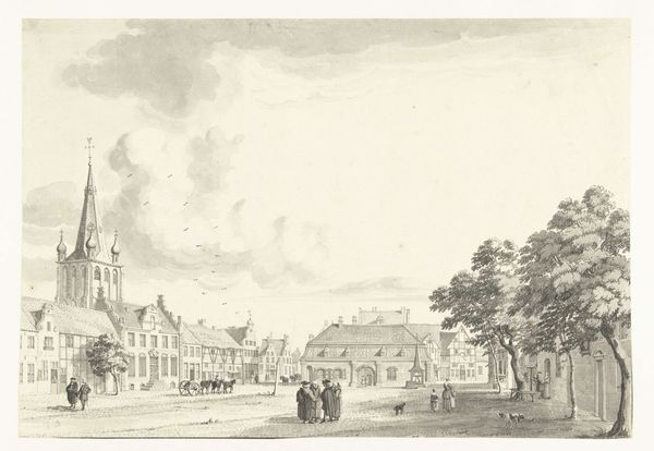
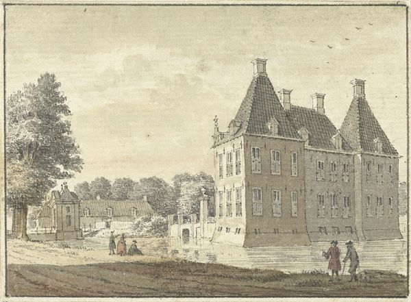
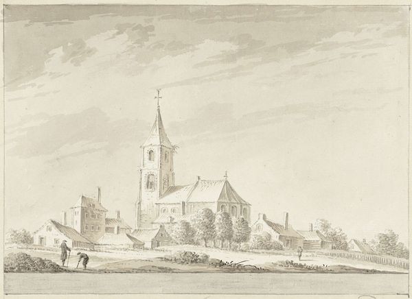
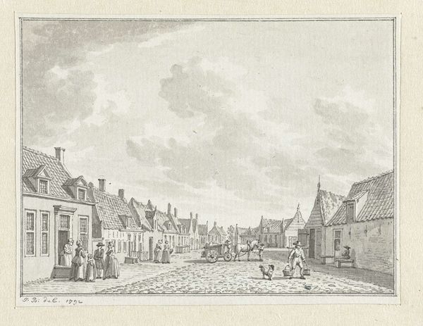
painting, watercolor
#
dutch-golden-age
#
painting
#
landscape
#
watercolor
#
cityscape
#
watercolour illustration
#
genre-painting
#
street
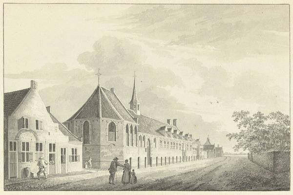
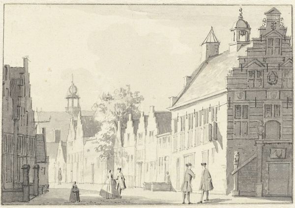
Dimensions: height 166 mm, width 229 mm
Copyright: Rijks Museum: Open Domain
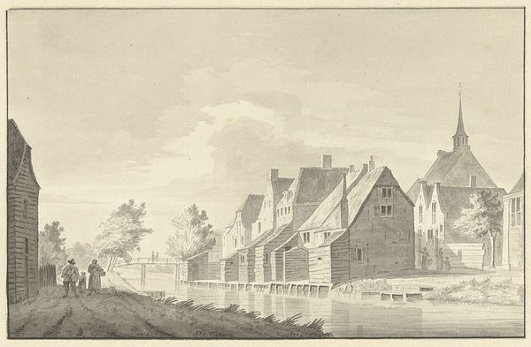
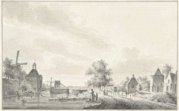
Curator: Let's turn our attention to this watercolor by Jacobus Versteegen, dating roughly from 1745 to 1795. It depicts the Jobs Almshouse in Utrecht. Editor: It’s incredibly serene, isn't it? A certain stillness permeates the scene, emphasized by the pale washes and soft rendering. Curator: Versteegen captures the building and the street using watercolor. Consider the conditions of artistic production in Utrecht at the time. What was available for artists regarding pigments and paper quality? The use of watercolor suggests affordability but also a market for this kind of picturesque architectural view. Editor: The architectural precision here is superb, every brick seems accounted for. The perspective creates a rhythmic pattern of windows. I’m particularly drawn to how the spire intersects the cloudy sky—a fascinating use of the picture plane. Curator: Beyond its aesthetic appeal, consider the Almshouse itself. It wasn't just a building; it represents social welfare, class structures and even ideas around charity in 18th-century Utrecht. Patrons commissioning these works likely saw them as status symbols but what about the lives of the actual residents? Editor: I see your point. While there's a certain coldness to its sharp geometrical lines, it evokes a tangible sense of history, a specific moment captured with precision and restraint. It’s an insightful record of this civic building that once housed elderly men in the city. Curator: The very act of depiction elevates the Almshouse. Genre scenes and cityscapes held certain positions within the hierarchy of art but artists of the Dutch Golden Age were known for the novel perspectives to existing modes. What do you think are the traces that indicate the context of this artwork? Editor: I notice, in a formal sense, the tonal uniformity across the composition—the delicate balance that lends harmony. The pale hues amplify that pervasive feeling of calm and the artist uses perspective masterfully to create depth. Curator: Looking at Versteegen’s choices tells us a lot about his engagement with materials and with his place in Utrecht's artistic and social fabric. Editor: Indeed. When observed from the artist's arrangement of color, composition, and subject, we can see it for what it truly is - a sublime testament to the power of careful observation and a compelling expression of order.
Comments
No comments
Be the first to comment and join the conversation on the ultimate creative platform.
More like this