print, watercolor, architecture
#
aged paper
#
toned paper
#
homemade paper
#
muted colour palette
#
baroque
#
ink paper printed
# print
#
light earthy tone
#
perspective
#
watercolor
#
cityscape
#
watercolour bleed
#
watercolour illustration
#
architecture
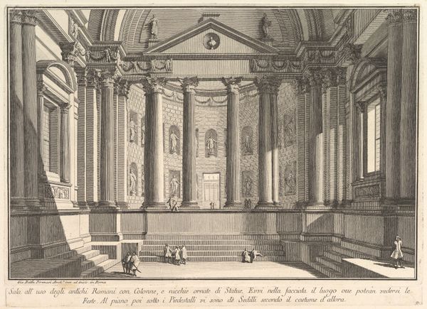
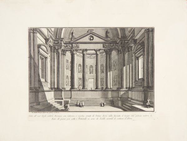
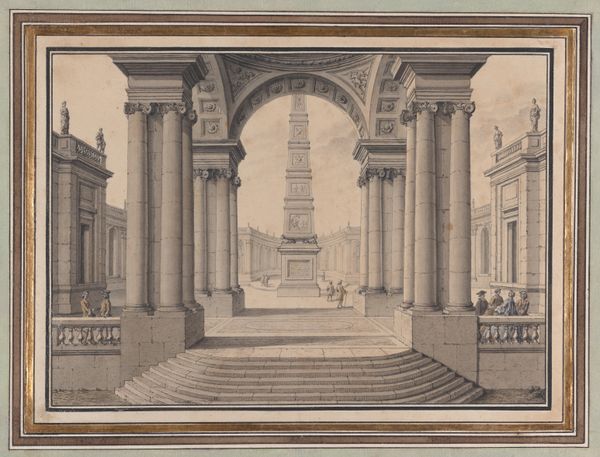
Dimensions: height 256 mm, width 361 mm
Copyright: Rijks Museum: Open Domain
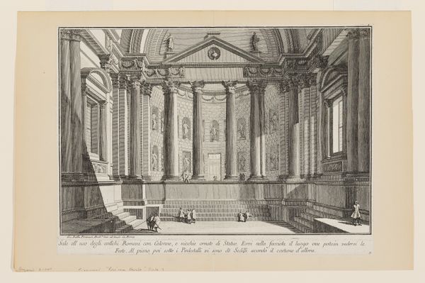
Editor: So, here we have "Gezicht op het interieur van een Romeins bouwwerk," or "View of the Interior of a Roman Building," created sometime between 1745 and 1775 by Jean-François Daumont. It seems to be a watercolor print. I'm really struck by the colors; that muted, almost faded palette gives it such an aged and timeless feel. What’s your perspective on this? Curator: Let’s consider the materiality. It’s described as an ink print, but what kind of ink? Was it a readily available, cheap ink, or one painstakingly produced with particular pigments? Think about how that choice influences the image. Also, this isn't just any paper; it's been identified as homemade. Editor: How does that influence your understanding of it? Curator: Well, consider the labour involved in creating both the paper and the print itself. This isn't mass-produced; it’s the product of someone’s dedicated time and skill. How accessible would such a print have been? Who was the intended audience, and what were they meant to consume with this image? Are we really seeing "Rome" or a romanticized European interpretation *of* Rome, and, ultimately, of power itself? Editor: So, it's not just about the grand Roman architecture, but about understanding the conditions that allowed for its depiction and the statement it made. That really changes how I look at it. Thanks! Curator: Precisely! We must look at both image and manufacture, both subject and subject's subjugation to those processes of making. It shifts how we consider the artwork.
Comments
No comments
Be the first to comment and join the conversation on the ultimate creative platform.
More like this