About this artwork
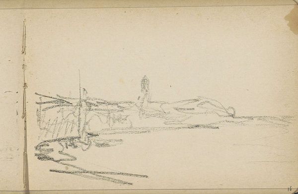
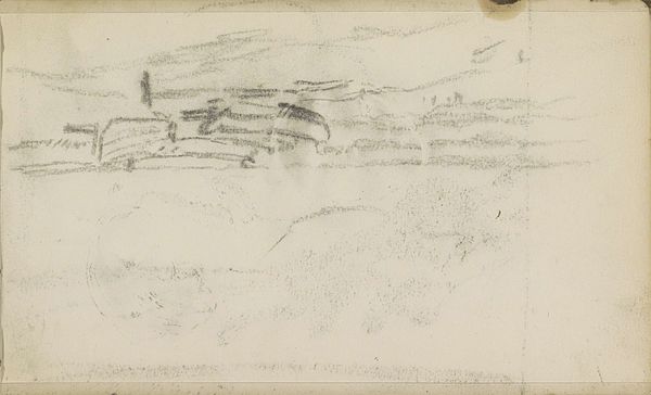
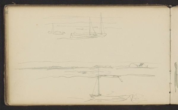
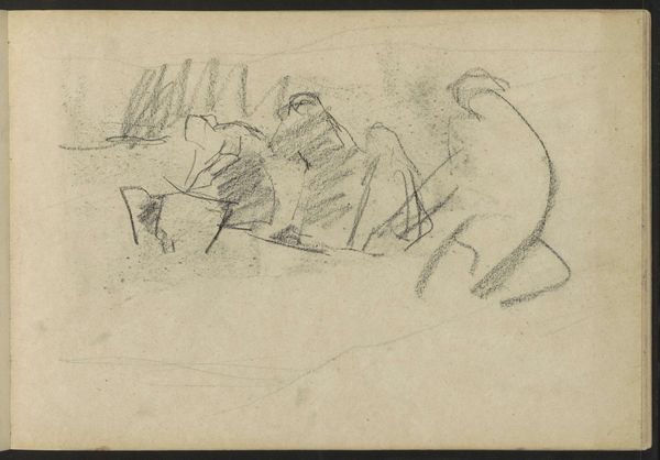
Editor: This sketch, "Liggende nomaden in de Kruisbaai te Nova Zembla," by Louis Apol, was made sometime between 1880 and 1888. It's a pencil drawing on toned paper, and what strikes me immediately is its bare, almost stark composition. What visual elements do you find most compelling in this work? Curator: The linear quality is paramount. Apol’s economy of line elegantly defines form and space. Notice how the figures, though minimally rendered, possess distinct weight and presence on the page. It’s also significant that the toned paper acts as a middle value, allowing Apol to suggest both highlights and shadows with only graphite. The contrast establishes depth in a subtle way. Editor: That’s a good point about the toned paper adding depth. I was so focused on the sparseness of the lines themselves. Is there any sort of intentionality behind that choice? Curator: Indeed. The unfinished quality contributes to its aesthetic. It emphasizes process over product, inviting us to consider the artist’s hand and the act of observation. Semiotically, these are signs of both the immediacy of perception and a considered artistic selection of exactly what to depict. It isn't the goal of Romanticism to overwhelm its subject with grandiose representation but rather distill it down to its essence. Editor: So the visible "work" is part of the art, in a sense. I appreciate you sharing that. Curator: Exactly! We should observe art to perceive the intentional decisions about formal composition within their historical contexts. Now do you feel differently towards this work having discussed that together? Editor: Yes! Before, I saw a simple sketch. Now, I see an invitation to consider the artist's choices and the act of creation itself. Curator: Splendid! The close read can sometimes provide the deepest appreciation.
Liggende nomaden in de Kruisbaai te Nova Zembla 1880 - 1888
Louis Apol
1850 - 1936Location
RijksmuseumArtwork details
- Location
- Rijksmuseum
- Copyright
- Rijks Museum: Open Domain
Comments
No comments
About this artwork
Editor: This sketch, "Liggende nomaden in de Kruisbaai te Nova Zembla," by Louis Apol, was made sometime between 1880 and 1888. It's a pencil drawing on toned paper, and what strikes me immediately is its bare, almost stark composition. What visual elements do you find most compelling in this work? Curator: The linear quality is paramount. Apol’s economy of line elegantly defines form and space. Notice how the figures, though minimally rendered, possess distinct weight and presence on the page. It’s also significant that the toned paper acts as a middle value, allowing Apol to suggest both highlights and shadows with only graphite. The contrast establishes depth in a subtle way. Editor: That’s a good point about the toned paper adding depth. I was so focused on the sparseness of the lines themselves. Is there any sort of intentionality behind that choice? Curator: Indeed. The unfinished quality contributes to its aesthetic. It emphasizes process over product, inviting us to consider the artist’s hand and the act of observation. Semiotically, these are signs of both the immediacy of perception and a considered artistic selection of exactly what to depict. It isn't the goal of Romanticism to overwhelm its subject with grandiose representation but rather distill it down to its essence. Editor: So the visible "work" is part of the art, in a sense. I appreciate you sharing that. Curator: Exactly! We should observe art to perceive the intentional decisions about formal composition within their historical contexts. Now do you feel differently towards this work having discussed that together? Editor: Yes! Before, I saw a simple sketch. Now, I see an invitation to consider the artist's choices and the act of creation itself. Curator: Splendid! The close read can sometimes provide the deepest appreciation.
Comments
No comments