Copyright: Modern Artists: Artvee
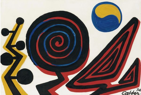
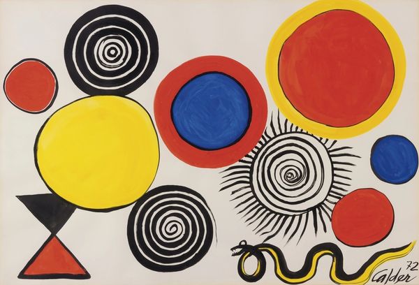
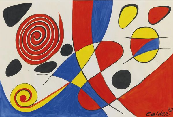
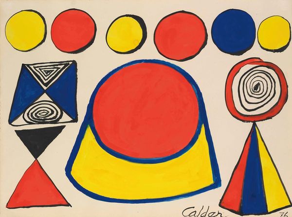
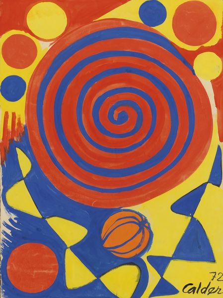
Editor: Here we have Alexander Calder’s "Happy," a vibrant acrylic painting from 1974. I’m really drawn to the playful geometric shapes and the bold color palette. What strikes you most about the composition? Curator: Indeed, the painting's strength resides within its formal organization. The interplay of primary colors—red, yellow, and blue—establishes a visual rhythm, a dialogue if you will. Observe how the shapes, though seemingly disparate, are unified by the black outlines, creating a cohesive whole. It demonstrates an advanced understanding of pictorial space and the potential for creating dynamism through strictly formal means. Editor: So, you are less concerned about the potential symbolism of, say, the circular shapes versus the more angular ones? Curator: The intrinsic visual properties hold precedent here. Note the tension between the flatness of the painted surface and the illusion of depth created by the spirals. Are they pulling us in, or pushing us away? These optical mechanics underscore Calder’s mastery. His approach transcends the need for referentiality; instead, it hinges on the immediate and purely optical engagement with the viewer. Editor: I see. It's less about what the shapes *mean* and more about what they *do* to the eye. That’s a useful distinction. I am starting to see this work from an exciting, different perspective. Curator: Precisely. Art at its best should prompt new perceptual relationships for us, which “Happy” certainly seems to achieve. Editor: I’ve certainly gained a much more precise vocabulary for decoding abstract works like this one, considering shape and color first. Thanks for your insights.
Comments
No comments
Be the first to comment and join the conversation on the ultimate creative platform.