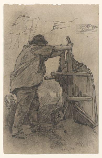
drawing, pencil
#
portrait
#
drawing
#
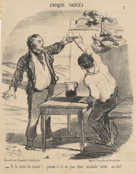
caricature
#
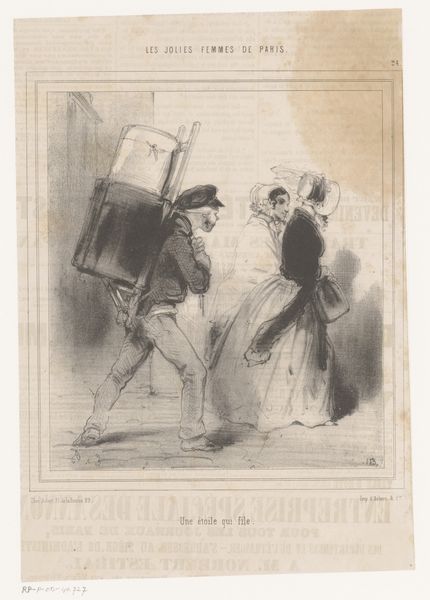
caricature
#
pencil
#
genre-painting
Dimensions: height 373 mm, width 318 mm
Copyright: Rijks Museum: Open Domain
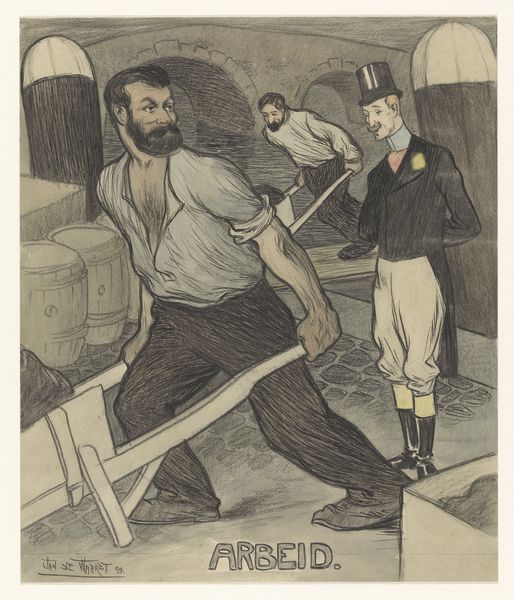
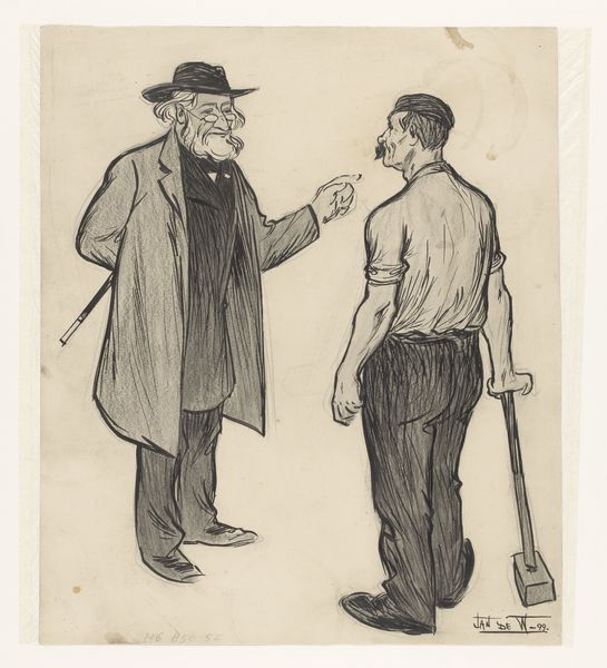
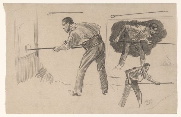
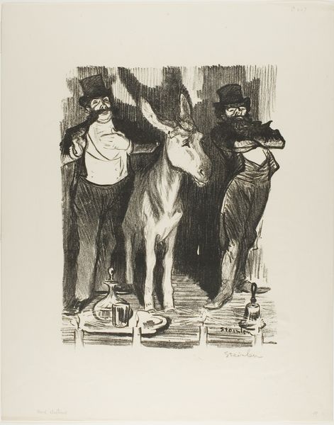
Curator: Before us, we have "Arbeid," created in 1899 by Jan de Waardt. This work at the Rijksmuseum is a pencil drawing showcasing a clear interest in both portraiture and genre painting. Editor: It's the stark juxtaposition that strikes me immediately. The hunched laborers are drawn with such deliberate roughness, while the figure in the top hat possesses this unnerving, almost disdainful smoothness. The textural variance is extremely jarring. Curator: Indeed, the contrasting textures achieved through the pencil work amplify the social commentary. De Waardt employs a vigorous hatching technique to define the musculature of the worker straining at the front, embodying exertion itself. Consider how the diagonal lines of his torso are positioned relative to those vertical beams. Editor: Which serves to amplify that sense of tension through the very construction of the image. Yet look at the ground – a grid-like pattern suggests a relentless pavement that dictates the laborious tasks. Do you notice the repetition? Curator: Certainly. Beyond mere social critique, there's also a complex visual language being employed. Note how de Waardt frames the figures. The man with the hat, for example, serves as a sharp diagonal break against the repetition and depth established by the arched corridor behind. This compositional division mirrors the social stratification depicted. Editor: Agreed. I am particularly interested in what those barrel-like objects stand for within the economic cycle. Their sheer quantity highlights their integral function and mass manufacture – something which is in stark contrast to the singular authority denoted through that gentleman’s outfit. The formal attire immediately removes him from that chain of laborious production. Curator: Precisely. De Waardt doesn't merely illustrate a scene, he constructs a powerful narrative of class disparity through careful arrangement and tonal variation. The dark tones associated with the workers create a tangible atmosphere of struggle against the brighter tones which give rise to our formal friend! Editor: So what initially reads as a stark visual contrast really unfolds into a deeply layered commentary when you delve into both material context and the very deliberate artistic decisions regarding the composition itself. This really prompts questions regarding that invisible workforce who are always toiling! Curator: The visual organization becomes another vehicle for delivering layered commentary. A memorable composition, indeed.
Comments
No comments
Be the first to comment and join the conversation on the ultimate creative platform.
More like this