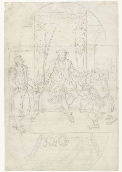
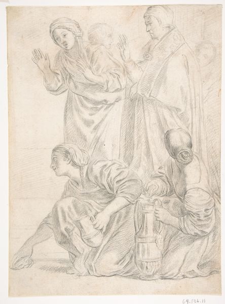
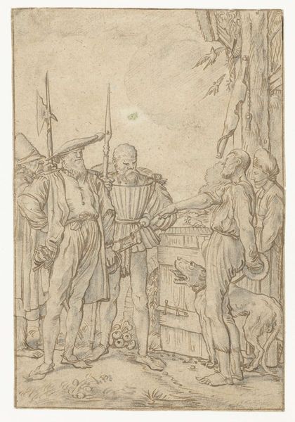
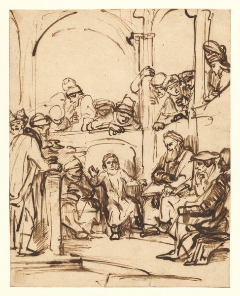
Ontwerp voor wandschildering in de Beurs van Berlage: kapitein Hooft met zijn zeven zoons bij koning Frederik II van Denemarken 1869 - 1925
0:00
0:00
drawing, paper, pencil
#
portrait
#
drawing
#
toned paper
#
light pencil work
#
pencil sketch
#
cartoon sketch
#
figuration
#
paper
#
personal sketchbook
#
ink drawing experimentation
#
pen-ink sketch
#
pencil
#
line
#
sketchbook drawing
#
history-painting
#
storyboard and sketchbook work
#
sketchbook art
Dimensions: height 234 mm, width 210 mm
Copyright: Rijks Museum: Open Domain
Editor: This is "Ontwerp voor wandschildering in de Beurs van Berlage: kapitein Hooft met zijn zeven zoons bij koning Frederik II van Denemarken," a pencil drawing on paper made sometime between 1869 and 1925 by Antoon Derkinderen. It's a preliminary sketch, quite sparse, but with very defined lines in places. What stands out to you? Curator: I see a fascinating study in form and perspective. Note how the artist uses line weight to delineate space and create depth, particularly in the rendering of the king’s garments and throne. The composition is rigidly divided, yet linked through a rhythm of vertical and diagonal lines, if you see what I mean? Editor: Yes, there is a stark contrast. The king is firmly planted, but the figures on the right seem almost… tentative, caught between different directions. It almost seems incomplete to me. Curator: Precisely! But is that a flaw, or an opportunity? Derkinderen uses the contrast to create a dynamic tension between authority and deference. Consider the negative space as an active element—it serves to isolate the figures, giving them heightened visual presence. How does that reading affect the symbolic charge? Editor: That's interesting, as if he used this space to emphasize a psychological distance as well, a conversation across a void. Curator: A very astute observation. Moreover, the linear quality, the emphasis on structure over detail, is, in essence, revealing of a certain intellectual clarity of process for the composition as a whole. The materiality of the medium serves to reveal the thought process underpinning its realisation. Editor: I'm seeing it in a new light. Thanks. I was initially put off by the sketch-like quality, but focusing on its structure really illuminates Derkinderen’s design process. Curator: Indeed. Formal analysis redirects our focus from representation towards the pure syntax of art. Hopefully, we've managed to get past the symbolic surface.
Comments
No comments
Be the first to comment and join the conversation on the ultimate creative platform.
More like this