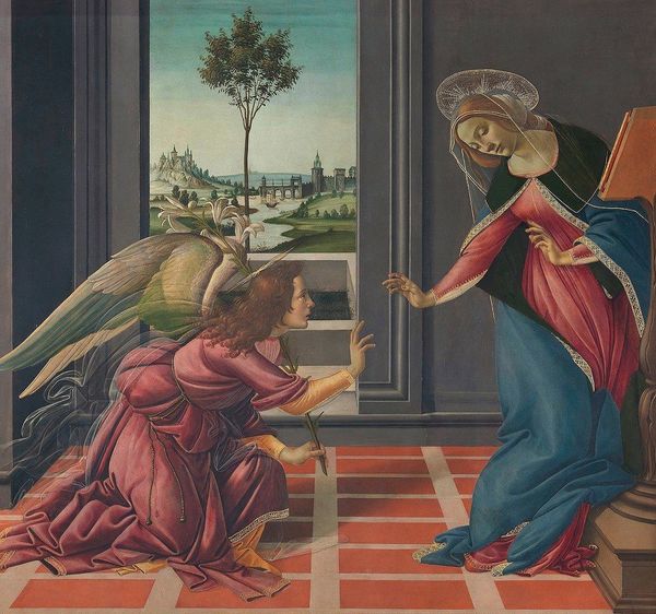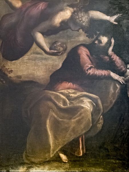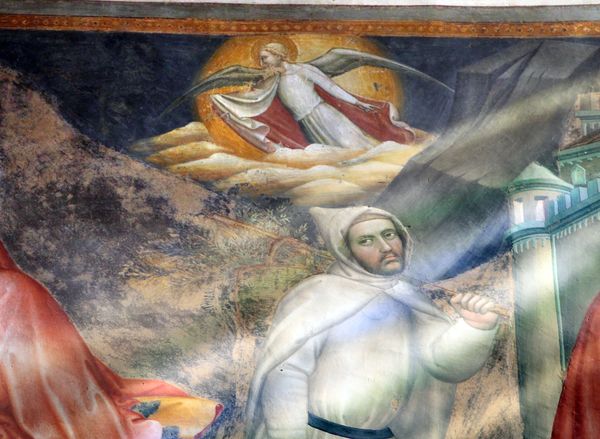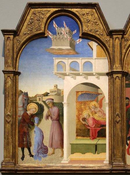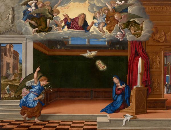
1534
Annunciation (detail)
Francesco de' Rossi (Francesco Salviati), "Cecchino"
1510 - 1563Location
San Francesco a Ripa, Rome, ItalyListen to curator's interpretation
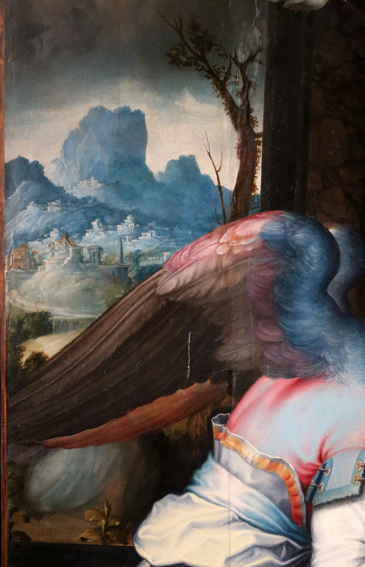
Curatorial notes
Editor: This is a detail of Francesco Salviati’s "Annunciation," painted in 1534. It's an oil painting, and looking at this small segment, I'm struck by the angel's wing. It almost seems to eclipse the landscape in the background, which appears quite dreamlike and distant. What compositional choices do you observe in this fragment? Curator: The formal arrangement here certainly invites close inspection. Observe how Salviati juxtaposes the detailed texture of the angel's wing – the distinct delineation of each feather – with the soft, almost blurred rendering of the background landscape. It creates a compelling tension, doesn’t it? Editor: Yes, the contrast is quite pronounced. The sharp, defined wing seems to push forward, while the ethereal landscape recedes, giving the composition a rather ambiguous sense of depth. Is that intentional? Curator: Without a doubt. Note, too, the chromatic arrangement. The varied hues within the wing itself—the gradation from brown to pink and then the striking blue—draw the eye, and keep the wing as the undeniable focus. Ask yourself: how would the painting's impact change if the landscape were brought into sharper focus, given the colour or details of a similar intensity? Editor: I see what you mean. Softening the landscape and varying hues create focal points and compositional depth. Curator: Precisely. And how might this visual tension underscore the theological weight of the Annunciation itself—the earthly and divine spheres meeting in a single, pivotal moment? It might be argued that Salviati masterfully employs formal elements to visually communicate this conceptual duality. Editor: I hadn't thought of it that way. It is all so intricately planned in order to convey meaning through both colour and composition.