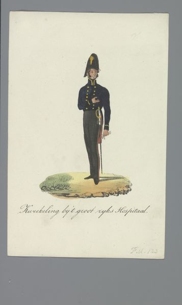
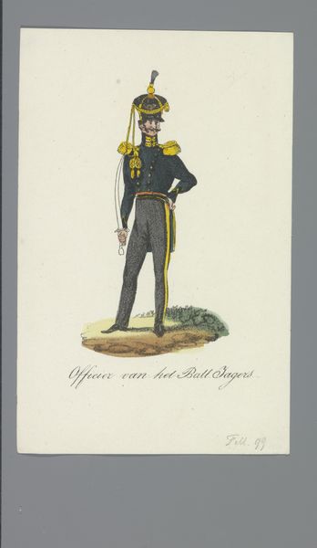
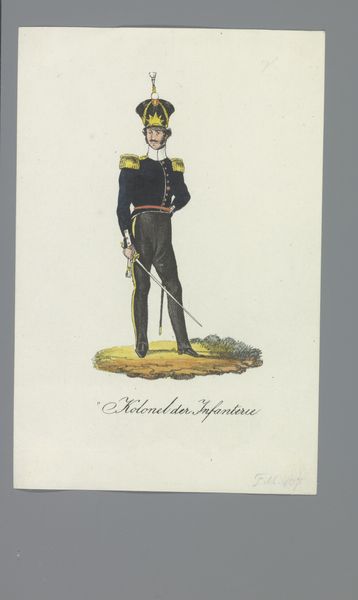
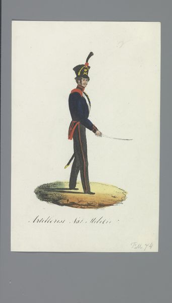
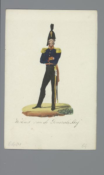
drawing, print, ink
#
portrait
#
drawing
# print
#
ink
#
costume
#
history-painting
#
academic-art
#
realism
Dimensions: height 170 mm, width 110 mm
Copyright: Rijks Museum: Open Domain
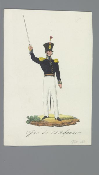
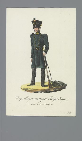
Editor: We are looking at "Kapitein Adjudant der Infant.e" created by Albertus Verhoesen between 1835 and 1850. It’s a drawing and print using ink, currently residing in the Rijksmuseum. I find the figure strikingly upright, almost rigidly so. What visual elements stand out to you? Curator: The linearity and precision. Note how the artist uses line to define the figure's contours, emphasizing the structure of the uniform and the posture of the subject. The palette is restrained, relying on subtle variations in tone and color to articulate form. This limited palette contributes to a certain formality. How does the composition influence your interpretation? Editor: I hadn't considered that! I was too caught up in trying to figure out his place in history to consider what the color palette might mean in relation to structure. How do you mean? Curator: Consider how the verticality of the figure and the sharp angles of his uniform, rendered through a predominantly linear technique, create a sense of order and control. The limited color palette, focusing on muted tones, further emphasizes this restraint. Is it possible to isolate how different elements in the portrait contribute to its overall impact? Editor: Definitely. The meticulous detail and rigid lines add to the militaristic theme, reflecting both historical accuracy and Verhoesen’s technique. It makes the portrait less about the individual and more about the representation of rank. Thank you for helping me understand that. Curator: Indeed. It shows how technique and structure dictate the impression on us. A compelling testament to the potency of form.
Comments
No comments
Be the first to comment and join the conversation on the ultimate creative platform.
More like this