engraving
#
allegory
#
baroque
#
geometric
#
history-painting
#
engraving
Dimensions: height 135 mm, width 160 mm
Copyright: Rijks Museum: Open Domain
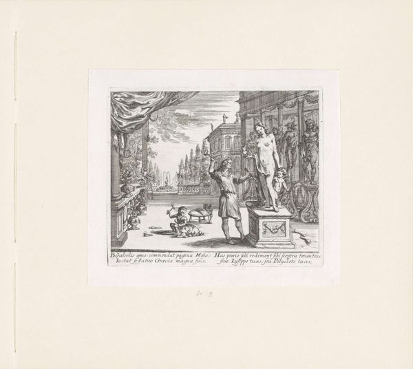
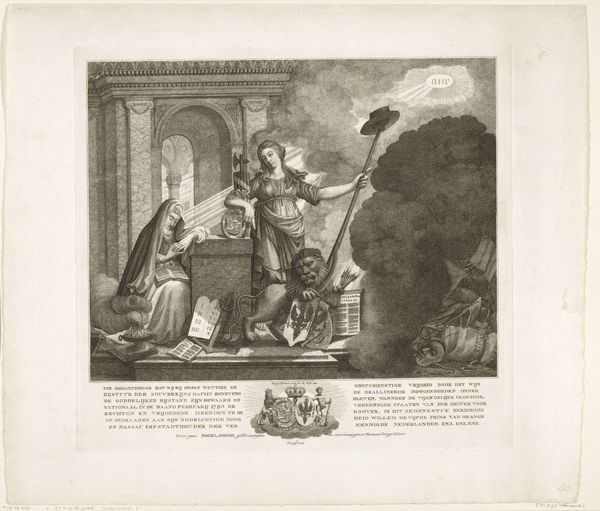
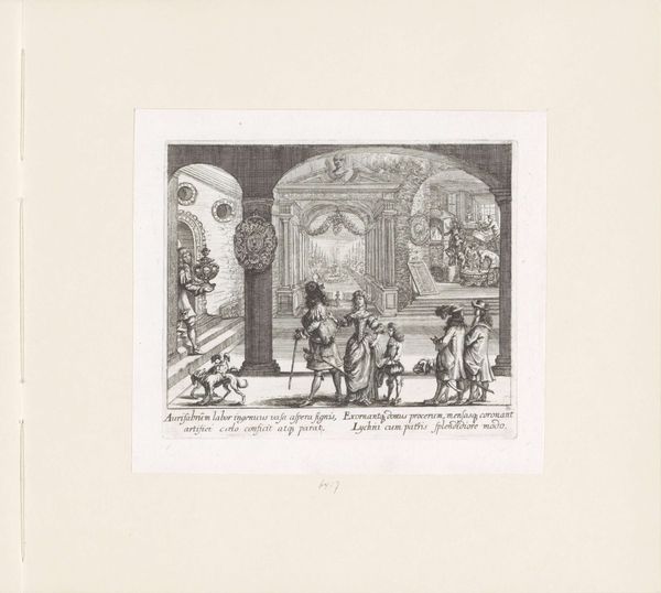
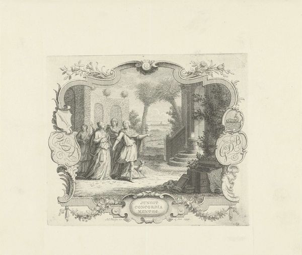
Curator: The print, "Minerva as protector of the arts" by Mathäus Küsel, dated 1680. A beautiful example of Baroque engraving currently housed at the Rijksmuseum. What do you observe initially? Editor: Well, the details are incredible, considering it’s an engraving. There's a real sense of depth and busyness. The composition is really engaging with geometric architecture surrounding allegorical figures, but it makes me wonder, what’s your read on the symbolic structure here? Curator: Formally, we can view the linear elements driving the image, the interplay of dark and light, or "chiaroscuro" generating volume and creating depth in an otherwise flattened plane. There is great dynamism! Have you also observed the geometry governing the architectural elements which adds structure to an allegorical composition. What feeling do you experience looking at it? Editor: I feel like there is an argument between geometric perfection and Baroque affect, I like this, yet feel somehow oppressed by so much strictness. So how might this visual tension contribute to the meaning of the work, particularly thinking about Minerva as a protector of the arts? Curator: Good question. She oversees rational artistic structure but also has to cope with creative freedoms, it creates complexity that embodies intellectual patronage through line, shape, texture—even down to the linguistic implications of the inscription itself. The image doesn’t allow emotional free play, and is controlled by many lines. Editor: I see, this rigidity helps formalize a patron’s contribution by establishing criteria which gives sense to forms! Thank you! Curator: Indeed, a fascinating piece from a purely compositional view. Always a pleasure to discuss it!
Comments
No comments
Be the first to comment and join the conversation on the ultimate creative platform.
More like this