drawing, print, engraving
#
drawing
#
baroque
# print
#
form
#
line
#
decorative-art
#
engraving
Dimensions: height 339 mm, width 240 mm
Copyright: Rijks Museum: Open Domain
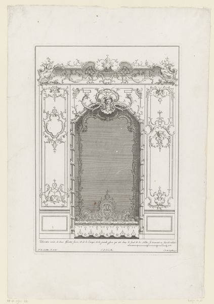
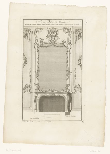
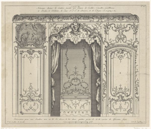
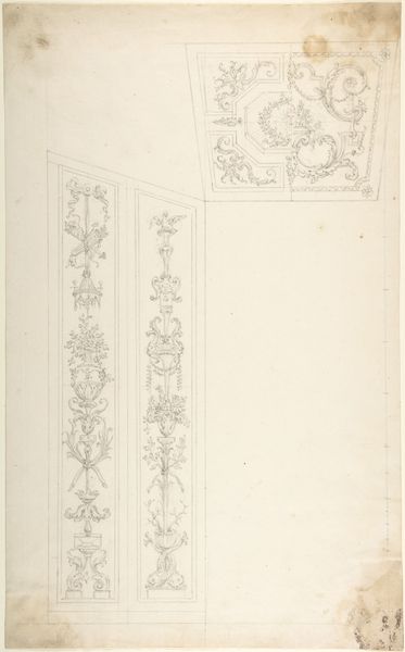
Curator: Immediately I feel drawn into this quiet interior. It is a Bank in Nis met Spiegel, or a Bench in Nice with Mirror, dating roughly to 1733-1768. Made using engraving and other drawing techniques by Carl Albert von Lespilliez. Do you get a sense of the Rococo here, with the ornate stylings and symmetry? Editor: The first thing I notice is the mirror reflecting nothing! It feels like staring into a void. Is it intentional, do you think, this invitation to fill the emptiness with our own projections, fears, desires? What are we meant to see when we look at such a looking glass? Curator: I suspect its more practical! It might be simply emphasizing design rather than depiction of life. See the curvaceous and intricate detail – it practically foams off the surface of the wall. It also incorporates time in two ways. One as decoration and another in how design continues in a way as a kind of cultural memory... it seems we find symbols of nature here – plants, life… almost a dance of life preserved. Editor: The "dance of life" is beautifully put, there is that decorative playfulness, yes. The way those flourishes are used to decorate that clock feels laden to me, even oppressive! But perhaps that’s what they wanted: time isn’t a casual visitor; time is a governing principle, as essential as breath. Clocks were the ultimate symbol of the constraints of order back then. Curator: You’re right, it brings us up short. Beauty as structure, a delicate imprisonment almost. Even the chair is facing this hall of reflection in a perfect posture. And the space does feel oddly unlived-in. I imagine a kind of ghostly etiquette… a call to order in those days? Editor: I think we’re asked to feel that tension and that space. Looking, being seen. Order, wildness. Ultimately that might speak to the larger context, these competing needs that drove the artist’s cultural reality! The art has this haunting echo that makes you look again... Curator: Indeed, there is a calligraphic touch. In the details of the prints we find meaning through the language and symbols employed which seem far less a design than a window on history. Thanks! Editor: Of course, I find those insights really bring new texture, even new depths and layers of meaning to what felt at first, frankly, decorative.
Comments
No comments
Be the first to comment and join the conversation on the ultimate creative platform.
More like this