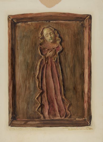
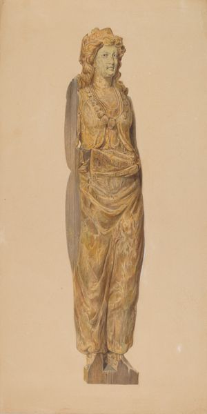
drawing, watercolor
#
portrait
#
drawing
#
greek-and-roman-art
#
watercolor
#
ancient-mediterranean
#
portrait drawing
#
watercolor
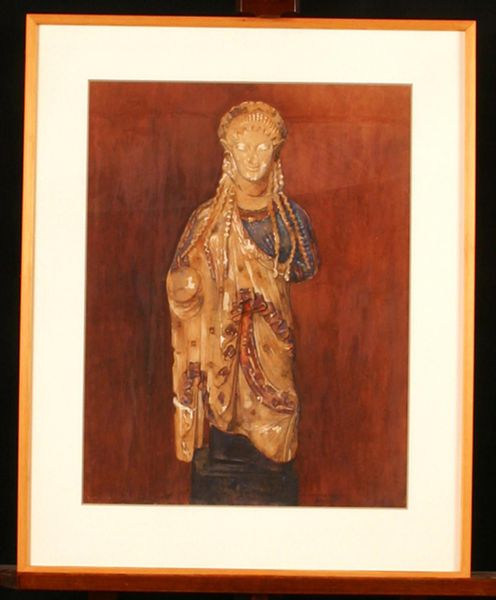
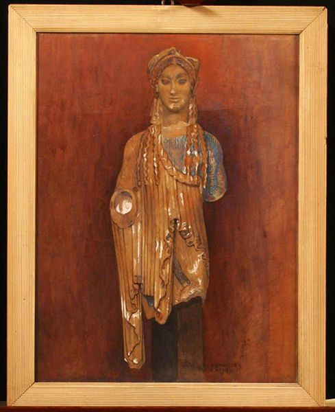
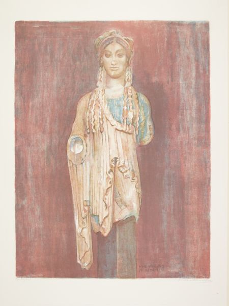
Dimensions: 61.5 cm (height) x 47.5 cm (width) (billedmaal)
Editor: Here we have "Hoved af Kore (Akropolis museet inv. 688)", a watercolor drawing from 1911 by Marie Henriques. What strikes me is the somber palette, despite the classical subject. What do you see in this piece from a formalist perspective? Curator: Certainly. The chromatic restraint is quite deliberate, yes. Observe how the artist deploys a limited range of ochre, sienna, and cool greys. These choices emphasize the interplay of light and shadow on the sculpted form, which suggests a deeper engagement with sculptural volume than coloristic concerns. The almost monochromatic effect prioritizes the tactile qualities of the depicted kore. What does that flatness in the background achieve? Editor: That must make the sculpture pop out, right? I think it pushes the sculpture into the foreground to stand out in stark relief against that muted ground. Are you thinking it emphasizes the sculpture’s three-dimensionality and tactile presence? Curator: Precisely. It flattens pictorial space while accentuating sculptural depth through the artist’s mastery of chiaroscuro. Consider how the drapery is rendered with crisp, linear folds that capture light. This formal analysis reveals a conscious decision to explore the dialogue between surface and depth within the visual field. Editor: That’s fascinating. I hadn’t considered how much the lack of color actually *adds* to the sense of form. Curator: The restriction to a limited range invites close study, doesn't it? The very careful handling of light and shadow become all the more important because they provide visual clues about the sculpture. Now, were vibrant hues included, these tonal arrangements would be largely unnoticed. Editor: Okay, so from a formalist view, the color choice is a feature and not a bug, since it focuses our attention on the artist’s style, technique, and arrangement of pictorial elements. It is not primarily to reference something beyond itself. Curator: Yes, it invites us to contemplate the piece not as a depiction of ancient art alone, but as a composition, above all, revealing a dialogue between drawing and sculpture. The forms almost converse with one another in a very self-aware sense. Editor: So cool; now I get it!
Comments
No comments
Be the first to comment and join the conversation on the ultimate creative platform.
More like this