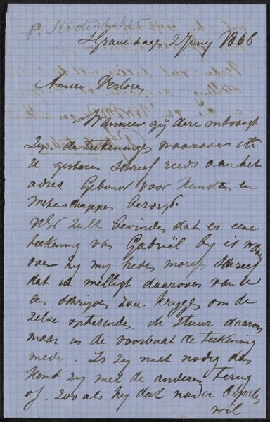
drawing, paper, ink
#
drawing
#
script typography
#
hand-lettering
#
text art
#
hand drawn type
#
hand lettering
#
paper
#
ink
#
hand-drawn typeface
#
fading type
#
stylized text
#
thick font
#
handwritten font
#
calligraphy
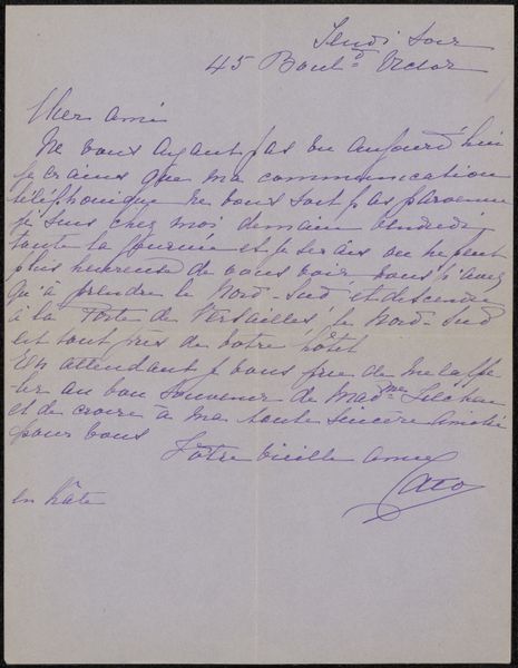
Copyright: Rijks Museum: Open Domain
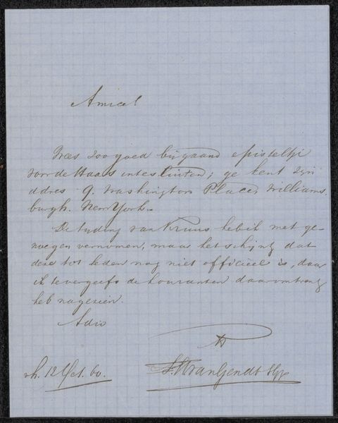
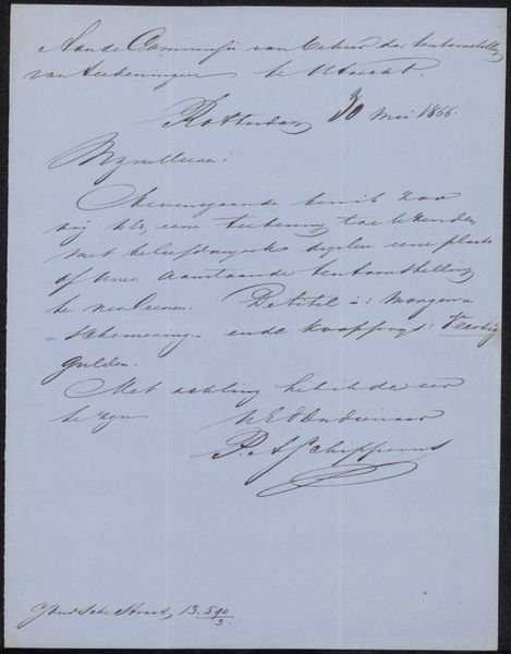
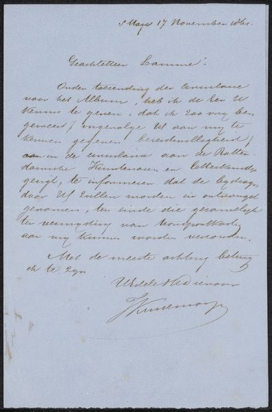
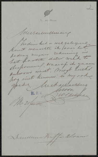
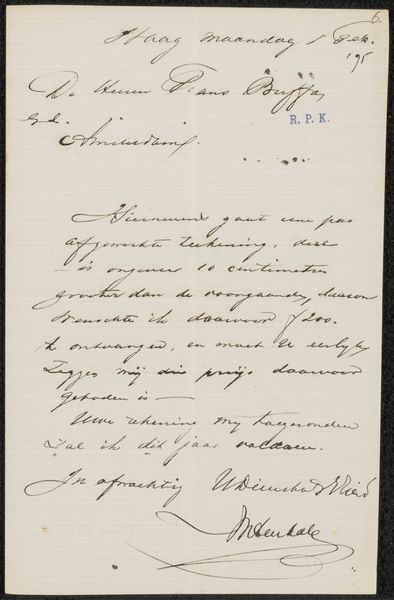
Editor: So, this is "Brief aan Frans Buffa en Zonen," or "Letter to Frans Buffa and Sons," potentially from 1875 by Jan Vrolijk. It's a drawing on paper with ink, housed here at the Rijksmuseum. What strikes me most is how beautiful the handwriting is. I'm wondering if it has a particular function for its original audience. What do you see in it? Curator: You know, what gets me about this piece is the intimacy it conveys, despite being a business letter! It's not just a document, it’s a peek into a relationship, a moment frozen in beautiful penmanship. Jan Vrolijk isn't simply conveying information, he's imbuing it with his personality through those swirling letters. Consider that this isn’t a typed memo. There's a conscious artistry in every stroke. Do you think the handwritten quality affects how we perceive the content, compared to a modern email? Editor: Absolutely! There's an inherent sense of care and intention behind each word that you just don't get with typed communication. Plus, the variations in ink thickness and pressure give it a certain texture. So, is this more than just fancy writing? Is there some underlying cultural significance? Curator: Well, calligraphy during that period wasn’t merely decorative; it reflected one's education and social standing. And don’t you find the fading ink, like whispers of time, adds another layer? It is now an artistic form. To me, it also poses the question of how something functional—like a letter—can so effortlessly transform into art, a window into the past. Editor: That’s fascinating! It really does highlight the artistry present in everyday life. Curator: Precisely! A simple letter transforms into this poignant artifact, whispering stories of connection.
Comments
No comments
Be the first to comment and join the conversation on the ultimate creative platform.
More like this