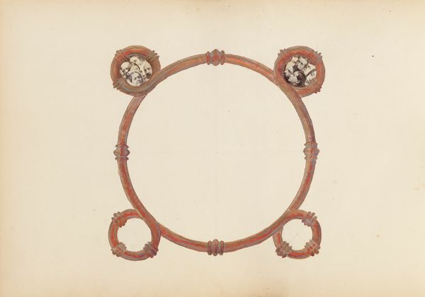
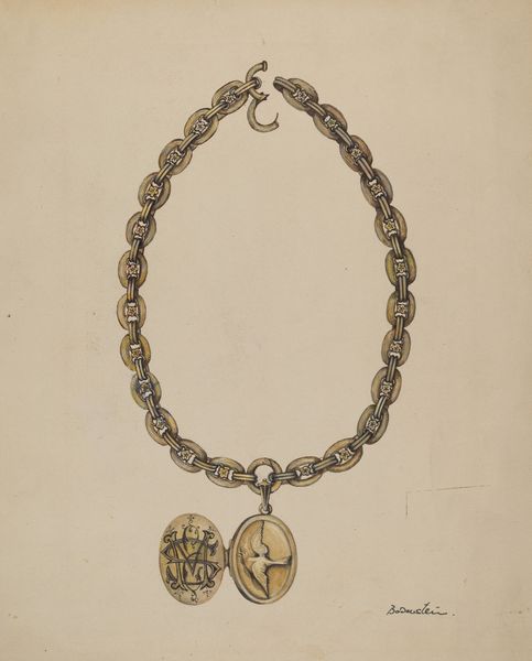
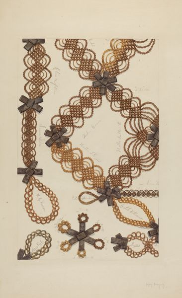
drawing, coloured-pencil, watercolor
#
drawing
#
coloured-pencil
#
water colours
#
watercolor
#
coloured pencil
#
decorative-art
#
watercolor
Dimensions: overall: 29.2 x 23 cm (11 1/2 x 9 1/16 in.)
Copyright: National Gallery of Art: CC0 1.0
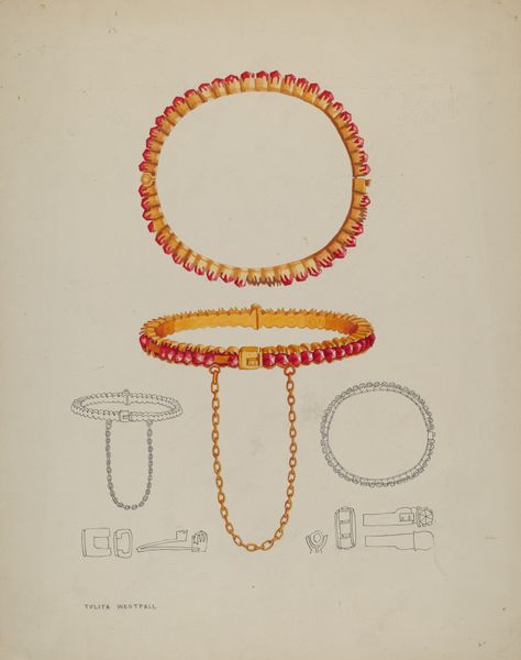
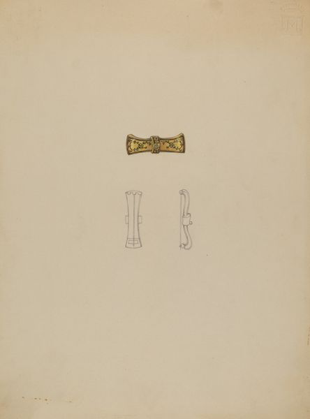
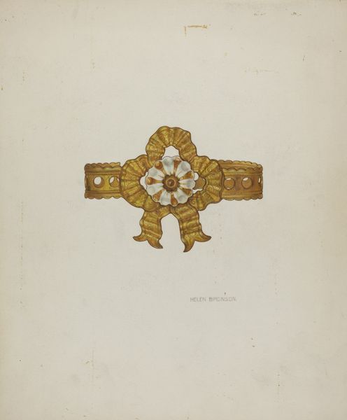
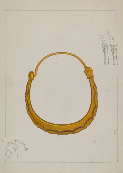
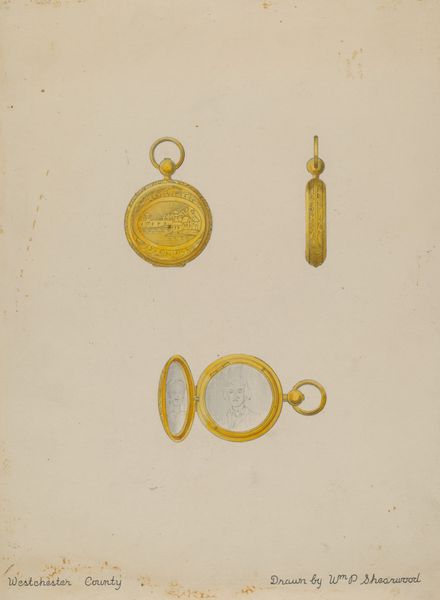
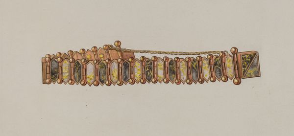
Curator: Let's turn our attention to this drawing entitled "Bracelet", created around 1936 by William P. Shearwood, rendered in watercolor and colored pencil. What's your initial impression? Editor: The rendering appears meticulous, almost a technical drawing. It projects a feeling of idealized elegance. I imagine it would be a commercial sample to display craftsmanship rather than an autonomous work of art. The subdued palette amplifies that aura of understated luxury. Curator: I agree about its elegance. Note how Shearwood employs a delicate, almost hesitant line in the watercolor, allowing light to define form. Semiotically, gold, the material represented, signifies status and affluence, creating a subtle interplay between signifier and signified within the design itself. The very composition leads your eye from the flat layout to the draped design below. Editor: From my point of view, it begs questions about its production. Was it intended as a design blueprint for a jewelry maker, or could Shearwood have been trying to solicit patrons himself? The careful rendering in watercolour and colored pencil points to specific materials: the potential luster of gold, and perhaps enamel highlights. I'm drawn to the material intent more than pure aesthetic gesture here; I also see its intrinsic link to decorative art and the historical context of fashioning status symbols during a period of potential economic disparity. Curator: The symmetry is really striking. Both bracelets are presented in isolation on the plain paper ground, demanding close, considered viewing. The upper bracelet emphasizes modular, repeated floral motifs encased within geometrical shapes, and the bottom echoes those geometries but arranged in a radial, symmetrical design. Editor: The linear format compared to the circular form also presents the dichotomy between display and wearability. A craftsperson would certainly note the design of each interlocking piece for manufacture, and I find myself more drawn into questions about their fabrication – perhaps the designs use molds to standardize forms or engraving for those refined decorative elements. Curator: A keen reading, as always. It’s intriguing to ponder the multiple levels of design and representation interwoven here. Editor: Indeed; it certainly gives us insight into some social and industrial factors operating when luxury designs are envisioned and realized through materials and processes.
Comments
No comments
Be the first to comment and join the conversation on the ultimate creative platform.
More like this