drawing, print, paper, graphite
#
landscape illustration sketch
#
drawing
#
quirky sketch
# print
#
pen sketch
#
incomplete sketchy
#
paper
#
personal sketchbook
#
ink drawing experimentation
#
pen-ink sketch
#
france
#
water
#
graphite
#
sketchbook drawing
#
watercolour illustration
#
watercolor
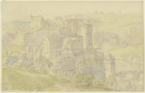
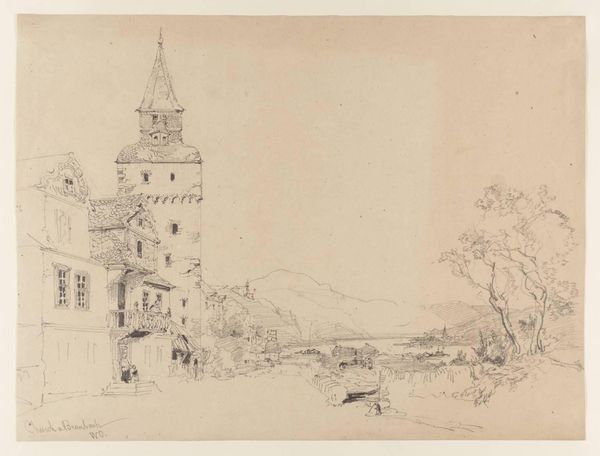
Dimensions: 235 × 346 mm
Copyright: Public Domain
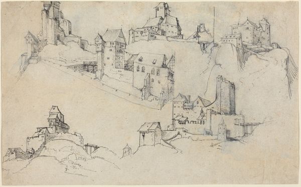
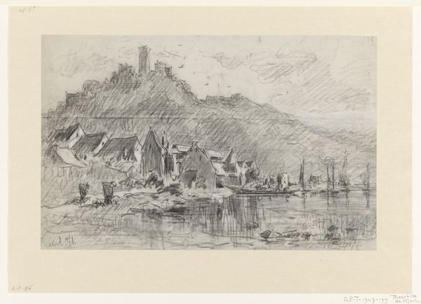
Editor: Here we have Arnauld de Vuez's "Town on the Meuse," a drawing of uncertain date, currently residing at the Art Institute of Chicago. Looking at this graphite and ink work, I'm struck by its quiet, almost contemplative mood. The composition, dominated by the architecture and soft textures of the landscape, seems very deliberate. What compositional strategies jump out at you? Curator: What arrests my attention most is how the composition deftly manipulates a limited tonal range to create an engaging interplay between structure and fluidity. Consider how the precision of the architectural lines contrasts with the softness of the graphite washes that articulate the surrounding land. It’s through this subtle variance that we perceive depth and distance. Notice, as well, the calculated placement of the dark accents—they guide the eye methodically, preventing the composition from dissolving into an amorphous whole. Editor: That’s a great observation. The stark lines against the hazy background do create depth, but also perhaps a sense of isolation? It almost feels as if the town is receding into the mist. Curator: An astute point! But I would encourage you to look deeper at the interplay of horizontal and vertical elements. The architectural lines create the vertical scaffolding of the piece. Yet, are we truly experiencing the isolation of the town? Editor: I see your point now. Those architectural forms contrast so deliberately with the misty landforms as they push our vision both into and across the image plane. I never really noticed how effective the ink strokes are in that role. Curator: Precisely. Recognizing those compositional elements truly alters the emotional timbre, wouldn't you agree? Editor: Absolutely. Focusing on the structural contrasts really changed how I understood the artwork's depth. I thought the image suggested more withdrawal, but can now appreciate that the landscape also embraces us, thanks to de Vuez's masterful lines. Curator: Indeed, a heightened perception is invariably our reward when we focus primarily on an artwork's internal mechanisms.
Comments
No comments
Be the first to comment and join the conversation on the ultimate creative platform.
More like this