painting, watercolor
#
portrait
#
water colours
#
painting
#
figuration
#
11_renaissance
#
watercolor
#
watercolour illustration
#
genre-painting
#
history-painting
#
academic-art
#
miniature
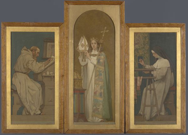
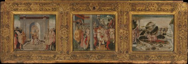
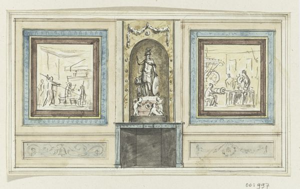
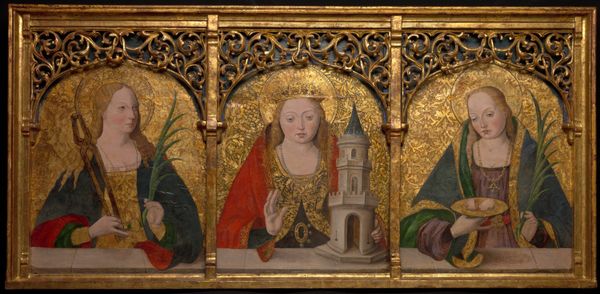
Dimensions: height 120 cm, width 86 cm, height 65 cm, width 34 cm, height 81 cm, width 34 cm, height 65 cm, width 34 cm
Copyright: Rijks Museum: Open Domain
Editor: Here we have "Architectuur- Sculptuur - Schilderkunst," or "Architecture-Sculpture-Painting," a watercolor painting by Georg Sturm created sometime between 1876 and 1885. The triptych format and subdued palette give it a somber, almost academic feel. What compositional elements stand out to you? Curator: Immediately, the tri-partite division commands attention. Each panel, self-contained yet intrinsically linked, offers a distinct spatial arrangement. Note how Sturm employs subtle variations in perspective and depth to delineate each discipline. Observe, too, the recurrence of linear elements—the architect's drafting tools, the verticality of the sculpted figure, and the painter's easel. How do these linear structures contribute to the work's overall visual coherence? Editor: They provide a structural rhythm, I suppose. The lines pull the eye from one panel to the next. But I’m still a bit unsure about what the artist wants me to feel when looking at this painting? Curator: Let's focus on the pictorial construction. Sturm utilizes a restricted palette dominated by tertiary hues, a choice that engenders a sense of tranquility and visual harmony. Do you observe how the artist modulates tone and texture within each panel, creating subtle yet perceptible differences in the treatment of light and shadow? The modulation helps add depth, creating a sense of order. Consider the implications of his controlled color scheme, not just in creating visual unity but in communicating ideas about harmony in arts. Editor: The subtlety in the color does invite close inspection, I agree. So, through structure and visual cohesion, Sturm directs the viewer to experience arts. It's less about grand gestures and more about measured observation, it would seem. Curator: Precisely. Sturm urges us towards analytical interpretation, appreciating the aesthetic achievement through studied reflection on visual form, and through each section's place within the triptych's wider visual logic.
Comments
No comments
Be the first to comment and join the conversation on the ultimate creative platform.
More like this