About this artwork
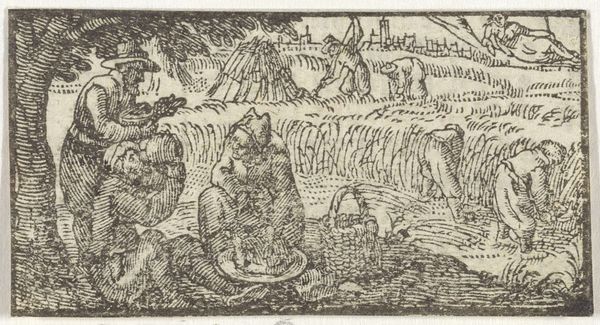
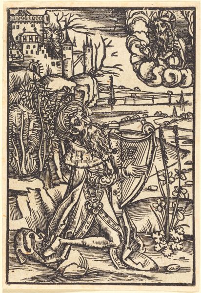
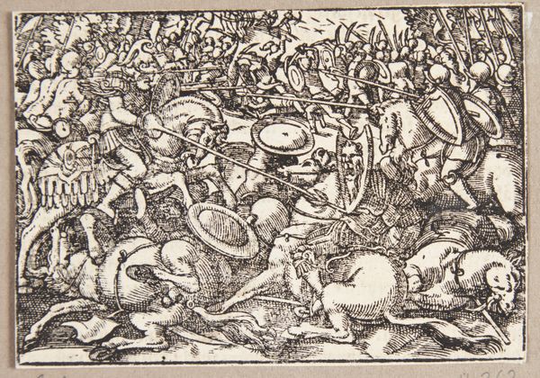
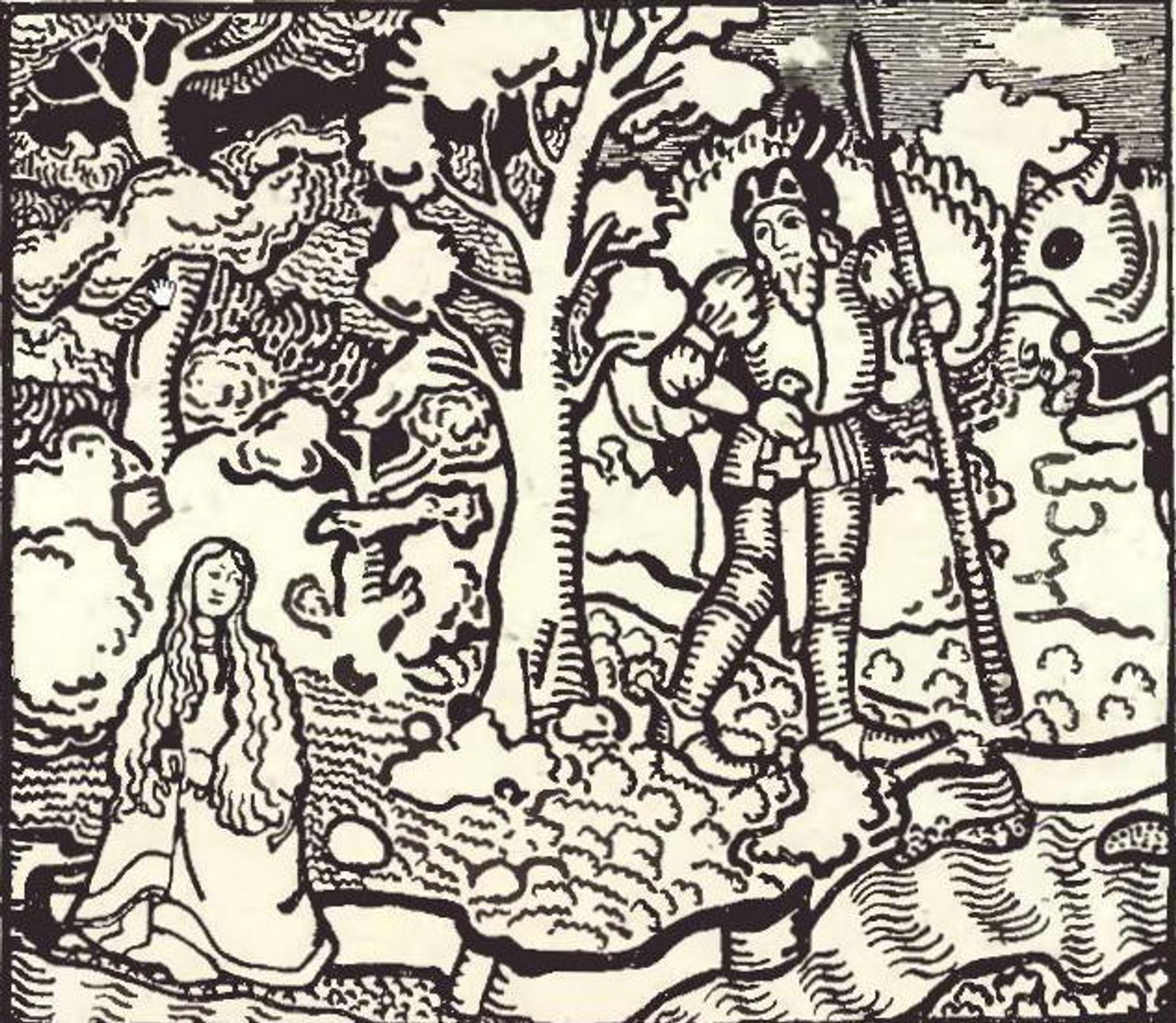
Editor: This is Nicholas Roerich's "Pelléas and Mélisande" from 1905, rendered in ink. It has an interesting, almost medieval quality. What stands out to you, looking at this work? Curator: The stark black and white immediately evokes a sense of dramatic contrast. Do you notice how Roerich uses the linework not just to define form but to create texture and atmosphere? Editor: I do. The density of the lines around the figures creates a sense of almost claustrophobic enclosure. What is the effect? Curator: Exactly! Enclosure is key. Look at Mélisande; the setting, even though a forest, seems to press in on her. Consider the title: "Pelléas and Mélisande." These characters, adapted from Maurice Maeterlinck's play, are icons of doomed love and fatalistic mystery. Does the image itself, in its design, resonate with themes that seem timeless? Editor: I see that. The heavy lines and shadowed areas surrounding the figures convey a feeling of tension and inevitable tragedy. It really taps into the feeling of inescapable fate in the play. Curator: Indeed. It almost functions as a visual "memento mori." How do you read the choice of using ink in rendering what are tragic figures from the story? Editor: It feels stark and unforgiving, less forgiving than, say, paint. There’s no room for nuance or blending. Every line is definite and clear. Curator: And those stark lines, set against the pale figures, create an immediate feeling. Does that color choice seem more relevant given our modern context, one with our cultural focus on line art? Editor: Yes, seeing line art everywhere now helps give it context. Now I better understand how ink communicates fate and impending doom through its permanence. Curator: Precisely. It invites us to consider how images participate in a larger cultural memory.
Artwork details
- Medium
- drawing, ink
- Copyright
- Public domain
Tags
drawing
figuration
line art
ink line art
ink
line
symbolism
Comments
No comments
About this artwork
Editor: This is Nicholas Roerich's "Pelléas and Mélisande" from 1905, rendered in ink. It has an interesting, almost medieval quality. What stands out to you, looking at this work? Curator: The stark black and white immediately evokes a sense of dramatic contrast. Do you notice how Roerich uses the linework not just to define form but to create texture and atmosphere? Editor: I do. The density of the lines around the figures creates a sense of almost claustrophobic enclosure. What is the effect? Curator: Exactly! Enclosure is key. Look at Mélisande; the setting, even though a forest, seems to press in on her. Consider the title: "Pelléas and Mélisande." These characters, adapted from Maurice Maeterlinck's play, are icons of doomed love and fatalistic mystery. Does the image itself, in its design, resonate with themes that seem timeless? Editor: I see that. The heavy lines and shadowed areas surrounding the figures convey a feeling of tension and inevitable tragedy. It really taps into the feeling of inescapable fate in the play. Curator: Indeed. It almost functions as a visual "memento mori." How do you read the choice of using ink in rendering what are tragic figures from the story? Editor: It feels stark and unforgiving, less forgiving than, say, paint. There’s no room for nuance or blending. Every line is definite and clear. Curator: And those stark lines, set against the pale figures, create an immediate feeling. Does that color choice seem more relevant given our modern context, one with our cultural focus on line art? Editor: Yes, seeing line art everywhere now helps give it context. Now I better understand how ink communicates fate and impending doom through its permanence. Curator: Precisely. It invites us to consider how images participate in a larger cultural memory.
Comments
No comments