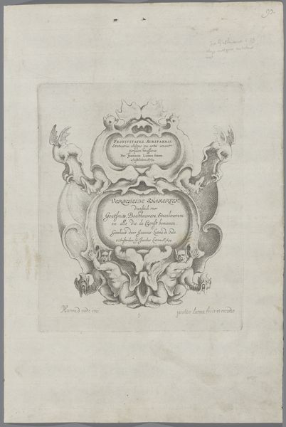
Trade Card of Thomas Searls, Sadler at the Bell and Ball, Fleet Street 1695 - 1705
0:00
0:00
drawing, print
#
drawing
#
aged paper
#
toned paper
# print
#
old engraving style
#
personal sketchbook
#
coloured pencil
#
ink colored
#
sketchbook drawing
#
watercolour illustration
#
sketchbook art
#
watercolor
Dimensions: Sheet: 9 1/16 × 6 3/4 in. (23 × 17.2 cm) Plate: 7 1/4 × 5 1/16 in. (18.4 × 12.8 cm)
Copyright: Public Domain
Curator: Here we have a trade card from around 1695-1705, advertising Thomas Searls, a saddler located on Fleet Street. The print centers on an image of a bell inside a framed sign, ornamented by tack and the name of the saddler beneath it. Editor: Immediately, the starkness strikes me—the almost diagrammatic quality, yet softened by the texture of the paper. It's less about illusionism and more about presenting information with a kind of utilitarian elegance. Curator: Indeed. Consider how the composition directs the eye: The symmetry, the placement of the text balanced against the iconographic bell. This speaks to an aesthetic valuing clarity and order. The very lines describing the bell and tack harness structural purpose alongside their descriptive role. Editor: But what of the craftsmanship evident here? It is clearly a print—the marks from the engraving visible if you look closely. These reveal the skilled hand involved in mass production. What level of artistry was necessary to carve that block and in what social strata was this artisan found? Curator: Those marks, to me, accentuate the two-dimensionality; there’s no illusion created, the mark is apparent and celebrated. Notice the font style too, and how it interacts with the surrounding images. It is an integral design element. It underscores the symbolic intent. Editor: Quite right! What was this card's circulation like? How many impressions were struck from this block? Considering the price and relative expendability of paper at this time, did Searls hire an expert or acquire these skills himself? I'm always drawn to understanding an artisan’s relationship to material and community. Curator: This is not mere illustration but design where everything coalesces, all carefully curated. And the signs and ornament are cleverly entwined, giving it an immediate recognition factor and appeal. Editor: So in some ways it's about commerce; about what makes a particular trade and artisan visible within a broader London context? I like that. It really illuminates an intersection between craft, labor, and daily life. Curator: I find it all to show the marriage of utility and grace. Every element serves a function, both in commerce and visual impact. Editor: Exactly. It is fascinating to imagine how it served as a physical representation of Searls and his brand. I have a great deal to contemplate about this piece and it's place in its time.
Comments
No comments
Be the first to comment and join the conversation on the ultimate creative platform.
More like this