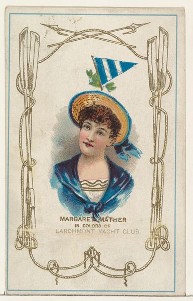
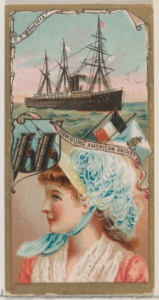
Margaret Mather in Colors of the Larchmont Yacht Club, from the Yacht Colors of the World series (N140) issued by Duke Sons & Co. to promote Honest Long Cut Tobacco 1890
0:00
0:00
drawing, coloured-pencil, print
#
portrait
#
drawing
#
coloured-pencil
# print
#
impressionism
#
coloured pencil
Dimensions: Sheet: 4 in. × 2 1/2 in. (10.1 × 6.3 cm)
Copyright: Public Domain
Editor: This artwork, titled "Margaret Mather in Colors of the Larchmont Yacht Club," dates back to 1890 and is a promotional print by W. Duke, Sons & Co. It seems to be made with colored pencils, or perhaps a print imitating the style. The palette is rather muted, and there's a certain nostalgic charm. What draws your eye when you look at it? Curator: Initially, the planar relationships present a curious puzzle. The figure of Margaret Mather is centrally positioned, yet the surrounding elements—flags, yacht imagery—appear almost as superimposed emblems rather than integrated components of a cohesive pictorial space. Note how the limited palette establishes a structural harmony through repetition, connecting the figure to the overarching symbolic order of the yacht club. Editor: I see what you mean about the planar relationships; it feels like different images combined. It doesn't quite sit right with my expectations. But how does that tension contribute to the overall effect, formally? Curator: The disruption of expected spatial coherence is indeed a defining characteristic. We observe a tension between representation and abstraction, where the portraiture tradition merges with a burgeoning language of advertising and commercial appeal. The effect, aesthetically, draws our attention to the image's construction, asking us to consider how meaning is manufactured rather than passively received. The superimposition isn't a flaw, but a deliberate strategy. Editor: That's fascinating. I hadn't considered how the disruption might be intentional. It makes me wonder what other strategies they might have used in similar advertisements. Curator: Precisely! A comparative analysis of the complete series would reveal further insights into the evolving visual language of consumer culture.
Comments
No comments
Be the first to comment and join the conversation on the ultimate creative platform.
More like this