drawing, paper, watercolor, ink
#
drawing
#
figuration
#
paper
#
watercolor
#
ink
#
geometric
#
line
Copyright: Public Domain
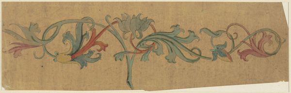
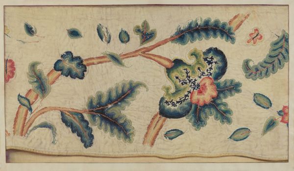
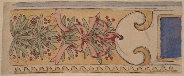
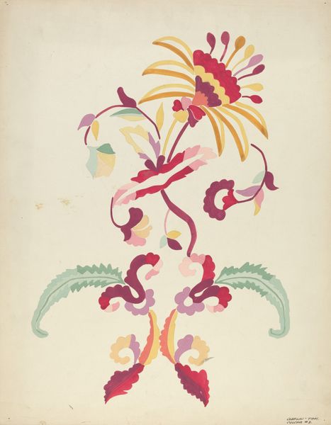
Editor: So, this drawing is called "Tendril Cornice," an ink, watercolor and paper drawing by Karl Ballenberger. I'm immediately drawn to the rhythmic, almost musical quality of the repeating floral and geometric motifs. It feels quite decorative, perhaps intended as a design for something larger. What do you make of it? Curator: Precisely. Disregarding external context, the initial intrigue resides in the formal interplay of line, color, and shape. Observe how the artist employs sinuous lines to create a sense of continuous movement, directing the eye from left to right. Editor: Yes, it almost feels like a freeze frame of something that's perpetually flowing. What about the choice of colors? Curator: Note the muted palette – blues, pinks, greens – these choices seem deliberately restrained, creating a harmonious and balanced visual experience. The controlled application of watercolor allows for subtle gradations and delicate washes, enhancing the organic forms. Editor: Do you see any significance in the central geometric flower? Curator: Consider its positioning, directly at the center. It serves as a focal point. From a formalist perspective, its strategic placement orchestrates the overall composition and provides visual stability. How does the artist manipulate positive and negative space? Editor: Good question. It’s interesting. I notice the composition balances filled spaces with empty areas. This probably enhances the rhythmic nature that initially drew me in. Curator: Precisely. The negative space breathes life into the floral and geometric forms. I think analyzing visual structure unlocks this piece. Editor: I agree, the careful examination of composition and line really brought it to life. Curator: Yes, this piece, free of external references, offers an exciting experience to visually unpack the object itself.
Comments
No comments
Be the first to comment and join the conversation on the ultimate creative platform.
More like this