drawing, print, pencil
portrait
pencil drawn
drawing
16_19th-century
pencil sketch
charcoal drawing
pencil drawing
pencil
academic-art
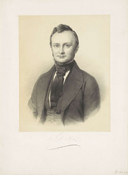
Dimensions: height 495 mm, width 365 mm
Copyright: Rijks Museum: Open Domain
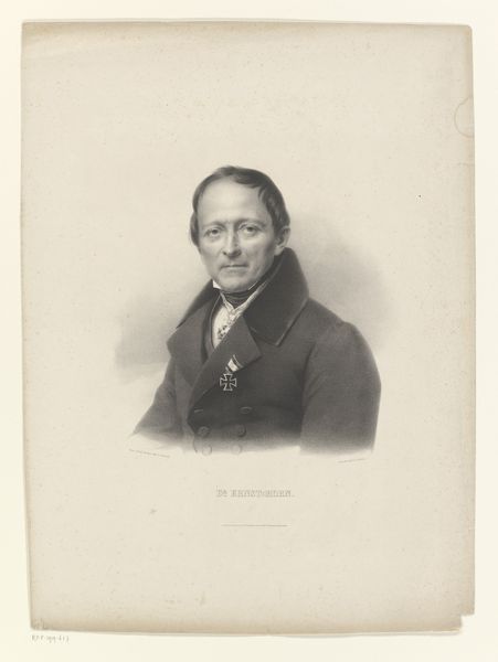
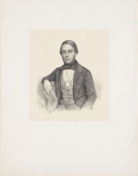
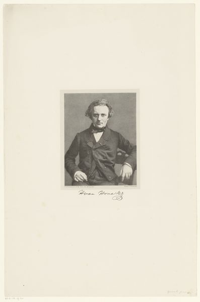
Editor: Here we have Adrianus Johannes Ehnle's "Portret van Jan Pieter Heije," created around 1855. It appears to be a print, perhaps based on a pencil drawing. It feels quite formal and restrained, very typical of the era. What stands out to you? Curator: Indeed. The piece presents a fascinating study in line and form. Observe how Ehnle uses the stark contrast between the finely rendered details of the face and the broader, more gestural strokes in the clothing. Notice the structural relationship of the composition itself. How does that structure affect your perception? Editor: I see what you mean about the contrasting techniques, especially around the face which really pops! I guess the clarity creates a strong focal point. Curator: Precisely. The artist manipulates our gaze through variation in the precision and density of line. Consider the way light is articulated. Is it a naturalistic light, or something more stylized? Note the symmetry; do you feel that this detracts from the representation, or adds something? Editor: I suppose the symmetry is interesting because it contributes to the formality but might also make it slightly static. The light source, though consistent, feels… well, constructed. Curator: An astute observation. Now consider the overall impact of these formal choices. What meaning emerges from their interplay? Editor: Thinking about your points on symmetry, line quality, and light, the “constructed” feel seems intended to project the subject's… I don't know, importance, even gravity? Curator: The construction creates an effect, as do the values and shading. Thank you for contributing such fascinating insights. Editor: I have really enjoyed breaking down how different lines and form come together!
Comments
No comments
Be the first to comment and join the conversation on the ultimate creative platform.