About this artwork
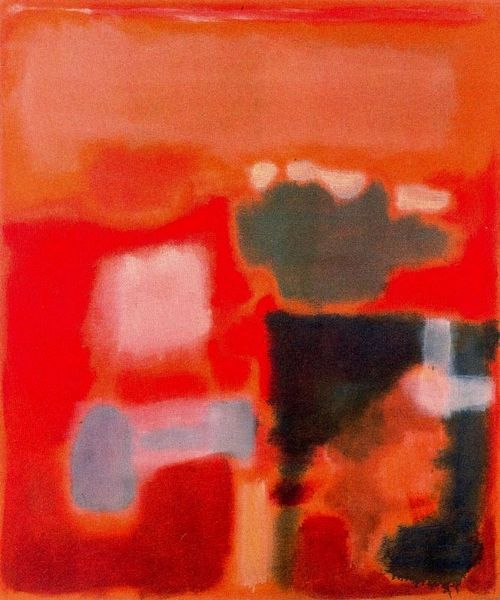
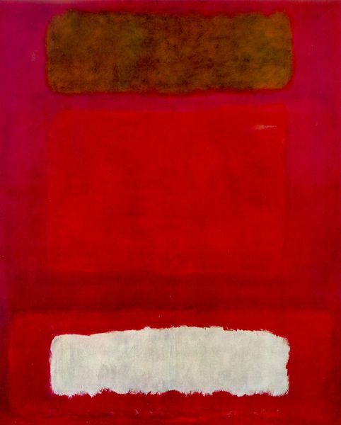
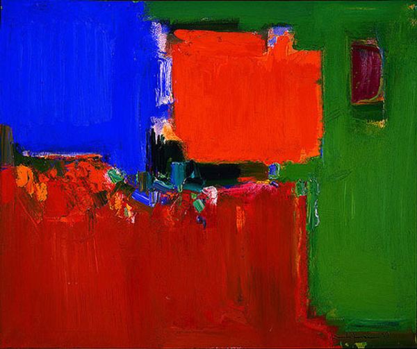
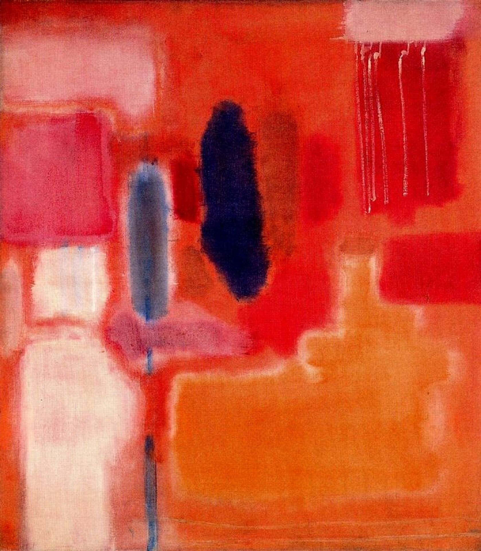
Editor: Mark Rothko's "No. 9", created in 1948 using oil paint, feels like an immersive experience, doesn't it? The stacked, blurry rectangles in shades of red, orange, and hints of darker hues are quite captivating. What strikes you most when you look at it? Curator: Immediately, the chromatic intensity demands attention. Observe the way Rothko manipulates the boundaries between these seemingly simple rectangular forms. It's less about distinct shapes and more about the subtle gradations, the push and pull of color relationships, the feathery edges achieved by thin washes and layering of pigment. Editor: So, it's the relationships between the colors that really define the piece? Curator: Precisely. Consider the large orange field dominating the lower portion of the canvas. How does its warmth interact with the cooler reds above? What impact does the stark blue intrusion at the painting's center bring, given its columnar structure? The formal elements – hue, saturation, value, shape – establish the entire vocabulary. Are you aware of the grid substructure used by the artist here? Editor: I wasn't! Now I see it though! It’s less chaotic than I originally thought. This perspective, by emphasizing the underlying composition, allows a richer interpretation. I appreciate understanding the painting as a structured exploration of color interaction, rather than just a collection of floating rectangles. Thank you! Curator: The emphasis shifts, doesn’t it? We've moved beyond simple aesthetics to discern the foundational mechanisms and how they are expressed here, allowing the piece to transcend, communicate.
No. 9
1948
Mark Rothko
1903 - 1970National Gallery of Art, Washington DC
National Gallery of Art, Washington, DC, USArtwork details
- Medium
- oil-paint
- Location
- National Gallery of Art, Washington, DC, US
- Copyright
- Mark Rothko,Fair Use
Tags
Comments
Share your thoughts
About this artwork
Editor: Mark Rothko's "No. 9", created in 1948 using oil paint, feels like an immersive experience, doesn't it? The stacked, blurry rectangles in shades of red, orange, and hints of darker hues are quite captivating. What strikes you most when you look at it? Curator: Immediately, the chromatic intensity demands attention. Observe the way Rothko manipulates the boundaries between these seemingly simple rectangular forms. It's less about distinct shapes and more about the subtle gradations, the push and pull of color relationships, the feathery edges achieved by thin washes and layering of pigment. Editor: So, it's the relationships between the colors that really define the piece? Curator: Precisely. Consider the large orange field dominating the lower portion of the canvas. How does its warmth interact with the cooler reds above? What impact does the stark blue intrusion at the painting's center bring, given its columnar structure? The formal elements – hue, saturation, value, shape – establish the entire vocabulary. Are you aware of the grid substructure used by the artist here? Editor: I wasn't! Now I see it though! It’s less chaotic than I originally thought. This perspective, by emphasizing the underlying composition, allows a richer interpretation. I appreciate understanding the painting as a structured exploration of color interaction, rather than just a collection of floating rectangles. Thank you! Curator: The emphasis shifts, doesn’t it? We've moved beyond simple aesthetics to discern the foundational mechanisms and how they are expressed here, allowing the piece to transcend, communicate.
Comments
Share your thoughts