graphic-art, print, paper, typography
#
graphic-art
# print
#
paper
#
typography
Dimensions: height 192 mm, width 126 mm, thickness 9 mm
Copyright: Rijks Museum: Open Domain
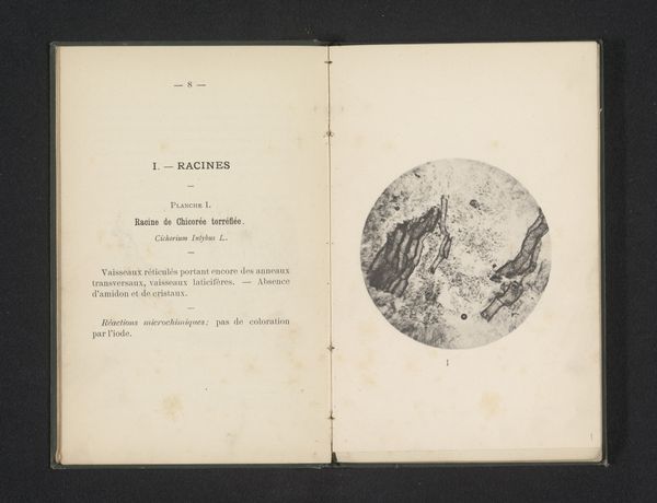
Editor: This is "Cercle des X: rapport sur la deuxieme periode quinquennale 1895-1900", a print on paper from 1901, created by Edouard Adelot. It looks like the title page of some kind of report. I find the use of typography to be pretty austere. What do you make of its presentation and overall impact? Curator: It’s interesting how such a seemingly straightforward document—a report—can be understood through a historical lens. We need to consider this in its socio-political moment: the turn of the century in France. The typography and design choices suggest a desire for order and scientific rigor. Notice how the crossed axes create a sort of pseudo-heraldic symbol. This period also saw the rise of statistical analysis and its visual representation. Do you think that the 'Cercle des X' was aiming for objective representation through these choices? Editor: Possibly, yes. It feels official. It's interesting you mention objectivity; could the design be influencing how the report itself would have been perceived, adding weight to its findings? Curator: Absolutely. Visual elements like this aren’t neutral. They construct meaning and shape reception. Think about the power structures inherent in institutional reporting at this time. Consider how printed materials like this shaped public understanding and legitimized certain voices over others. Who exactly was "Cercle des X", what purpose do we assume was fulfilled, and whom were they targeting to communicate to? Editor: So, it's not just about the information *inside* the report, but the whole package, including its design, is a deliberate form of rhetoric? Curator: Precisely. Even the choice of typeface, the layout, everything contributes. Looking closely allows us to unravel how power and knowledge were circulated through printed material. It becomes less about simply what the report *said*, and more about what it *did* in the world. Editor: That gives me a completely new way to think about documents like this. It's more than just conveying information. Thanks for shedding some light on that! Curator: It’s about understanding art as deeply intertwined with broader social and political dynamics. And seeing a title page, we can think, embodies that!
Comments
No comments
Be the first to comment and join the conversation on the ultimate creative platform.
More like this