1529
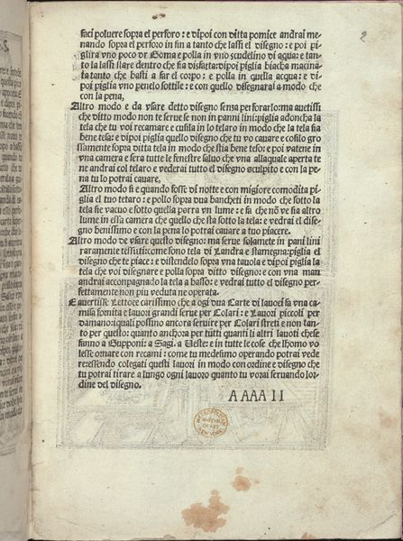
Esemplario di lavori, page 2 (recto)
Listen to curator's interpretation
Curatorial notes
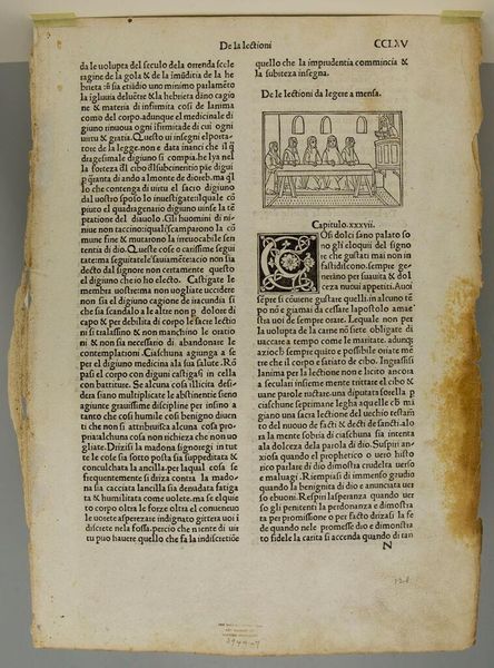
This is a page from “Esemplario di lavori,” made by Nicolò Zoppino around the early 16th century, using woodcut and letterpress. Initially, the texture of the paper and the black ink creates a stark contrast, drawing us into the structured world of Renaissance typography. The page is arranged with careful symmetry, where a dense block of text is anchored by decorative initials and a clear heading. The lettering itself is a study in contrasts. Notice how the bold, blocky initials play against the delicate, even lines of the text. This interplay creates a visual rhythm that guides the eye, much like a musical score. Structurally, the page is divided into distinct zones. Each typographic element, from the title to the body, is carefully placed to create a harmonious balance. It is a carefully calibrated composition that seeks to both inform and delight the viewer. Ultimately, this page reveals how early printers thought about the architecture of information. It stands as a testament to the enduring power of form and structure in conveying meaning.