Copyright: Rijks Museum: Open Domain
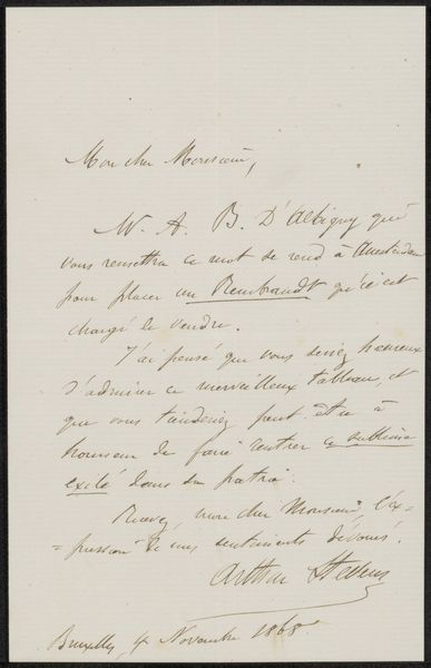
Curator: This is "Brief aan anoniem" – "Letter to Anonymous" – possibly from 1875, by Theodoor Soeterik. It’s ink on paper. Editor: It looks like someone's personal correspondence. The elegant handwriting gives it a very intimate, almost secretive feeling. What visual elements stand out to you? Curator: Immediately, the linear quality dominates. Note how the artist, or writer, has used the very structure of written language, the repeated ascenders and descenders of the script, to create a visual rhythm across the page. Observe also the textural variations created by the varying pressure of the pen, producing areas of dark emphasis alongside lighter, almost transparent strokes. The arrangement isn't casual; notice how elements are balanced with calculated visual weight. Editor: It almost feels like calligraphy as art form itself, instead of just a message. But if it is, how do we consider the semantic weight of the writing versus just looking at the pure formalism? Curator: An excellent point. Even divorced from its immediate content, the visual character of the handwriting suggests character and intention. This, combined with the texture of the paper itself, lends another dimension. Semiotics is always crucial, especially with text. We ask not only about meaning of the words, but how meaning is constructed and how those structures manifest. Are we privileging one form over another, and how can the formal approach avoid being blind? Editor: So we have to consider the relationship of form to text, structure and visual rhetoric to reach meaning… Curator: Precisely. And our perception can always be revisited as our comprehension expands. A formal examination of "Brief aan anoniem" allows us to analyze how even utilitarian objects gain a unique aesthetic essence.
Comments
No comments
Be the first to comment and join the conversation on the ultimate creative platform.
More like this