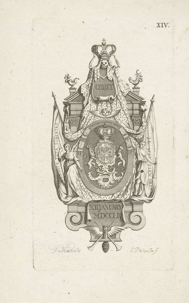
drawing, print, engraving
#
portrait
#
drawing
# print
#
figuration
#
form
#
11_renaissance
#
line
#
history-painting
#
academic-art
#
engraving
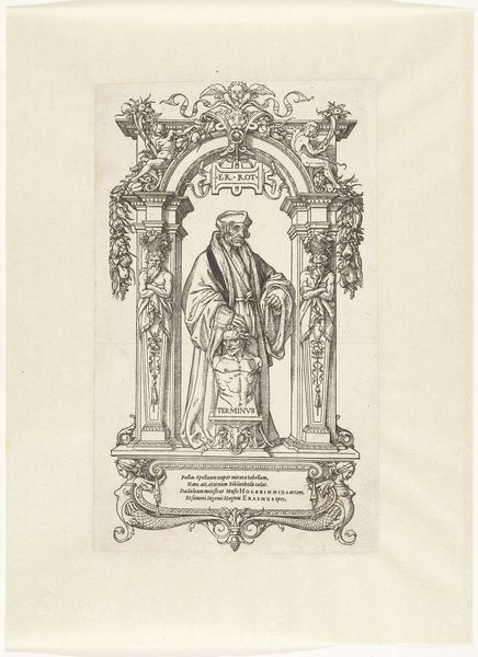
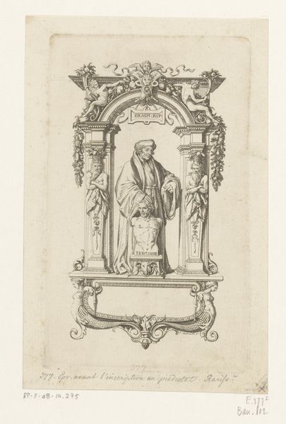
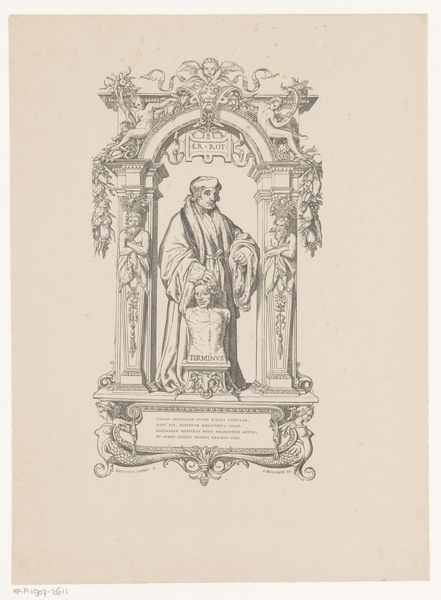
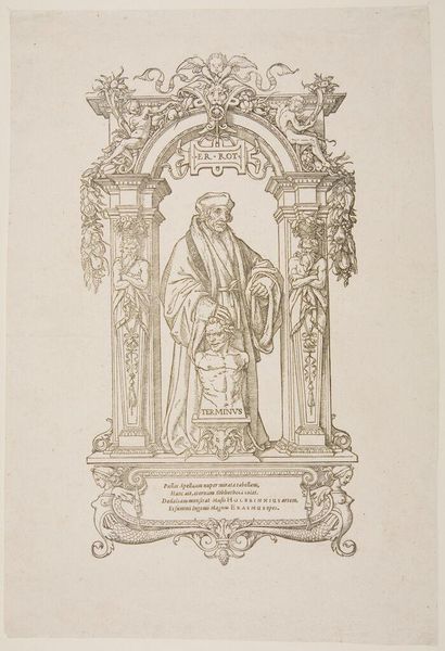
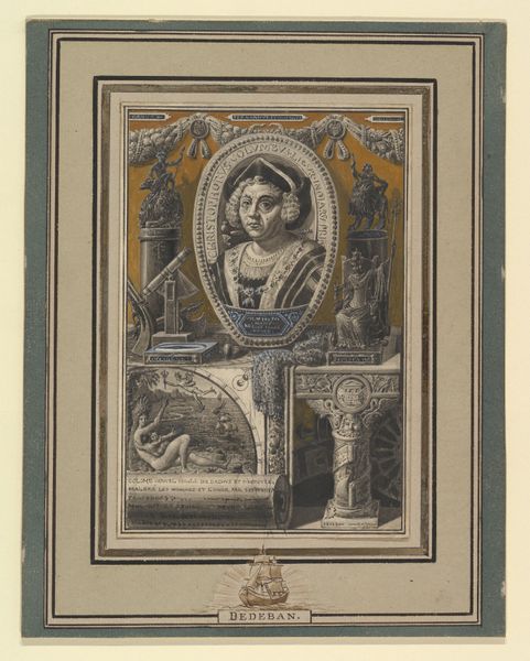
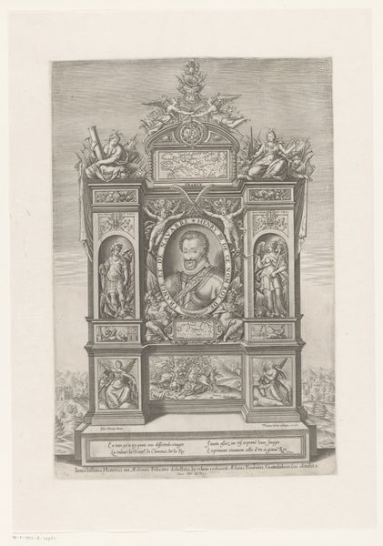
Dimensions: height 355 mm, width 246 mm
Copyright: Rijks Museum: Open Domain
Curator: Looking at this print, purportedly a depiction of Erasmus by Veit Rudolf Specklin, likely created between 1533 and 1820… There’s a certain... seriousness, isn't there? Editor: Seriousness is definitely the vibe! The linear engraving style reinforces that formal feeling, all those meticulous lines composing this rather elaborate setting around Erasmus. It speaks to a culture obsessed with detail and exactitude in its image-making. But the setting itself feels artificial; the heavy ornamentation feels divorced from Erasmus's work somehow. Curator: You’re right; it feels constructed. Erasmus stands imposing, almost like an architect inspecting his build—yet he touches the head of Terminus, the god of boundaries, who stares up blankly. There is tension between Erasmus’s intellectual exploration, and the limit Terminus presents him. I find it touching, as though revealing private anxieties around a very public figure. Editor: And the construction of that public image relies on labor, skill, and the printing press! This wasn't just an act of artistic expression; it was a calculated act of production, creating multiples, distributing a very specific idea of Erasmus. Consider the paper, the ink, the engraver’s hand. Someone crafted those lines, impressing this image onto page after page for an eager public. Curator: The Latin phrases interspersed, and elaborate frame gives him authority, literally placing him in a classical lineage, a Renaissance man made print. It does, however, soften my original impression, makes it calculated rather than insightful. The more you look, the more formal the portrait becomes—and the more academic it appears. Editor: Exactly. And notice the cherubs, the twisted columns; are they reinforcing that scholarly authority, or slightly mocking it? This object is designed for consumption. The image, like many others of its kind, blurs the lines between reverence and production, between high art and commercial craft. And you've got to admit, as reproducible portraits go, it does carry some gravitas. Curator: Despite all the labor and historical weightiness you've pointed out, there's something genuinely vulnerable about the image of Terminus, head craned upwards—which somehow manages to move me again, and makes the artist, whoever they were, feel more present. Editor: So, we began with seriousness, then acknowledged labor, and conclude by seeing potential emotion, even tenderness, emerging from these historically grounded material conditions of artistic production.
Comments
No comments
Be the first to comment and join the conversation on the ultimate creative platform.
More like this