About this artwork
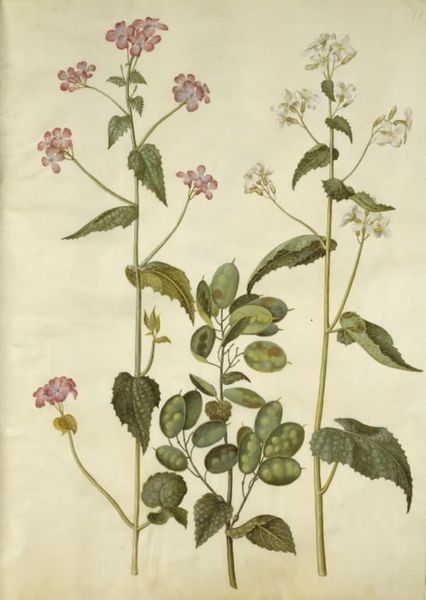
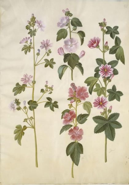
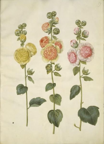
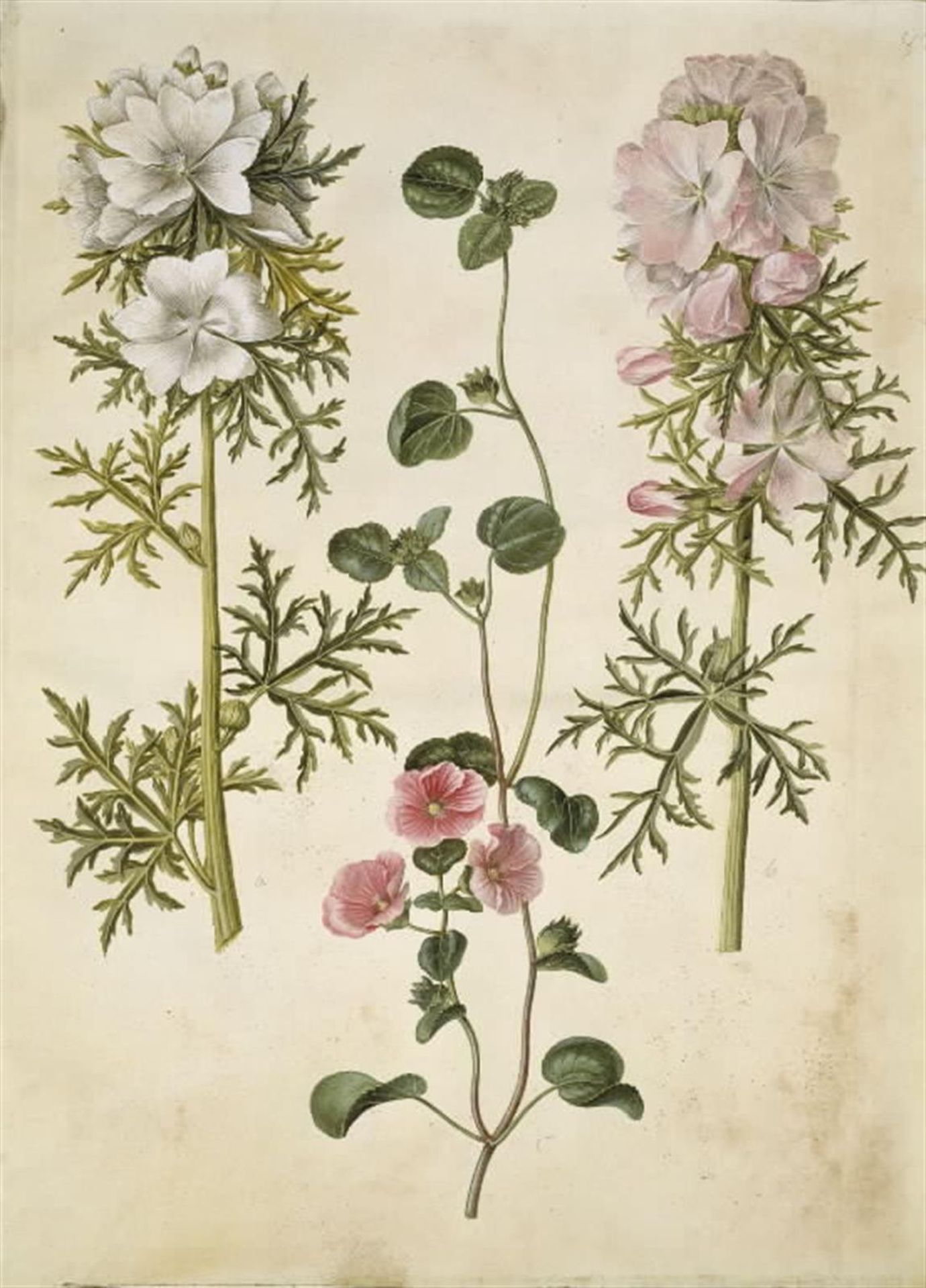
Editor: Here we have Hans Simon Holtzbecker’s “Malva moschata (moskus-katost); Malva eller Malope (art af katost eller malope),” made sometime between 1649 and 1659 using watercolor, gouache and drawing. The flowers, each rendered with such meticulous detail, strike me as both scientifically accurate and aesthetically pleasing. What compositional elements stand out to you? Curator: The most immediate observation is the arrangement. Holtzbecker employs a triptych-like structure. Three distinct floral arrangements command their vertical space on a muted ground. Notice how each plant occupies its zone, delineated not by hard lines, but by implied spatial relations, which creates a structured visual rhythm across the composition. Editor: That's interesting. The implied spatial relations give a sense of depth despite the relative flatness. Curator: Precisely. The linearity of the stems contrasts with the complex layering of the petals. And then consider the colours: how does Holtzbecker's use of a restricted palette — primarily whites, pinks, and greens — impact the overall reading? Editor: The limited colour palette does contribute to a sense of tranquility and unity, although the meticulous detailing also lends the image a vibrant quality. It is all very balanced. What else strikes you about it? Curator: It is the interplay of botanical exactitude and aesthetic choice. How Holtzbecker marries observation with artistic selection that yields meaning. Do you find the artwork pleasing or scientifically accurate, or something more? Editor: I appreciate how our formal analysis reveals an intentional, rather than accidental image. Thanks. Curator: Indeed, reflecting upon visual cues leads us toward potential interpretations.
Malva moschata (moskus-katost); Malva eller Malope (art af katost eller malope) 1649 - 1659
Artwork details
- Medium
- drawing, gouache, watercolor
- Dimensions
- 505 mm (height) x 385 mm (width) (bladmaal)
- Location
- SMK - Statens Museum for Kunst
Tags
drawing
water colours
gouache
11_renaissance
watercolor
watercolour illustration
northern-renaissance
watercolor
Comments
No comments
About this artwork
Editor: Here we have Hans Simon Holtzbecker’s “Malva moschata (moskus-katost); Malva eller Malope (art af katost eller malope),” made sometime between 1649 and 1659 using watercolor, gouache and drawing. The flowers, each rendered with such meticulous detail, strike me as both scientifically accurate and aesthetically pleasing. What compositional elements stand out to you? Curator: The most immediate observation is the arrangement. Holtzbecker employs a triptych-like structure. Three distinct floral arrangements command their vertical space on a muted ground. Notice how each plant occupies its zone, delineated not by hard lines, but by implied spatial relations, which creates a structured visual rhythm across the composition. Editor: That's interesting. The implied spatial relations give a sense of depth despite the relative flatness. Curator: Precisely. The linearity of the stems contrasts with the complex layering of the petals. And then consider the colours: how does Holtzbecker's use of a restricted palette — primarily whites, pinks, and greens — impact the overall reading? Editor: The limited colour palette does contribute to a sense of tranquility and unity, although the meticulous detailing also lends the image a vibrant quality. It is all very balanced. What else strikes you about it? Curator: It is the interplay of botanical exactitude and aesthetic choice. How Holtzbecker marries observation with artistic selection that yields meaning. Do you find the artwork pleasing or scientifically accurate, or something more? Editor: I appreciate how our formal analysis reveals an intentional, rather than accidental image. Thanks. Curator: Indeed, reflecting upon visual cues leads us toward potential interpretations.
Comments
No comments