About this artwork
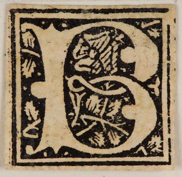
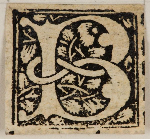
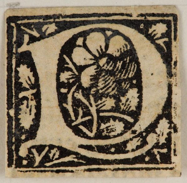
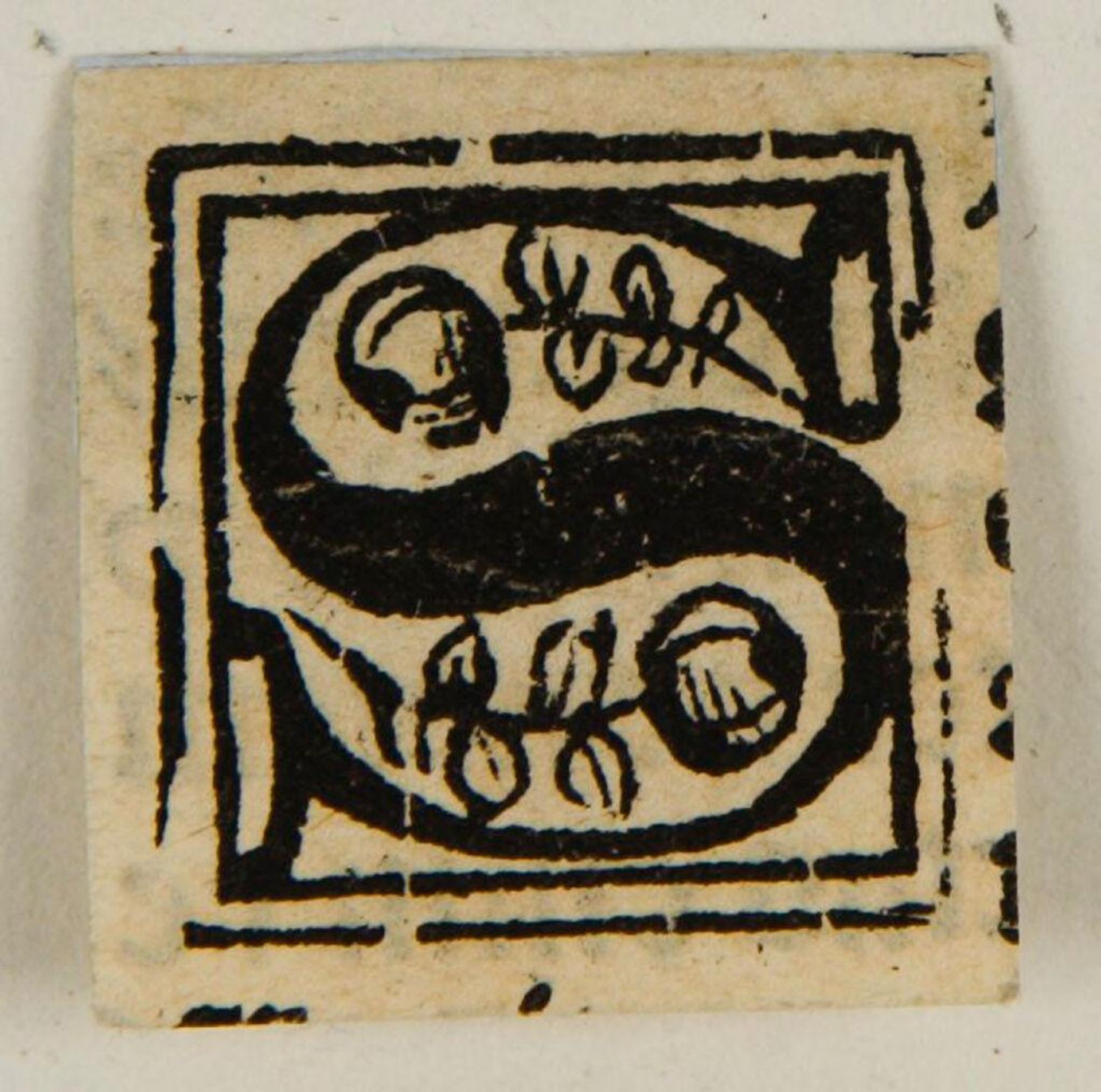
Curator: This striking "Letter S" print from the Harvard Art Museums, created by an anonymous artist, presents a fascinating point of entry into the world of early typography and graphic design. It's so bold. Editor: It feels almost like a relic—rough-hewn edges, thick black ink. It projects an aura of profound simplicity, wouldn't you agree? Curator: Indeed. The letter itself, rendered in a bold, almost serpentine form, is flanked by floral motifs. Notice how these elements aren't merely decorative; they seem to imbue the letter with connotations of growth and vitality, mirroring the very blossoming of literacy and communication within society. Editor: I hadn’t thought of that connection! I was considering this little print in the context of early publishing, how something like this democratized knowledge. Curator: Precisely. It reminds us that even something as seemingly simple as a letterform carries a profound cultural and historical weight. Editor: Yes, seeing that interplay makes me appreciate how accessible art can still make powerful statements.
Artwork details
- Location
- Harvard Art Museums
- Copyright
- CC0 1.0
Comments
Share your thoughts
About this artwork
Curator: This striking "Letter S" print from the Harvard Art Museums, created by an anonymous artist, presents a fascinating point of entry into the world of early typography and graphic design. It's so bold. Editor: It feels almost like a relic—rough-hewn edges, thick black ink. It projects an aura of profound simplicity, wouldn't you agree? Curator: Indeed. The letter itself, rendered in a bold, almost serpentine form, is flanked by floral motifs. Notice how these elements aren't merely decorative; they seem to imbue the letter with connotations of growth and vitality, mirroring the very blossoming of literacy and communication within society. Editor: I hadn’t thought of that connection! I was considering this little print in the context of early publishing, how something like this democratized knowledge. Curator: Precisely. It reminds us that even something as seemingly simple as a letterform carries a profound cultural and historical weight. Editor: Yes, seeing that interplay makes me appreciate how accessible art can still make powerful statements.
Comments
Share your thoughts