drawing, paper, ink
#
drawing
#
script typography
#
typeface
#
hand drawn type
#
paper
#
ink
#
hand-drawn typeface
#
romanticism
#
stylized text
#
thick font
#
handwritten font
#
delicate typography
#
thin font
#
thick lined
Copyright: Rijks Museum: Open Domain
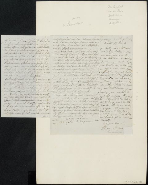
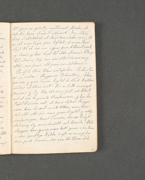
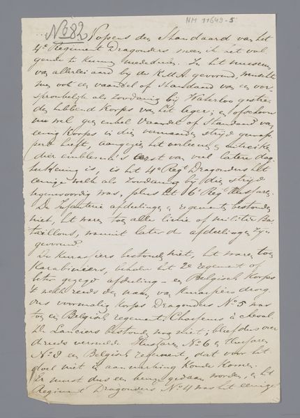
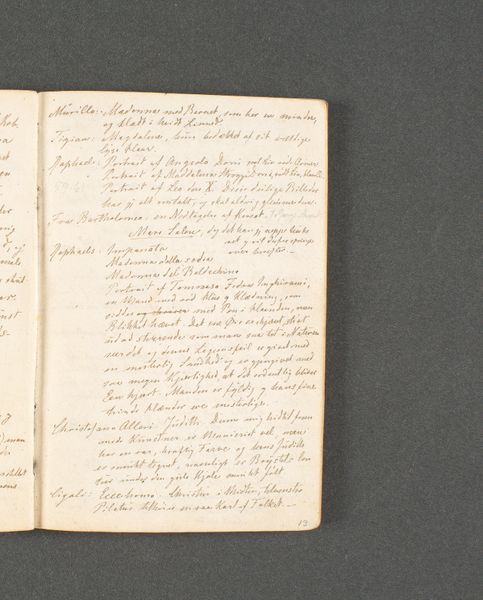
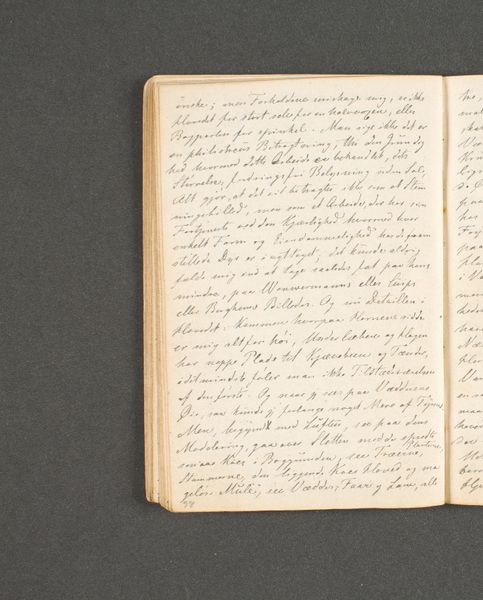
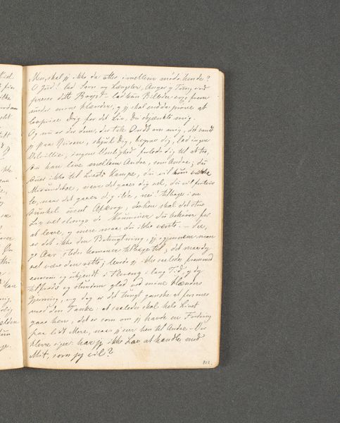
This is Johannes Immerzeel's "Handschrift betreffende Pieter Gaal," a manuscript now housed in the Rijksmuseum. The composition is strikingly simple: a dual-page spread filled with dense, looping script. The texture is defined by the ink's interaction with the paper, creating a visual rhythm of light and shadow. The uniformity of the handwriting speaks to a structured mind, yet the very act of writing, of filling the void, gestures towards expression beyond mere information. How do we decode this array of strokes and patterns? Viewing this manuscript through a semiotic lens, we can consider the individual letters as signs. The historical context informs our understanding. In the 18th and 19th centuries, handwriting was not only a means of communication but also an expression of personal identity and social status. Consider the manuscript's materiality. The paper's surface, the ink's consistency, and the pressure applied to the quill contribute to the overall aesthetic. This interplay of form and content challenges us to reconsider the boundaries between text and art, between the literal and the expressive.
Comments
No comments
Be the first to comment and join the conversation on the ultimate creative platform.
More like this