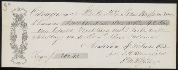
Possibly 1880
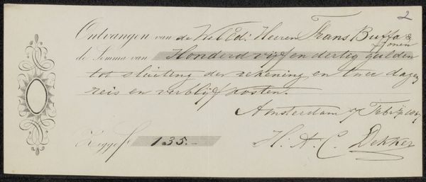
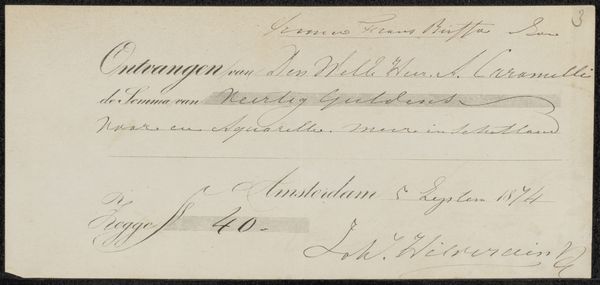
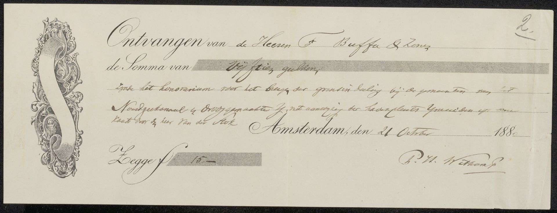
Kwitantie voor Pieter Harmen Witkamp
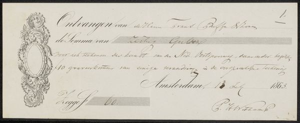
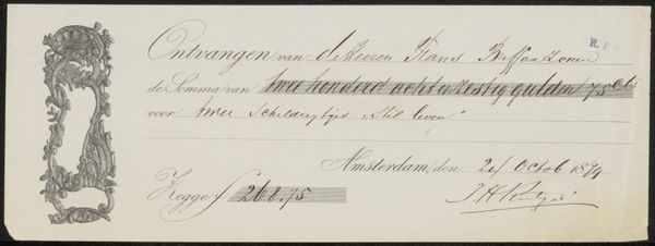
Frans Buffa en Zonen
@fransbuffaenzonenLocation
RijksmuseumListen to curator's interpretation
Curatorial notes
Curator: This object is a receipt, a "Kwitantie voor Pieter Harmen Witkamp," dating back to possibly 1880. It's currently held in the Rijksmuseum's collection. Editor: My first thought? Elegance! The flourish of the calligraphy, the restrained use of ink... it elevates the mundane to something quite beautiful, wouldn’t you say? Curator: Absolutely. It's tempting to view it simply as a historical artifact related to commerce, but I think its artistic qualities give insight into class dynamics and the art world economy during that era. Receipts, like portraits or landscapes, speak volumes about societal structures and power. It appears Frans Buffa en Zonen were a business, maybe an art dealer. Editor: Precisely! I imagine the act of physically creating such a beautiful document lent a certain gravitas to even the simplest of transactions. The paper seems almost translucent. I wonder about the scribe's intention; was he deliberately injecting beauty into what would usually be considered just a note? Curator: I suspect there was some pride and professionalism embedded in the production of this document. Consider also the presumed client of the Buffa firm, a member of the Amsterdam cultural elite, a consumer in the cultural ecosystem. Editor: I am immediately drawn to the decorative border that contains a ribbon and frames a flourish on the left side. It's more than just functional; it’s embellished. There's a human element here. Did the receipt possess symbolic weight to either or both the provider or recipient of funds? What are they telling each other in the details? Curator: Receipts often mark asymmetrical power dynamics and are indicative of social standing between parties, but one also has to consider the artist's autonomy, or lack thereof. The ink is the primary medium. What kind of sociopolitical statements do those calligraphic choices articulate? Editor: Right. In its essence, it's just a receipt, confirming a monetary transaction. Yet, looking at it this way, seeing how the creators imbued everyday life with subtle art, it’s hard not to feel charmed by the care. I am captivated by it. Curator: Indeed, reflecting on the art’s inherent biases helps us move beyond surface readings. Appreciating it with awareness allows us to engage more meaningfully with visual culture in our contemporary context. Editor: It's strangely uplifting to remember beauty wasn’t only in grand oil paintings. Thank you for contextualizing such a subtle beauty and imbuing a small monetary artifact with significant cultural implications!