Copyright: CC0 1.0
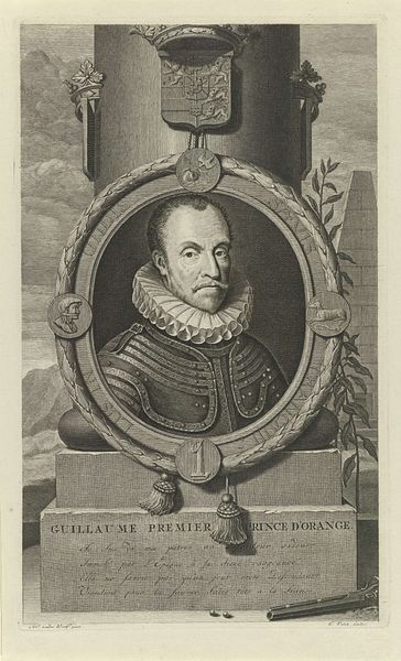
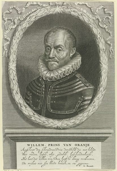
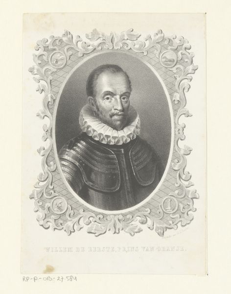
Editor: Here we have Gerard Valck's portrait of "William I, Prince of Orange." I'm struck by how the circular frame and the column behind create such a strong sense of depth and formality. What compositional choices stand out to you? Curator: Notice how Valck uses the circular frame to draw attention to William's face, the clear focal point. The detailed rendering of textures—the ruff, the armor—speaks to the artist’s technical skill and the print medium itself. Consider the relationship between the figure and the architectural elements. Editor: I see what you mean. The textures are so carefully rendered. How do those material qualities play into the overall effect? Curator: The contrast between the smooth stone and the intricate details of William's clothing creates a visual hierarchy. The strategic use of line and shadow guides our eye, establishing a sense of balance. I'd say Valck aimed for an image of controlled power. Editor: That’s a fascinating point. I hadn't considered how those different textures contribute to the overall composition. Curator: And now, considering the composition, what new meanings can you derive? Editor: It’s interesting to consider the strategic choices of the artist and how the composition comes together to produce meaning. Thanks!
Comments
No comments
Be the first to comment and join the conversation on the ultimate creative platform.
More like this