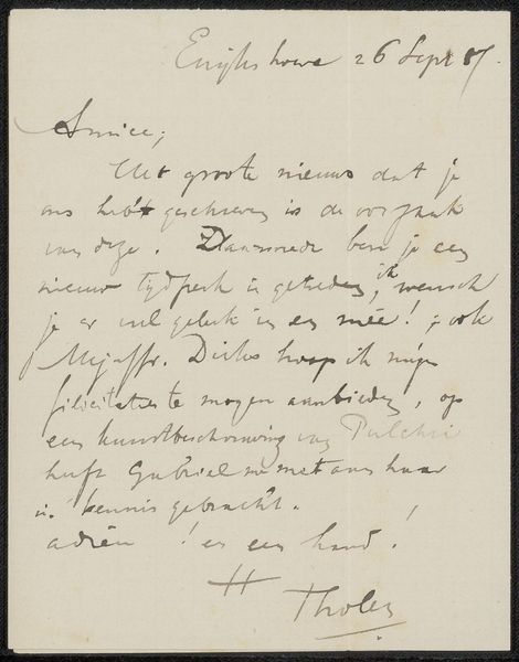
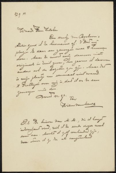
Brief van prins Willem V aan Pieter Hendrik Reijnst, 1788 Possibly 1788
0:00
0:00
willemvprinsvanoranjenassau
Rijksmuseum
drawing, paper, ink
#
portrait
#
drawing
#
dutch-golden-age
#
paper
#
ink
#
history-painting
#
calligraphy
Dimensions: height 95 mm, width 115 mm
Copyright: Rijks Museum: Open Domain
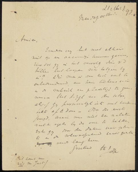
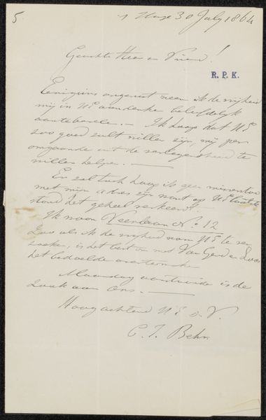
Editor: Here we have "Brief van prins Willem V aan Pieter Hendrik Reijnst", a letter by Prince William V from possibly 1788. It’s ink on paper and displayed at the Rijksmuseum. The flowing calligraphy gives it such an elegant, historical feel, even though I can't read a word of Dutch. What catches your eye from a formalist perspective? Curator: Note the placement of text. The hand creates dynamic visual contrasts; thick and thin strokes generate rhythm, consider the signature in the lower-right corner. It's balanced, yet asymmetrical. Notice how the letter "V" in his name echoes the looping ascenders in the body of the letter. This isn't just information, it's visual construction. How would you relate this to the Dutch Golden Age? Editor: Well, I see the clear, careful line work reminding me of detailed drawings and engravings of that period. It's more functional than expressive. Is the formality itself a visual statement? Curator: Precisely. Calligraphy itself, irrespective of its textual meaning, constitutes a considered practice of applying and arranging marks on a plane, with its unique shapes. It speaks to notions of power and the act of communicating as a physical artifact. Would you consider the composition dense or open, and what effect does that choice achieve? Editor: It feels very dense; very little white space. Perhaps to show the importance of the message, or to simply maximize the use of expensive paper? I didn't consider that until now. Curator: An excellent observation. It demonstrates how seemingly practical decisions impact the aesthetic qualities of a piece. Editor: I see that now; even something like the density of the text contributes to the overall impact. Curator: Indeed, and by analyzing these formal elements we are better equipped to assess it beyond its context.
Comments
No comments
Be the first to comment and join the conversation on the ultimate creative platform.
More like this