drawing, ink, engraving
#
drawing
#
baroque
#
pen drawing
#
ink
#
line
#
decorative-art
#
engraving
Dimensions: height 135 mm, width 190 mm
Copyright: Rijks Museum: Open Domain
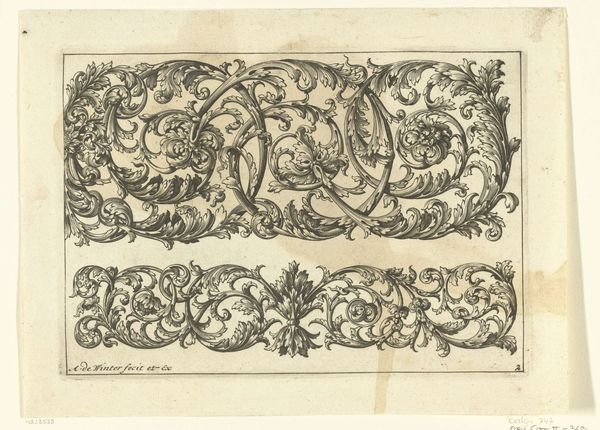
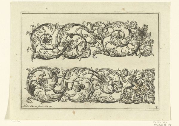
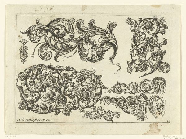
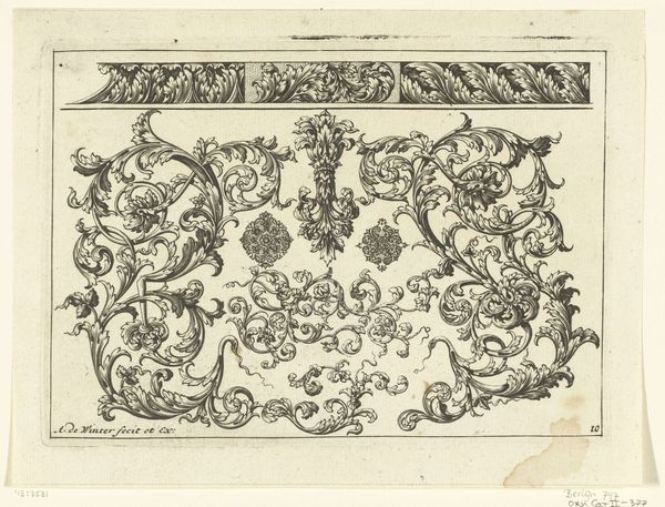
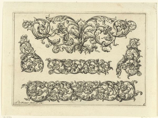
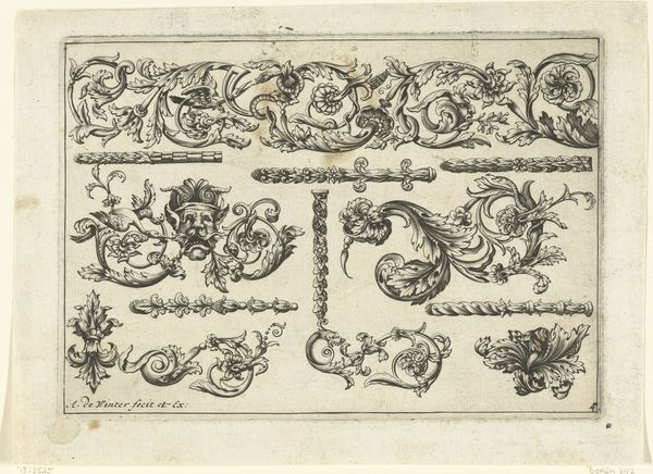
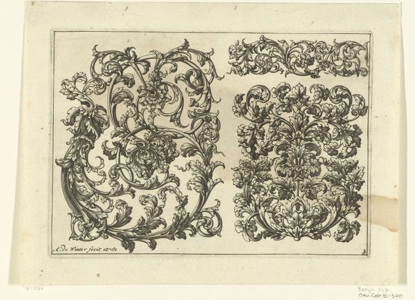
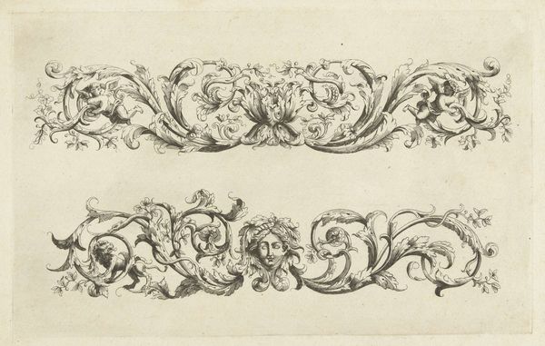
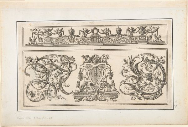
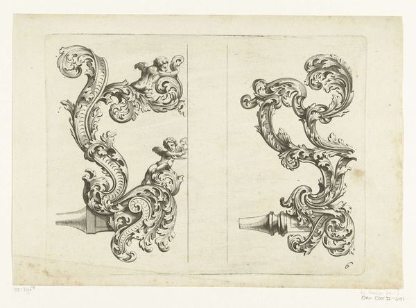
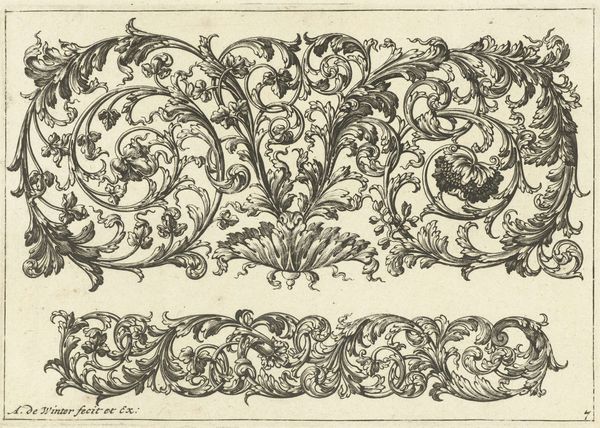
Editor: Here we have "Zeven Motieven" created around 1690-1700 by Anthonie de Winter, a drawing done in ink and engraving. It has a strong Baroque style. I am really captivated by the repetition and almost hypnotic effect of the floral details in each individual section. What do you notice? Curator: Indeed. Note the strategic use of line and tone to create depth and movement. Observe the careful arrangement of forms within each motif. De Winter masterfully uses hatching and cross-hatching, doesn’t he, to create the illusion of three-dimensionality on a two-dimensional plane. Each motif functions as an exercise in balancing positive and negative space. What do you make of that? Editor: I see the contrast and balance. So each individual motif relies on its relationship to the whole composition? It's more than just decoration then, the artist created visual interest through contrasting lines, light, and forms within a structured layout. Curator: Precisely. The linear quality emphasizes structure. Ask yourself, what philosophical notions may apply here? Editor: Hmmm. A structured philosophy focusing on balance, line, and form... Maybe something akin to stoicism, with its principles of order, control, and virtue? Curator: Very good, those principles are visible throughout this design. Editor: I learned to examine art based on elements that build it. Curator: The intrinsic elements reveal larger frameworks of thought and design!
Comments
No comments
Be the first to comment and join the conversation on the ultimate creative platform.
More like this