Dimensions: height 87 mm, width 174 mm
Copyright: Rijks Museum: Open Domain
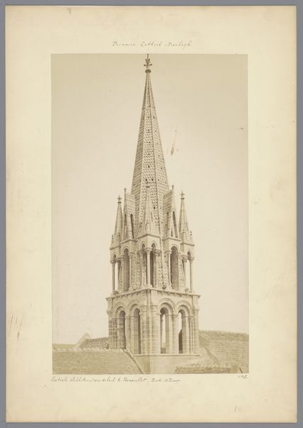
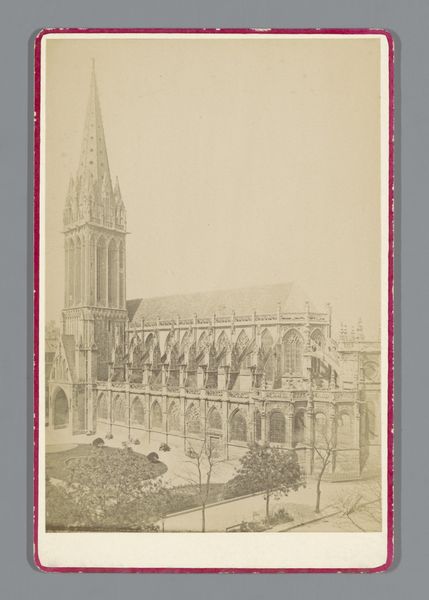
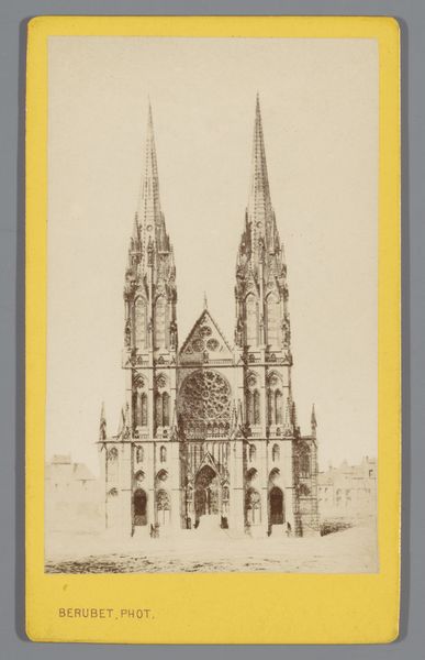
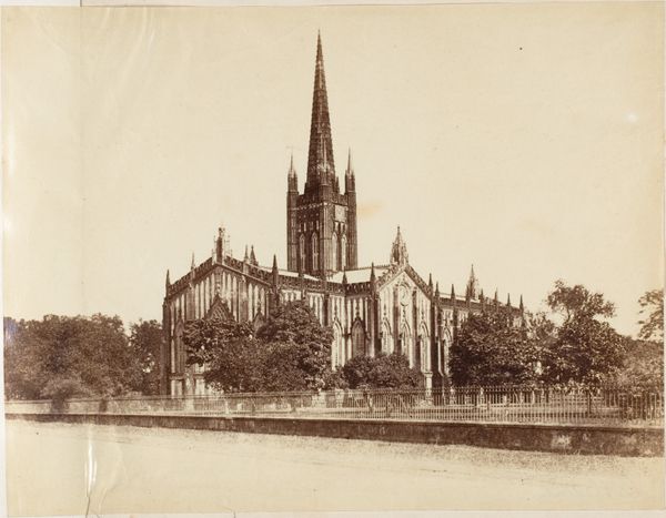
Editor: Here we have Vibien Golvin's "Gezicht op de \u00c9glise Sainte-Clotilde in Parijs," an albumen print dating from around 1850 to 1880. The sepia tone gives it a wistful feel. How would you approach an interpretation of this work? Curator: Focusing purely on the visual language, consider the albumen print's capacity for capturing minute details of Sainte-Clotilde. The architectural structure is almost obsessively rendered. Do you observe how the geometric forms interplay with the soft gradations of light and shadow? Editor: Yes, the pointed arches and rose window contrast with the out-of-focus trees at the base, creating layers. Is that tension purposeful? Curator: Precisely! Consider the formal relationships—the interplay between line, shape, and texture. Note how the verticality of the spires is countered by the horizontality of the trees, drawing the eye upward. Does that influence the perception of the Sainte-Clotilde's imposing size? Editor: I see. The composition leads you to perceive the church as massive and imposing. Curator: Moreover, consider how the print medium itself, the albumen process, contributes to our understanding. The warmth of the sepia tone, the subtle imperfections…Do they not enhance the textural richness? The material quality of the print impacts meaning. Editor: So, the artistic choices about light, geometry, and materiality all contribute to the essence of the piece. That makes sense. Curator: Exactly. Through a detailed assessment of the composition and materiality, we've uncovered something crucial about how the photograph works as an image.
Comments
No comments
Be the first to comment and join the conversation on the ultimate creative platform.
More like this