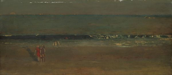
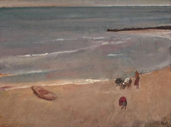
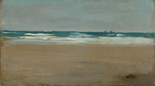
painting, oil-paint
#
acrylic
#
painting
#
impressionism
#
oil-paint
#
landscape
#
charcoal drawing
#
figuration
#
oil painting
#
water
#
painting painterly
#
genre-painting
#
sea
Copyright: Public domain
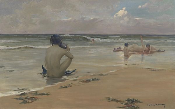
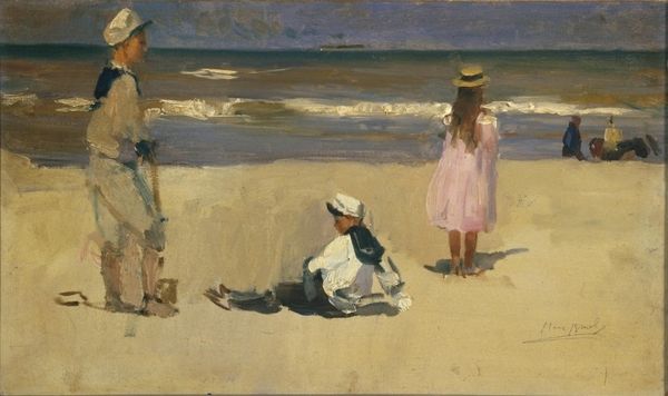
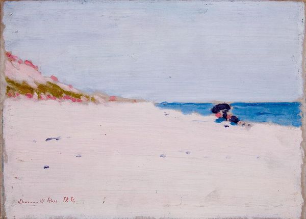
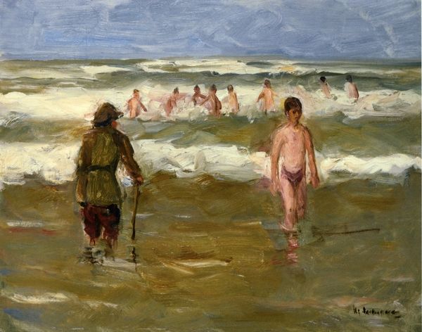
Editor: We're looking at "Boys at the Beach: Study" by Nikolai Ge, done with oil paint. I’m really struck by how the colors create a muted, almost melancholic mood. What do you see in this piece, particularly in terms of its composition? Curator: I’m immediately drawn to the painting’s exploration of spatial relationships. Observe how Ge uses the horizon line, a subtle yet firm horizontal stroke, to divide the composition. Note the placement of the figures – one seated, grounded, the other standing, reaching towards that line, creating a dynamic tension between the horizontal and the vertical. It’s about balance and contrast; the darker colors of the sky weigh heavily above, countered by the lighter hues of the water and sand below. The texture, created by the application of paint itself, adds depth to these contrasts. Do you find that texture contributes to your initial feeling? Editor: Definitely. The visible brushstrokes in the water make it feel almost turbulent, despite the otherwise still scene. How does the absence of sharp details contribute to the overall effect? Curator: The lack of crisp outlines pushes the work away from literal representation and invites the viewer into a space of interpretation. Semiotically, these vague forms suggest a universality of experience, of youth at the beach. The brushwork deconstructs and flattens conventional perspective to its core components. In your estimation, what would sharper outlines do to this affect? Editor: It'd lose some of its dreamlike quality and feel more like a portrait. Curator: Precisely. And this brings us back to the genius of the structural choices. Editor: I see it now! The focus on composition and the interaction of color and brushstrokes reveals so much more than just boys at the beach. Thank you. Curator: Indeed. And these basic structural choices offer significant rewards to those who choose to engage with them directly.
Comments
No comments
Be the first to comment and join the conversation on the ultimate creative platform.
More like this