Copyright: Public domain
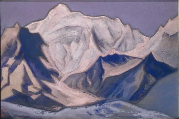
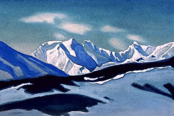
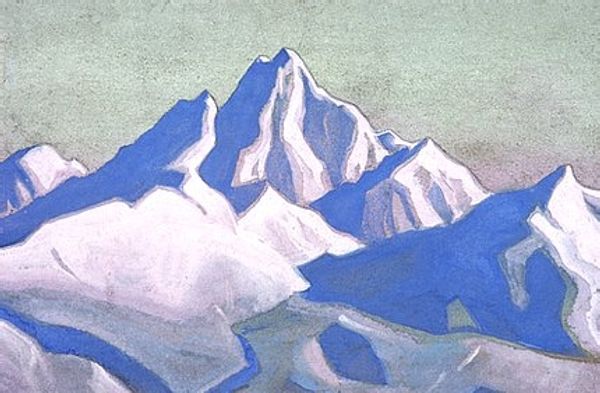
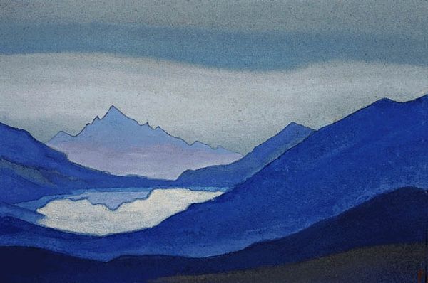
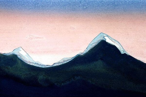
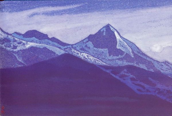
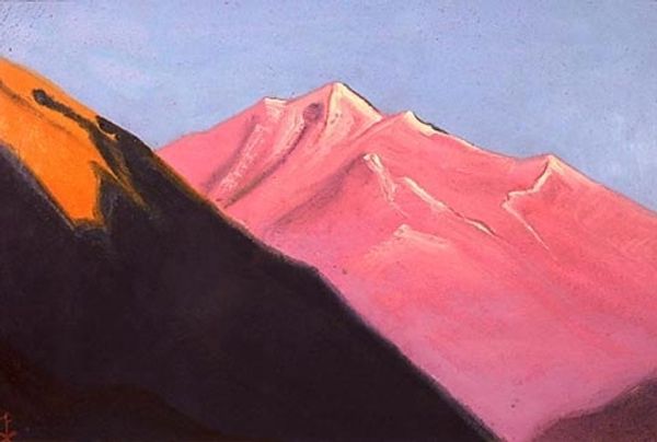
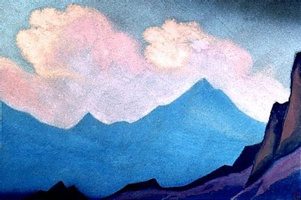
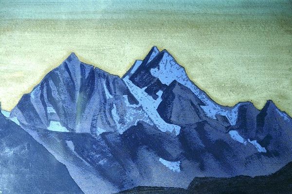
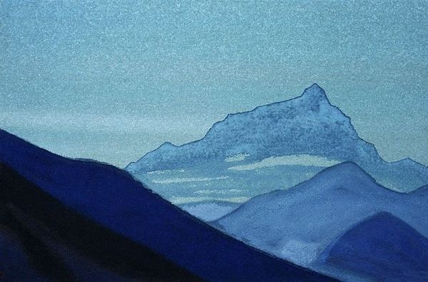
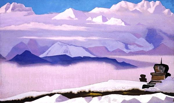
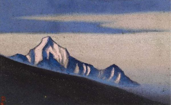
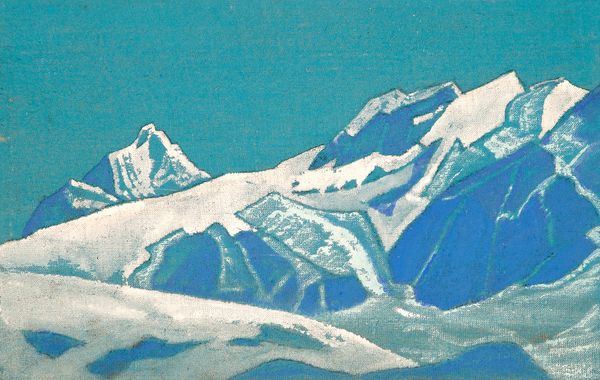
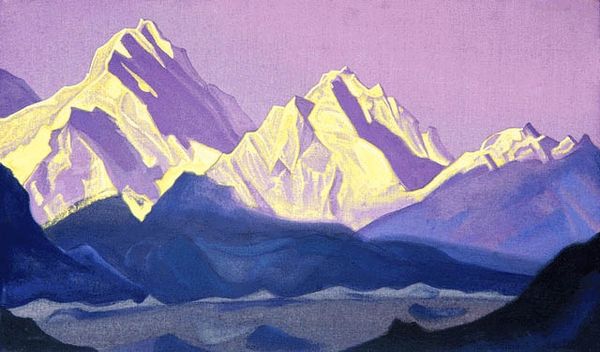
Nicholas Roerich painted these Himalayas with what seems to be tempera paint, rendering forms with a real sense of immediacy and directness. I'm drawn to the way the colors are layered; you can see how he blocked in the shapes, building them up to make a composition where the mountains push up against the sky and clouds. The paint application is matte, and this flatness gives it a sort of otherworldly quality. Look at the contrast between the dark blues and the bright whites – the sharp delineation emphasizes the massive scale of the mountains. The edges of the clouds and mountains are soft and blurred, giving them an ethereal feel. Roerich, like Marsden Hartley, had a deep interest in spiritualism and landscape. You can see how Roerich's personal beliefs seeped into his art, elevating the natural world to something transcendent. Art like this reminds us that the act of seeing and painting is a way of thinking and experiencing.
Comments
No comments
Be the first to comment and join the conversation on the ultimate creative platform.
More like this