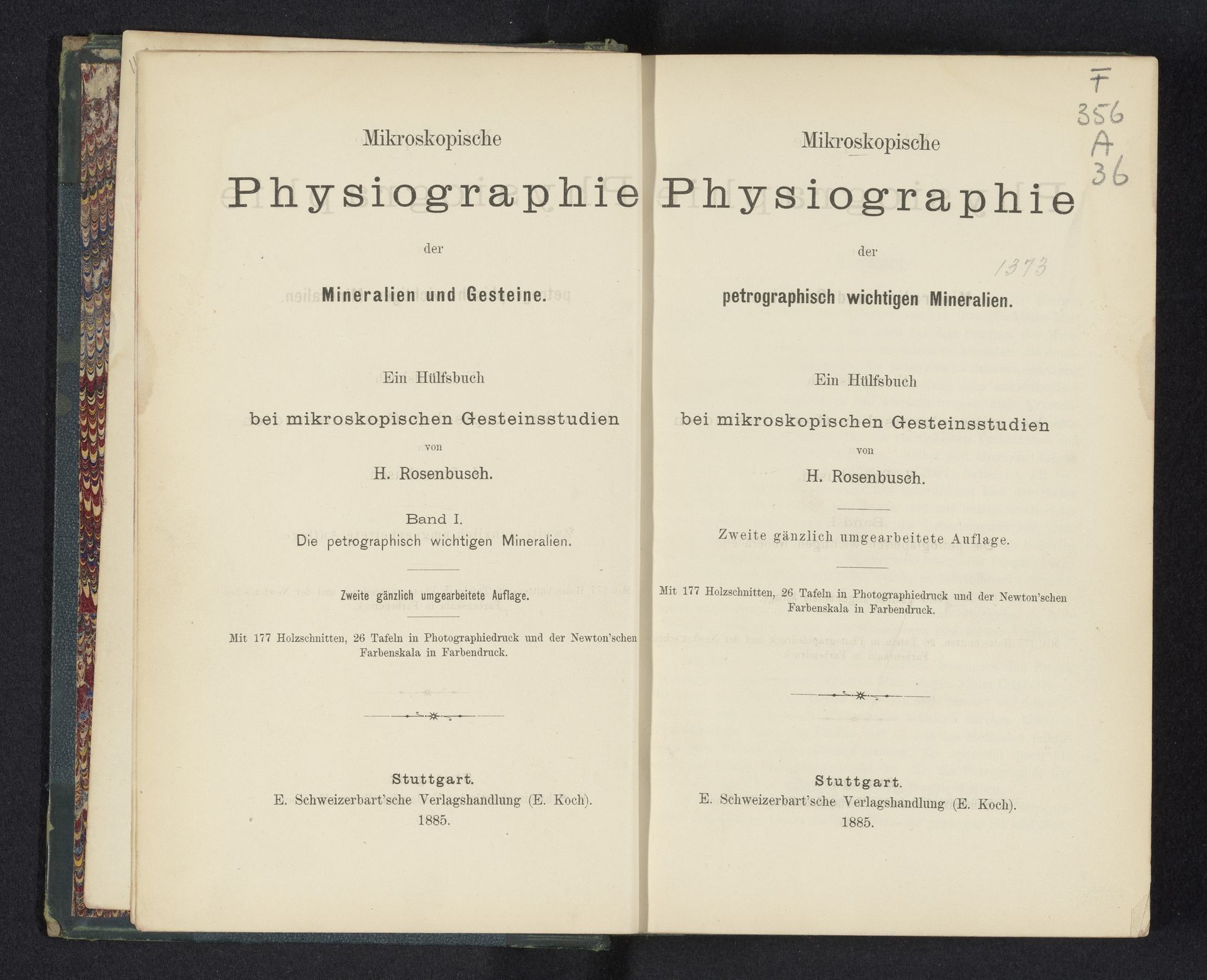
1885
Mikroskopische Physiographie der petrographisch wichtigen Mineralien
Listen to curator's interpretation
Curatorial notes
Curator: This striking typographic print is the title page for H. Rosenbusch's "Mikroskopische Physiographie der petrographisch wichtigen Mineralien," published in 1885. The layout and aged paper create a real sense of history. What's your first reaction? Editor: It feels like opening a forbidden textbook, doesn't it? Sort of… ominous and inviting at the same time. The strict typeface promises some seriously dense scientific knowledge, yet there’s an artistry to the design itself. Curator: Absolutely. Rosenbusch employed a rather academic style here, prioritizing clarity and organization. The structure clearly defines the hierarchy of information. Observe the differing font sizes that guide the reader through the book's title, author, and publication details. Editor: The symmetry is pleasing, even with slight variations on the two pages – it suggests evolution, an updated edition side-by-side with the older one, but firmly rooted in the same rigorous tradition. There’s something very satisfying about how precise everything is. Makes me wonder what wonders these "petrographisch wichtigen Mineralien" hold under a microscope. Curator: Indeed. The typography emphasizes precision, reflective of the meticulous nature of microscopic mineralogy. The font choices contribute significantly; that bold, almost gothic typeface is common for scientific publications of the period. Semiotically, it lends authority and gravitas. Editor: But it’s not cold, you know? It feels crafted, deliberate. Each letter seems placed with purpose. And look at the small print—almost an afterthought. Despite being subordinate to the title, it gives the piece a touch of humanity, suggesting the detailed labor within. It’s a blend of art and pure scientific observation, promising almost spiritual insights. Curator: I agree, although the primary focus remains the systematic presentation of information, typical for academic publications of its time. This is more functional art than expressive art, wouldn’t you say? Editor: Maybe. But that functionality *becomes* the expression, don't you think? Either way, the book's visual design is compelling, and makes me eager to see what's inside. Curator: It provides a certain tactile intellectual experience, indeed. The image, after analysis, presents an intriguing snapshot of late 19th-century scientific communication and visual culture. Editor: Agreed! A beautiful relic from a time when even science had a flair for the dramatic reveal.