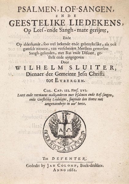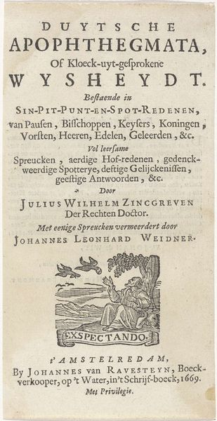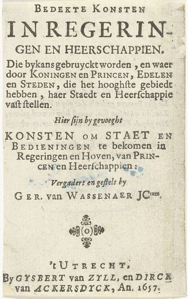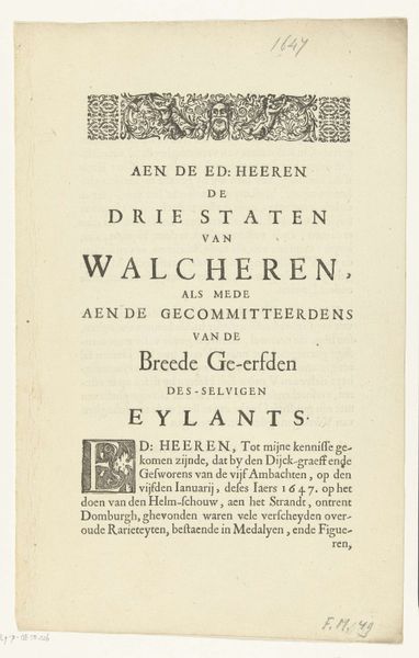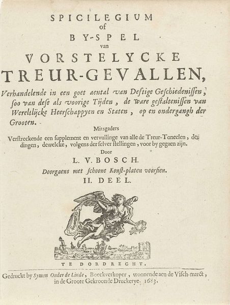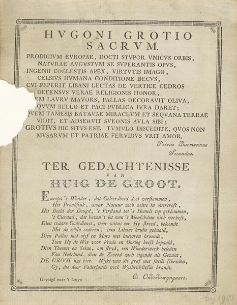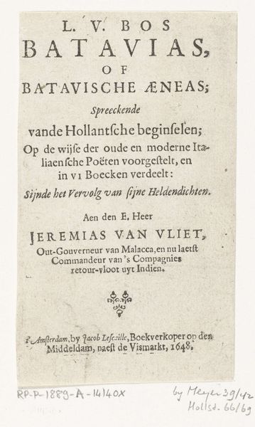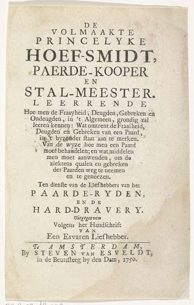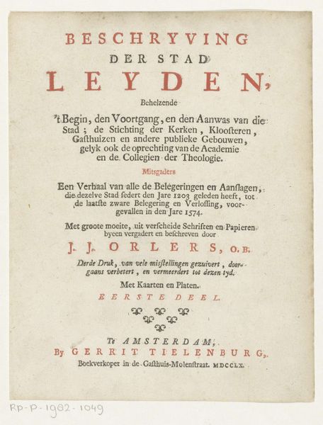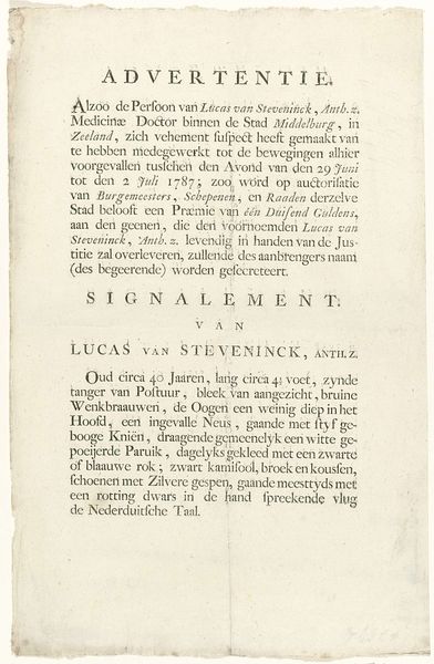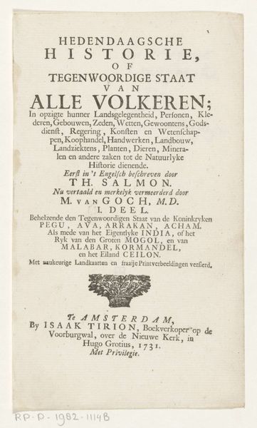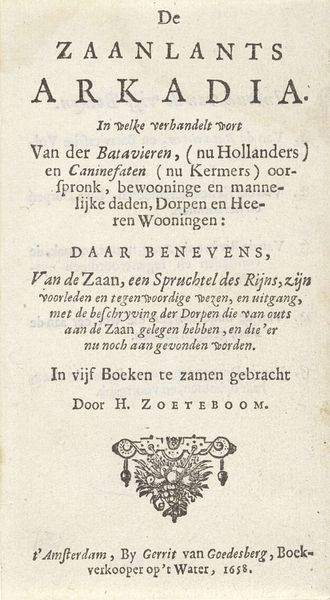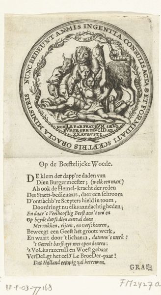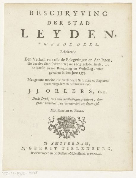
Titelpagina voor: D. van Baardt, Tapytje der geestelijcke ende wereldtlijcke heerschappije, 1661 1661
0:00
0:00
graphic-art, print, typography, engraving
#
graphic-art
#
hand-lettering
#
baroque
# print
#
old engraving style
#
hand drawn type
#
hand lettering
#
typography
#
hand-drawn typeface
#
fading type
#
thick font
#
handwritten font
#
engraving
#
historical font
#
columned text
Dimensions: height 145 mm, width 90 mm
Copyright: Rijks Museum: Open Domain
Editor: This is the title page to "Tapytje der geestelijcke ende wereldtlijcke heerschappije," which translates to "Carpet of Spiritual and Worldly Dominion," created in 1661 by Hendrick Stuyfzandt. It's an engraving, and what immediately strikes me is the elaborate, almost ornate typography. What can you tell me about the context of this work? Curator: Considering this piece within its socio-political context, we see the strong influence of religious and secular power in 17th-century Dutch society. The title itself, "Carpet of Spiritual and Worldly Dominion," suggests a tightly woven tapestry of these two realms. This era witnessed intense debates about religious authority and its relationship to civic governance. The choice of typography, almost aggressively prominent, signals the importance placed on disseminating specific ideas during this period. Editor: That’s a great point. The text is really front and center. It makes me wonder about the intended audience and its role within society. Curator: Exactly. Stuyfzandt was a printer in Steenwyck. Who was he trying to reach, and why? The prominent display of theological text tells us about its likely market. Consider the Protestant Reformation's emphasis on individual interpretation of scripture and the increasing literacy rates; printed works like this facilitated the spread of religious and political ideas directly to a wider audience. Were pamphlets and printed works were crucial tools to participate in the burgeoning public discourse? Editor: I see that connection. So the typography is not just aesthetic, but it's actively working to engage the public with these weighty ideas. Curator: Precisely. It signifies a public assertion and debate in early modern Europe and acts as a focal point for a community, and in what way it could solidify specific ideological viewpoints. Editor: It's amazing to see how a single title page can reveal so much about the period's cultural and political landscape. I hadn't initially thought about how typography itself could be a tool of persuasion! Curator: Yes! By considering printing’s role as a public tool and the politics of imagery during the time, we gain new appreciation.
Comments
No comments
Be the first to comment and join the conversation on the ultimate creative platform.
