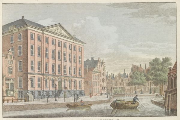
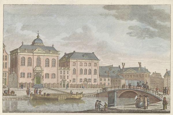
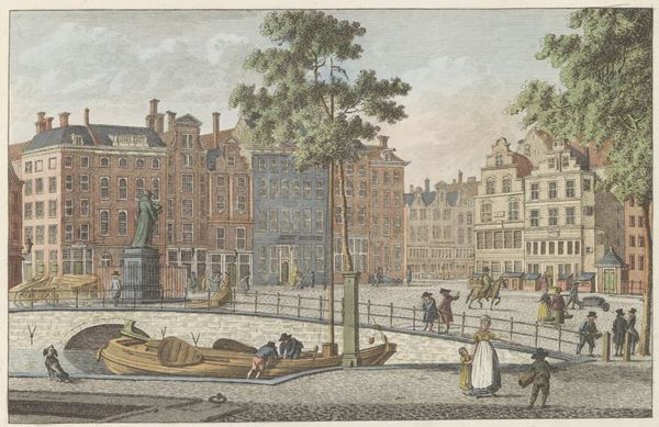
Portugese Synagoge te Amsterdam, ca. 1790 Possibly 1786 - 1825
0:00
0:00
carelfrederikibendorp
Rijksmuseum
painting, watercolor, architecture
#
neoclacissism
#
painting
#
watercolor
#
architecture drawing
#
cityscape
#
watercolour illustration
#
genre-painting
#
architecture
Dimensions: height 175 mm, width 250 mm
Copyright: Rijks Museum: Open Domain
Curator: What a charming watercolor! There’s something about the subdued palette that invites closer inspection. Editor: Yes, the muted tones create a certain tranquility. It feels more documentary than artistic. Curator: That's quite fitting given the subject. This is "Portugese Synagoge te Amsterdam, ca. 1790," likely rendered by Carel Frederik Bendorp sometime between 1786 and 1825. The Rijksmuseum is fortunate to have it. It’s a rather excellent example of neoclassicism showing everyday life in Amsterdam with architectural precision. Editor: It definitely captures a sense of the period. The Neoclassical architecture projects an air of order and rationalism but it feels slightly undone by the whimsy of the genre scene unfolding in the foreground with playing children and strolling figures. It projects two ways of life – and possibly values! - within one piece. Curator: Precisely. That juxtaposition really draws you in. Notice the careful depiction of the synagogue's façade. Bendorp focused intently on the rhythm of the arches and pilasters. It echoes a reverence for classical forms that speaks volumes about the cultural aspirations of the time, to create these monuments but for a faith tradition in Amsterdam, a safe-haven! Editor: And the light! It seems so diffuse, bathing everything in this soft, almost egalitarian glow. The effect normalizes the Jewish population within Amsterdam city-scape. The dog running in the street. The gossiping ladies seated at the park’s edge. Curator: The symbol of the dog might signal fidelity and watchfulness. Synagogues, historically, had to watch themselves...but that interpretation would need more research. The fact that the watercolor survives also indicates how architectural painting and watercolors of the day acted like postcards – images and sites circulated in these popular mediums and memorialized sites for their consumers, many who possibly traveled! Editor: A subtle detail I noticed is how the artist employs this higher vantage point. The higher placement offers a level of control and commentary as it watches and sees Amsterdam daily life unfold below. Curator: A great observation. Looking at it this way has certainly unlocked new dimensions within a familiar cityscape! It makes me want to know even more about Bendorp's choices here. Editor: Agreed. It underlines the painting’s complexity. Much more than just a picture postcard after all.
Comments
No comments
Be the first to comment and join the conversation on the ultimate creative platform.
More like this