mixed-media, print, typography
#
mixed-media
#
art-nouveau
# print
#
typography
#
decorative-art
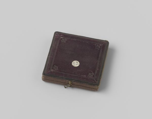
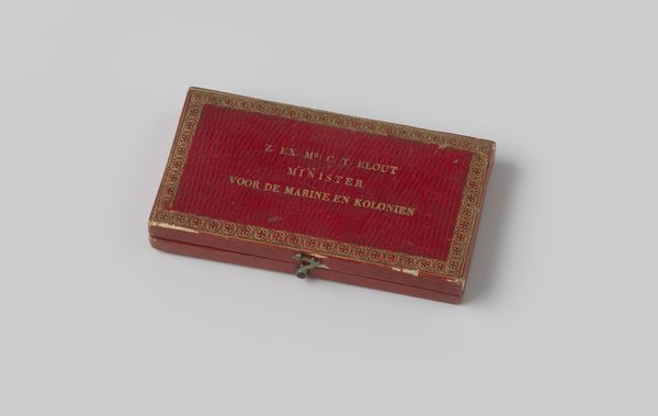
Dimensions: height 2.0 cm, width 9.5 cm, depth 13.5 cm, width 9.0 cm, depth 3.0 cm, width 5.0 cm, depth 1.0 cm, diameter 2.0 cm
Copyright: Rijks Museum: Open Domain
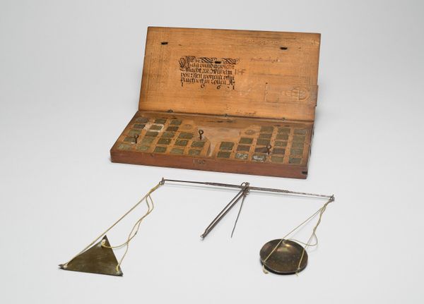
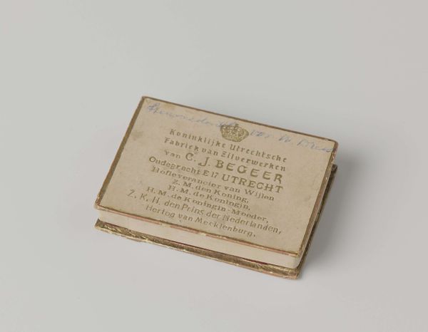
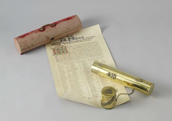
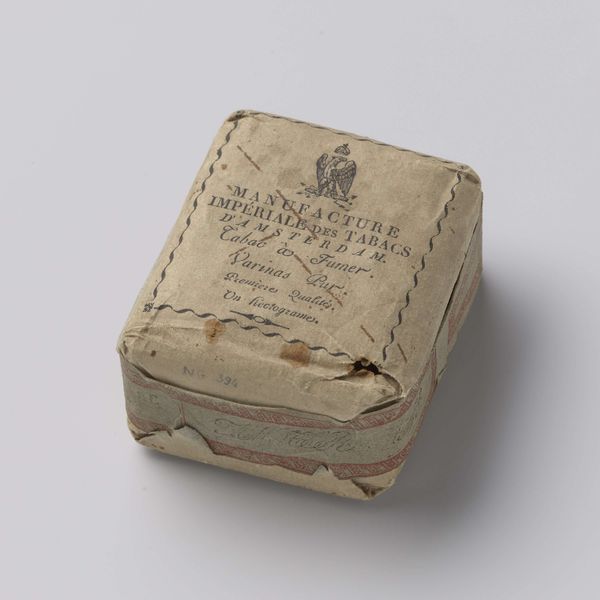
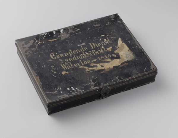
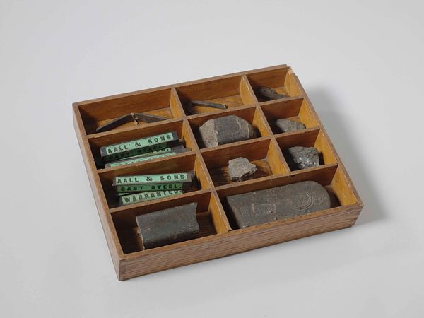
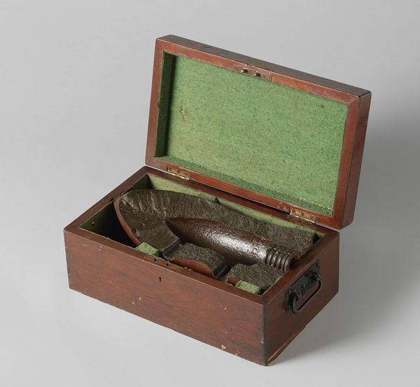
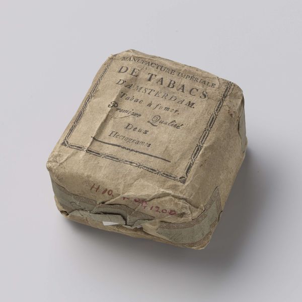
Curator: Here we have “Sjabloonmateriaal voor linnen” – or “Stencil Material for Linen” – dating from around 1910 to 1920, by Johann Merkenthaler. The piece employs a mixed-media approach, bringing together print and typography. Editor: Immediately, I'm struck by the almost archeological feel of this arrangement. The objects suggest a faded elegance and functional artistry, like remnants of a well-organized, very tactile world. Curator: Absolutely, the composition is meticulously arranged; note the deliberate placement of each item—the box, stencils, instruction sheet—how does this contribute to its effect? Editor: The parallel lines of the metal stencils, offset against the box with its contrasting diagonal type and dark color fields, create a tension that really draws the eye. It is a harmonious contrast in texture, from smooth metal, rough card, matte paper and typography. Curator: Indeed, the text gives significant historical insight to embroidery practices of the period. Note also the Art Nouveau influences visible in the design of the box and lettering. Editor: True, these ornate stencils signal a culture of personalization—democratizing access to crafted textiles with elegant monograms, and reflecting the era's wider emphasis on art and design enriching everyday life. I find the layering of language intriguing; what's implied by the trilingual packaging? Curator: The multilingual text indicates the intended appeal to a diverse, possibly international clientele. Also notice how even the most functional elements are imbued with decorative quality. Editor: Exactly, form follows function but also enhances it. In its time this would have signaled to the middle-classes quality and prestige. But what survives is testament to design that transcends a mere product, as we look at these artefacts and think beyond mere commercial imperative. Curator: Yes, reflecting on it, the success of this piece lies in its presentation as much as in its historical or utilitarian value. Editor: I concur; what's amazing is that beyond mere form and function this piece speaks so well to this bygone era.
Comments
No comments
Be the first to comment and join the conversation on the ultimate creative platform.
More like this